WIP for picture book - critique request - thank you!
-
Hi Everyone,
I am just starting to learn to be a picture book author/illustrator and I am pleased to find such a talented group here! I am looking forward to learn much from everyone.
I am working on an illustration for a picture book to submit to a mentorship opportunity, and may I ask for some advice?
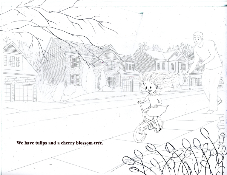
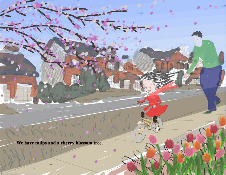
The story is about an immigrated Asian family; the main character (age 7 or so) was initially going through a rough time adjusting to the new environment but eventually grew to like it. On this page, she is telling the reader about the beautiful flowers at the new home, but more importantly I am trying to convey that the family’s love makes the adjustments easier.
I am attaching here a pencil sketch and a rough color draft. I'd like advice on the following (and anything else that comes to your mind):
(1) composition <Do things look proportional? Does the left bottom corner look too empty? Does the dad look like he was pushing the girl's bike and just letting go?>
(2) Color - Do the colors allow the main characters to stand out? Are the colors of the houses too dull and should I use brighter colors to go with the mood of the scene?
THANK YOU SO MUCH! !!
-
It looks like everything is proportional (nothing is jumping out at me). I think that the bottom corner is nice place for the eye to rest. Be careful not to add to much grass texture where you are placing the text. If the text is going to be black you want that area to be a light value. Dad's pose looks good to me (such a sweet moment of learning to ride a bike). I don't really have a strong opinion about which colors you choose to use, but you definitely want to make your characters (especially the girl) the focal point. I think the 2 main ways you can make sure you have a strong focal point are: 1- Value Contrast (think dark on light or light on dark), 2- Color Contrast (If you have your most vivid or intense colors in the focal point area that will help draw the eye in).
Good luck! It is really a cute illustration! I can't wait to see the finish!")
-
The values in your BG are a little dark around the girl. If you squint down or shrink the image way down her hair disappears into the back
-
@alissaempey Thank you so much! Yes that was a great tip; I will play around with the colors. Thanks!
-
@lisa-ngan It's a nice illustration
However (leave it or take it;) I am wondering, whether girl's dad is too close to the right side of the pic (?). Concerning colors, I am rubbish with color choices so will not try to advice. -
@rcartwright Thanks for catching that! True! Thank you!
-
This looks incredible so far! Really loving the houses in the back too. I would agree with @rcartwright about brightening the background colors as well
-
@aska Thank you! You're right he might get cut off.
-
@gdbee cool thank you!