Society of Visual Storytelling

    SVSLearn Forums

    • Register
    • Login
    • Search
    • Recent
    • Tags
    • Popular
    • Users
    • Groups
    • Search

    Octopus WIP (crits welcome)

    Artwork
    9
    20
    2670
    Loading More Posts
    • Oldest to Newest
    • Newest to Oldest
    • Most Votes
    Reply
    • Reply as topic
    Log in to reply
    This topic has been deleted. Only users with topic management privileges can see it.
    • evilrobot
      evilrobot SVS OG @Gary Wilkinson last edited by

      @gary-wilkinson I like your idea of the big octopus holding the ship and taking a selfie that's pretty funny. Also like your idea for #5. ?But maybe not with it on his head. Maybe it's like a fisherman's catch photo. Holding out the baby octopus as his prized catch (make it very obvious it's a baby octopus)

      http://www.palacioillustration.com/

      https://www.scbwi.org/illustrator-gallery/illustrator-detail/?illustrator_id=84142

      https://www.pinterest.com/evilrobot2/pins/

      https://twitter.com/MyEvilRobot

      1 Reply Last reply Reply Quote 2
      • Chip Valecek
        Chip Valecek SVS Team SVS OG @Gary Wilkinson last edited by

        @gary-wilkinson I like #3, i love cute things.


        https://www.instagram.com/chipvalecek/
        https://www.facebook.com/cvalecek
        http://www.cshellmedia.com/

        1 Reply Last reply Reply Quote 1
        • TessaW
          TessaW last edited by

          I like 1, 2, and 4. 4 is funny and I feel like it's more of a stand alone illustration. 1 and 2 invite me to imagine them as part of a larger story. 1 has a great gesture, so I was initially drawn to it, but I wonder if the pay off of it stealing paint is satisfying enough? Though I do think of octopuses as clever and sneaky, so I think it captures it's spirit well.

          Can't wait to see which you go for. They are all really fun.

          Website: www.tessawrathall.com

          Instagram: www.instagram.com/tessawrathall_art/

          1 Reply Last reply Reply Quote 1
          • Jon Anderson
            Jon Anderson SVS OG last edited by

            I'm partial to 1 and 4. I like the idea of 5, too, but with more indication of the mother octopus such as a large arm or two. You have very creative ideas here!

            instagram.com/jonandersonillu

            1 Reply Last reply Reply Quote 1
            • Gary Wilkinson
              Gary Wilkinson last edited by

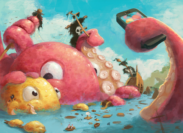
              Thanks for everyone's suggestions . I was tied between going with 4 or 5, but I felt that 5 wasn't super original (although I may work on it in the future). So I decided to go with 4 and added in a kid octopus to create a father/son bonding moment as they destroy a bunch of pirate ships (I want to add some lifeboats/ life rings at the lower part of the screen among the wreckage to be a bit more kid friendly).

              I have tried to keep the perspective and proportions relatively realistic although I feel the arm with the camera would in fact be really big as it is, but I want it to be the foreground object to help frame the piece and add a bit of depth to it.

              If anyone has any advice on things I should add, delete or adjust it would be appreciated 😃

              0_1518748322049_octopus 2.jpg

              stringfellowart 1 Reply Last reply Reply Quote 5
              • stringfellowart
                stringfellowart SVS OG @Gary Wilkinson last edited by

                @gary-wilkinson I think my only suggestion would be to make the phone slimmer. Because most smart phones these days are pretty slime, so right now it doesn't immediately read phone, the thickness made me thing of a beard trimmer (of all random things).

                Bringing whimsical creatures to life.
                www.stringfellowart.com
                www.instagram/stringfellowart

                Gary Wilkinson 1 Reply Last reply Reply Quote 1
                • Gary Wilkinson
                  Gary Wilkinson @stringfellowart last edited by

                  @stringfellowart I'm guessing you meant to say slim instead of slime 😃 but you are exactly right, maybe I should add on a back camera as well and round the corners a touch. I'm also hoping to try to give it an nautical logo vibe, although keeping it similar to the apple logo. Perhaps a fish with a bite out of it...

                  stringfellowart 1 Reply Last reply Reply Quote 0
                  • stringfellowart
                    stringfellowart SVS OG @Gary Wilkinson last edited by

                    @gary-wilkinson Um.... no.... slimey phone would work better with an octopus....
                    Ya, no, you got me. 🙂 Though now that I think about it, he needs a waterproof case 😛

                    Bringing whimsical creatures to life.
                    www.stringfellowart.com
                    www.instagram/stringfellowart

                    1 Reply Last reply Reply Quote 1
                    • Gary Wilkinson
                      Gary Wilkinson last edited by

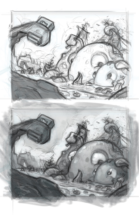
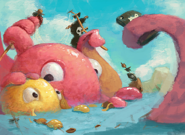
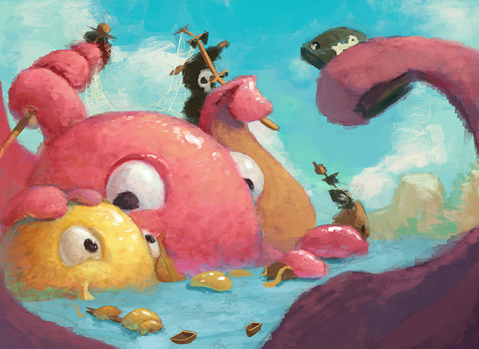
                      Got a little time to work on some of my painting still have a wayyyy to go, but I would appreciate your thoughts on how it's looking so far. I'm trying out some new painting styles to try and be a bit more painterly so although it's a struggle I feel like i'm learning a lot. I still need to give the octopuses a much more wet feel and add all the pirates and broken pirate ships along with a lot of other issues, but one thing i'm unsure of yet is what to do with the foreground tentacle that is holding the phone. The 2nd image was my original design, but I think that the 1st image may help the image flow better and draw your eye more to the octopuses once the shadow on the sea has been refined more.I just felt that the perspective of the foreground tentacle was off and as I wanted it to be in shadow (to make it less pronounced) it made no sense due to the position of the sun.

                      I think If I do the 1st image style then I will probably add a lot of debris and small pieces to the lower left corner to help frame it a bit better and I can also add props under the shadow to point more towards the octopuses. Hope I can find time again to finish it off 😕

                      1_1519179546607_octopus line3b.jpg

                      0_1519179546607_octopus line3.jpg

                      aska stringfellowart 2 Replies Last reply Reply Quote 11
                      • Jon Anderson
                        Jon Anderson SVS OG last edited by

                        This is a great image @Gary-Wilkinson! For what it's worth the first image "feels" better. I think the things you pointed out about the foreground arm are a little distracting and come across as a part of land instead of part of an octopus. Either way I'm looking forward to seeing this one finished!

                        instagram.com/jonandersonillu

                        1 Reply Last reply Reply Quote 1
                        • aska
                          aska @Gary Wilkinson last edited by

                          @gary-wilkinson clear and fun story! such a cool idea 🙂

                          Aska
                          www.mugaska.com
                          https://www.instagram.com/mugaska/
                          https://www.etsy.com/uk/shop/mugaska

                          1 Reply Last reply Reply Quote 1
                          • rcartwright
                            rcartwright last edited by

                            Nice colors, The tentacles look chunky they seem to lack the elegance and rhythm that real ones have

                            https://www.scbwi.org/members/richard-cartwright/
                            https://www.instagram.com/richardwcartwright/
                            https://www.pinterest.ca/richcartwright3/art-of-richard-cartwright/
                            https://www.richardwcartwright.ca/

                            1 Reply Last reply Reply Quote 1
                            • evilrobot
                              evilrobot SVS OG last edited by evilrobot

                              This is looking really fantastic. 2nd one is working much better frames everything in nice. You just need some more boat debris and maybe a few survivors floating around. Right now my eye is drawn straight to that empty spot in the middle like something important is suppose to be there.

                              http://www.palacioillustration.com/

                              https://www.scbwi.org/illustrator-gallery/illustrator-detail/?illustrator_id=84142

                              https://www.pinterest.com/evilrobot2/pins/

                              https://twitter.com/MyEvilRobot

                              1 Reply Last reply Reply Quote 1
                              • stringfellowart
                                stringfellowart SVS OG @Gary Wilkinson last edited by

                                @gary-wilkinson I do like the first image better. And I like the text you have on the octopi faces. You could always have water dripping down from the foreground tentacle since its closest to us.

                                Bringing whimsical creatures to life.
                                www.stringfellowart.com
                                www.instagram/stringfellowart

                                1 Reply Last reply Reply Quote 1
                                • bnewman
                                  bnewman last edited by

                                  @Gary-Wilkinson This is looking really good. I love the colors and the shapes. I prefer the first image as it feels more believable -- in the second it feels as though the arms are too far away -- although the second does a better job of framing. The only thing at this stage that niggles is the eyes, the outside eyes feel too bulbous, like they stick out too far from the face compared to the inside eyes.

                                  1 Reply Last reply Reply Quote 1
                                  • Gary Wilkinson
                                    Gary Wilkinson last edited by

                                    @Jon-Anderson thanks for the input Jon. I agree about the arm, I was actually considering changing it to part of the coast rather than the tentacle.

                                    @aska thanks Aska, hoping to make it something good to look at, but also tell a good story.

                                    @rcartwright I agree with the tentacles, I hope the final piece will push them to be a bit more interesting and varied.

                                    @evilrobot The 2nd one does frame it better, but I think it also creates a distraction, so I'm going to find a better better way to frame it. There will be many an escaping pirate in that empty space, don't worry 😛

                                    @stringfellowart I was wondering where I put text on the face, but i'm guessing you were meaning texture, right? 😃 Water dripping off the front tentacle sounds like a great idea, thanks
                                    @bnewman glad that the first image is the one that getting the vote as that was the one I decided to change it to 🙂 You're right about the eyes, I think they need some trimming!

                                    stringfellowart 1 Reply Last reply Reply Quote 3
                                    • Gary Wilkinson
                                      Gary Wilkinson last edited by

                                      This post is deleted!
                                      1 Reply Last reply Reply Quote 0
                                      • stringfellowart
                                        stringfellowart SVS OG @Gary Wilkinson last edited by

                                        @gary-wilkinson Sigh. Again, I blame auto correct, and general lack of sleep from small children. 😛

                                        Bringing whimsical creatures to life.
                                        www.stringfellowart.com
                                        www.instagram/stringfellowart

                                        1 Reply Last reply Reply Quote 2
                                        • Gary Wilkinson
                                          Gary Wilkinson last edited by

                                          More work to do on the sea area and background, as well as a load of other things, but it's slowly coming along

                                          0_1519393501242_4.jpg

                                          1 Reply Last reply Reply Quote 3
                                          • First post
                                            Last post