Color advice
-
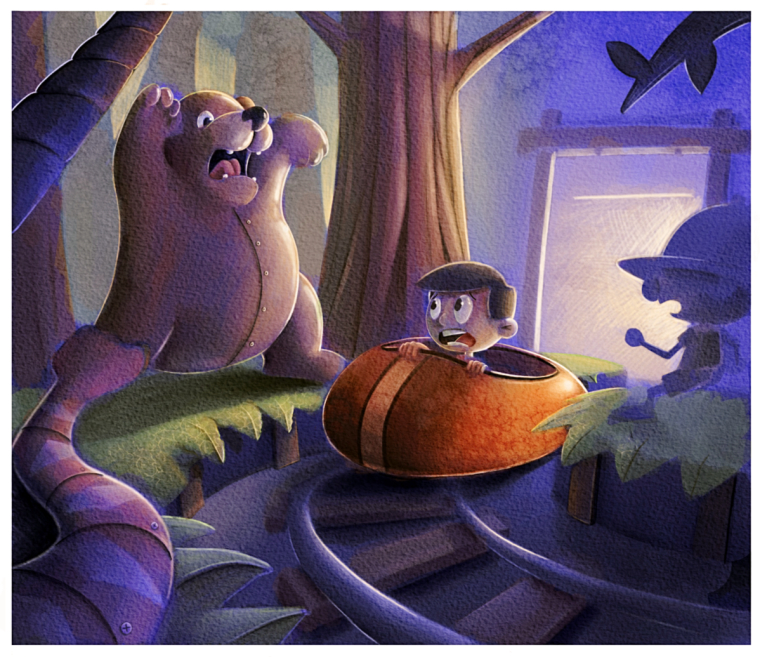
This is something I am working on at the moment. I am still relatively wack at color, but I get by for the time being. When sharing my work with my artist brother, he thought that the orange and green weren’t working that well together. Idk I think it looks fine, but I am open to suggestion or critiques.
-
@eric-castleman I think the orange , because it complements all of the blue helps to bring focus on the boy. The green doesn't bother me but I wonder if there were a little more blue in the green if that would look good. Everything else has a bluish tint to it and I do see some blue in the green also so....I'm probably not the best person to ask but, that's my thoughts. Actually I think it looks great as is also. You're an artist, Eric!
-
I like the orange it works with the cool blue tones. FYI the object on the left front corner is creating a nasty tangent with the bear mostly due to value and color being very close as they near each other
-
The orange might be just a bit harsh. It doesn't look too bad to me though. You might try just adding a layer over everything (Normal Layer) fill it with a blue or purple, then lower the opacity of that layer down to maybe 6%-15% what ever looks good and it will tie all the colors together pretty well.
-
@eric-castleman orange, purple and green are triadic colors. i see a lot of blue-purple so your other two colors should be more of a red-orange and yellow-green. the yellow-green seems to be there even though it is subtle and not bright. i like the image... maybe added a touch of green to the fish over the door to break up all that blue and create a triangle of green. see if you artist brother likes it then. nice work though...
-
It's a charming illustration, Eric! It's looking good and I enjoy your use of color and texture (especially on the cart). I think the orange is a pleasant contrast to the surroundings. As Marsha mentioned, if you want to make some adjustments here the green can be brought to the cooler side. I don't think it is an issue personally, but it would further tie it in as a color with the rest of the background and not be as close on the color wheel to the cart. I love the hard lined light hitting your characters, really gives a clean look to them and lightens the mood a little too. Great job Eric!
-
I like the colors you have but I would probably cool down the from end of the car and warm the things hit by the rear light a bit more. You could also do with pushing the dark values to add depth and atmosphere to the painting
Also, not so much about the color, but your snake is merging into the bear's leg. I would try to move one or the other to create a distinction and add depth
-
I really like this! Colors work well together, but the orange of the car is not behaving quite the same as the other objects are to that strong light source behind it. I agree the front of the car is probably the issue. It is too bright. The biggest problem, though, is that snake. Looks like he's eating the bear and the bear is reacting to that instead of scaring the boy. Might be better if the snake's head crossed a part of the track rail? Something to make it appear more threatening and add depth.
-
@jittles Amazing!!! This is pretty much done for me. The colors work harmoniously. If you still want to improve it though, I guess you can increase the vibrancy of the boy and the cart/ride(I don't know what it's called). This is very optional though and is only my opinion. You can definitely leave this one alone. Like I said, It's pretty much done. Great work!
-
@eric-castleman I was just looking at this again. It really looks so good, Eric. Did yuo do anythign new to it or am I just seeing it wiht new eyes. I mean, I thought it looked really great before but somehow the colors seem richer and more balanced than I remembered.
Marsha Ottum Owen
-
@marsha-kay-ottum-owen thanks!! are you referring to the image I posted on social media, or this one in the forums?
-
On the forums.