Help with Value and Color
-
Good morning!
My name is Nick. I've had a Forums account before but have recently had to create a new one with the new site.
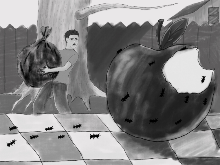
Currently I'm mostly focusing my illustration work on improving on composition and color/value. The illustration I have below is a personal illustration created for an alliteration: "Adam accidentally allowed ants atop his aging apple after Allie asked for assistance."
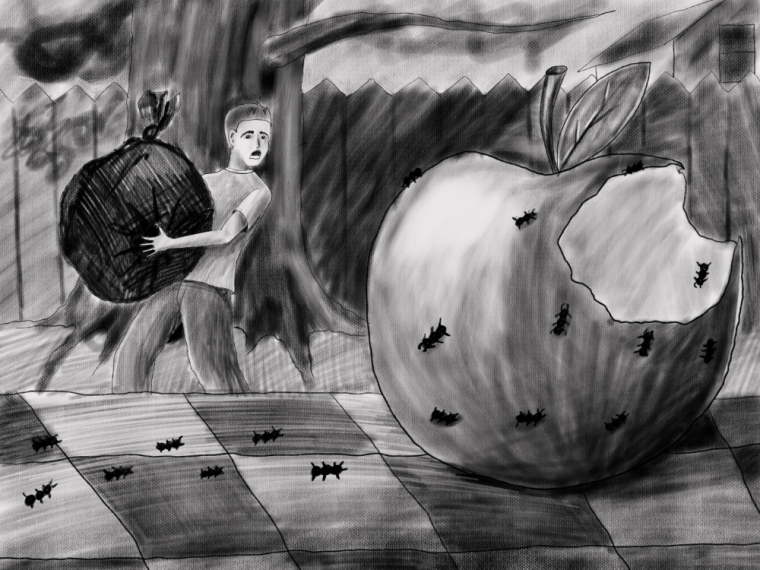
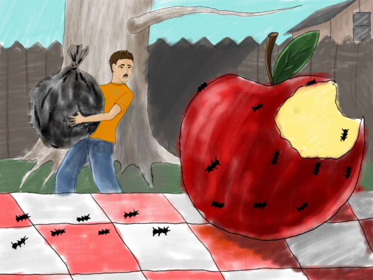
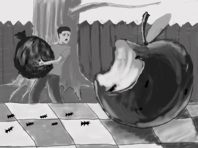
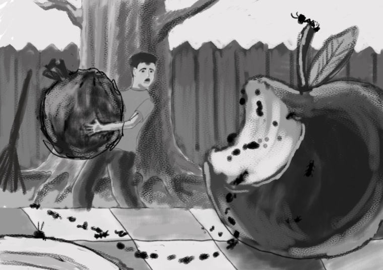
Coloring and Value have been a big struggle for me since I've started illustrating and on this piece I feel it has too much of a "King of the Hill" style to it. The three images below are the quick color study, that color study turned black and white, and then a new value study created in black and white. I'm having trouble understanding where to have the biggest areas of contrast and deciding if things that seem bright, (like grass, the sky, and white skin) really need to be bright when you need areas of high contrast.
In this illustration I'm struggling with areas around the kid's pants, the left part of the apple in front of the fence, and even the tree because most tree can look light, but I really needs to be darker for the kid to stand out. (maybe I shouldn't have put the tree behind in the first place)
Please offer your feedback and critique! It's very welcomed.
-
Hey I did a quick paint over that might help you. I brought your character forward and changed the colour of the table cloth, then added some conifers instead of the big tree. Makes the apple look good. Just ideas though.
")
-
I like the color change on the table cloth! I think that makes the apple pop more. and the conifers fit better than the one tree i think. Thanks for those!
I think the crop brings the scene inward a little too much, though. I was trying to communicate a definite foreground and background in the image.
-
Nick, I like Jason's solution a lot! Here is just another way that I look at it. In my opinion your whole composition leans a bit to the right and sort of stays there. That may or may not have been what you were going for, however.
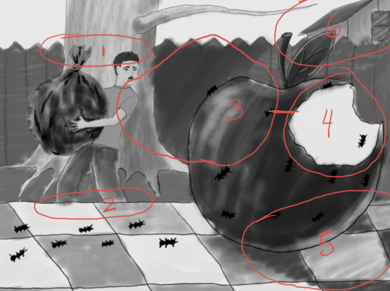
I circled some of the areas that I think might be issues.
- Boy's head, top of bag and fence line are more, or less, at same height.
- Cutting his legs off where you have initially made me wonder if this is a picnic table or blanket on the ground.
- You have a dark value against a dark value.
- Your brightest area of interest is all the way over to right.
- Cast shadow on the table indicates direction of sunlight, but little else in the picture indicates the same light source.
If the bite is on the right side of the apple away from the sunlight it would not be as bright as you have it and there would
be highlights on the apple where the light source is hitting it which would pop it out from the fence value. The fence would not likely be as dark as you have it. There would be reflected light coming up off the grass and the side of the tree facing the sun. So determine where your light source is in the sky and everything else should fall into place. - The point of the apple's leaf follows the roofline of the house right up and out of the picture. The lonely branch does the same. I don't think the house is helping the scene at all. I would just lose it.
Here is a draw over suggestion. I think the boys head should probably come up over the line of the fence even though I didn't do that here.
I flopped the side that has the bite to center that area of interest and contrast it against the fence and removed the house. Also leaned the bag in the other direction. My only question now is that a bag of trash or leaves. Not clear from the picture. If it's leaves then let's stick a rake in there somewhere. If it is a trash bag then forget about the rake.
Maybe tighten up the composition so we cut off the right side of the apple and even add a bit of fence to the left. We probably want the boy to have more importance than the apple. Put some sunlight on the grass which except close to the fence.
Remember also that ants travel in a line. That can be a compositional element. Show one of the ants pulling himself up onto the table to convey that this is a table and not a blanket on the ground. Maybe put something else on the table to break up that checkerboard pattern and make it clear that it's a table and add some interest to the lower left. Could be an ant there that has broken off from the rest to explore the plate.
So those are just some quick thoughts. Take them for what they are worth. You have an excellent start here. I have not changed any of that and the way I would approach it is not necessarily the way you would. It's just revise, revise, revise until you get what you want. We all do the same thing. Jason had a great solution, as well! This should help you to maybe look at your own work with another pair of ideas and come up with an even better solution! Nice job.
-
@jittles Thanks for the thoughts and sketches! I'll look at them closely over the next couple of days and see what happens!