Asking for Critique | Illustration
-
Hello, SVS and community! I would appreciate any and all critique on this. Anything from composition to suggestions on color are welcome! (It was created in Procreate.) Also, I'm including beneath the image a little story that may go with the illustration.
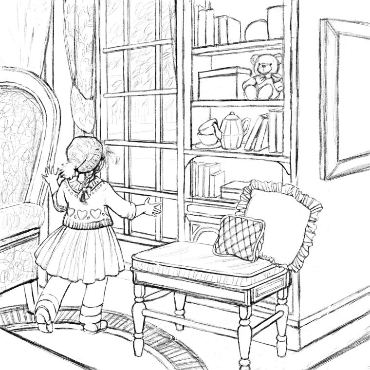
"Rays of sunshine spilled like shattered crystals as Katy entered the sitting room. Morning doves creamed the stillness with the comforting warmth of song. The light tap, tapping of branches agains the window panes threaded into the morning sounds of breakfast happening just downstairs.
Katy loved the sunshine. In fact, she enjoyed almost anything and everything about life that was truly beautiful. She moved forward noiselessly and pressed her hands against the shining window.
Dozens of pedestrians passed the still figure, oblivious of her presence but yards above. Several children dashed down the street chasing after a dog, their squeals softening through the barrier of glass.
Birds began a morning chorus of song, while a street musician made happy, playful tunes on his pipe organ.
The world had so much beauty to Katy. Everyday she hoped to breathe a little more in.
It really didn't matter that she couldn't see."
-
Whoa, the composition is beautiful! Without reading the story below the sketch, the art works quite well! One nit pick would be the diagonal line at the bottom left behind the girl. Is this line representing extra furniture in the foreground? If so it might be a little too close to the other furniture.
After reading the text (also very beautiful!) it feels like the window is more important, and thus it might be beneficial to have a larger window to show more activity going on outside? Or shift the camera over to the left to show more of the room she is in and a little less of the wall on the right?
Either way, gorgeous work!www.gdbee.art
-
Wow, nice...
In case it's helpful, when I first looked at the image, the girl looked like she was small for the environment since her posture and figure seem to imply that she's older than a young toddler. After I stared at it for a while, I realized that it was because my eyes were changing what I believe you intend to be the arm of the chair into the cushion of a couch facing the girl. When my eye read it as a couch, then her elbow only coming up to the cushion made her look too small. I think dilineating the shape of the back of the chair a little more to show for sure what the piece of furniture is might help.
") I think this is a beautiful piece and story.
I think this is a beautiful piece and story. -
Really lovely drawing, Melissa!
I think I would try having her already standing up at the window with her hands and left cheek against the glass (so we can see her expression) soaking up the moment. If she is blind (?) then showing her with her cheek against the glass ignoring the interesting scene outside would help communicate that. Currently her figure is communicating that she is a child who can see and wants to look out the window.
It's possible the right side of the image is taking away from what you are trying to convey. Or might just be her pose. I would at least try maybe cutting if off at the pillows.
I'm excited to see where you go with this, though.
-
@gdbee Thank-you so much for your thoughts and encouragement!!
I might change the the bottom left area and experiment with shifting the camera over to the left! Thanks again!! -
@kathrynadebayo Thanks so much for sharing, Kathryn!! I'm glad you mentioned how the chair came across to you and how it looked like a couch. I'll work on delineating the shape of the back of the chair a little more! And thanks so much for the encouragement too!!
-
@jittles Thank you very much for your thoughts and encouragement!! I'm going to try placing her up at the window. I'm also going to try changing the placement of the "camera"! Thanks again so much!!