Cover design
-
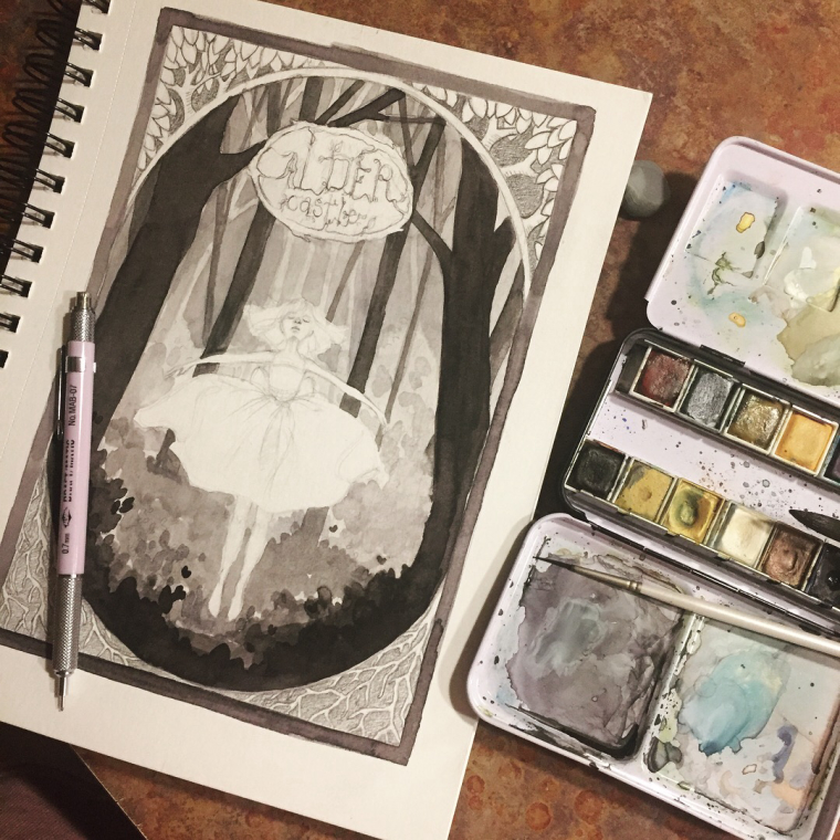
I posted this in my Instagram and asked for feedback there - I realized I should ask here though because you all are studying this stuff too. Sometimes I forget that I have community outside of Instagram. Anyway, I’m doing this just as a personal challenge. I want to create something interesting with strong contrast and focal point and I’m loving the lack of color, but everyone is saying I should add some. I’m very drawn to the style of Arthur Rackham and I love how a lot of his work is black and white. I’m not opposed to adding color, but I’m thinking muted and in very selective places if at all.... what do you guys think? Wanted to ask before I finished it. I wish I could have done the book cover class too! It looks like so much fun! Maybe next time.

-
@pamela-fraley arrgh! Tough choice! I also have a penchant for black and white/greyscale images, and it looks lovely as it is. I agree, though, that some spare/muted color would look amazing here!
-
Nothing goes wrong with black and white color, this cover is really simple yet so beautiful. I love every detail of it.
-
@itsjoyce @Eli Thank you! At least a couple people like the black and white.
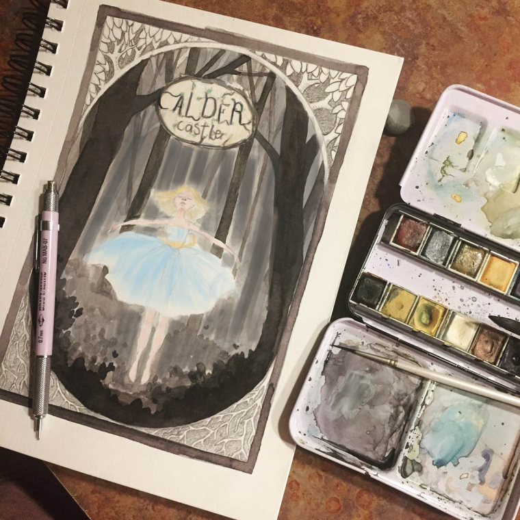
 I feel like it works better since I mixed my own "black" it looks a bit richer I think, but I've been playing around with it in my procreate app and I might add some muted colors. I might actually redo the whole piece as there are a few other elements I'm thinking about sneaking in. I like where it's going and this may become a portfolio piece.
 -
Beautiful work! I would be tempted to add some pale color to the figure and the title text of the book and maybe/possibly to the corner details as well, but this is where color study comparisons can be extremely helpful!
-
@pamela-fraley I think if you picked one color and just did it muted on the dress it would really pop off the page.
-
This is just some beautiful work.
-

If you want to know what it looks like coloured I did a quick paint over... Personally I would darken the background to push your character forward. I added some dark to the lettering too. It still has a nice soft look. Just an idea.

-
@evilrobot Thank you!
-
@bnewman @Chip-Valecek Thanks for the input! I think I'm going to do a couple little thumbnail color studies and see what I like. @Jason-Bowen Thank you! That looks really cool. I have a tendency to lose the focal point a bit when I start coloring. I like the idea of coloring her and darkening the background. I did a little painting on it in procreate and I think I put a dark green in the corners and blue on her bow. I'll post y ideas when I have a few.
-
@pamela-fraley sounds good

-
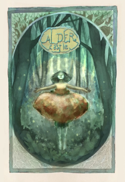
@pamela-fraley I love this piece! I am in a similar place with my work i think - mostly working in black and white and knowing i want to work in color more - i hope you don't mind my trying to color your drawing! My goal was a muted complimentary color scheme - just a quick thumbnail in Procreate with the Water Brush.... i don't think i really pulled it off ..too saturated?? ...(but i do think that fireflies would look very good in the image) I look forward to seeing where you go with this


-
@kevin-longueil I love that! I was actually hoping people would want to color it. And I was going to try to add in some glowy white flecks to push the magic a bit. I love the idea of fireflies.