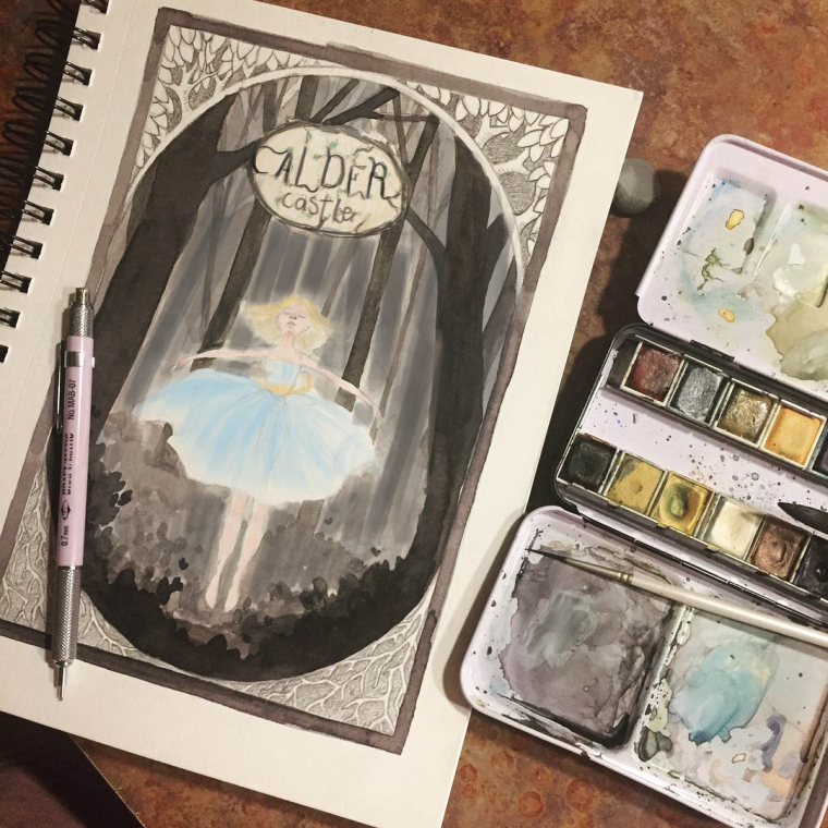
Society of Visual Storytelling

    SVSLearn Forums

    • Register
    • Login
    • Search
    • Recent
    • Tags
    • Popular
    • Users
    • Groups
    • Search

    Cover design

    General Discussion
    8
    13
    1587
    Loading More Posts
    • Oldest to Newest
    • Newest to Oldest
    • Most Votes
    Reply
    • Reply as topic
    Log in to reply
    This topic has been deleted. Only users with topic management privileges can see it.
    • I
      itsjoyce last edited by

      Nothing goes wrong with black and white color, this cover is really simple yet so beautiful. I love every detail of it.

      Pamela Fraley 1 Reply Last reply Reply Quote 1
      • Pamela Fraley
        Pamela Fraley SVS OG @itsjoyce last edited by

        @itsjoyce @Eli Thank you! At least a couple people like the black and white. 🙂 I feel like it works better since I mixed my own "black" it looks a bit richer I think, but I've been playing around with it in my procreate app and I might add some muted colors. I might actually redo the whole piece as there are a few other elements I'm thinking about sneaking in. I like where it's going and this may become a portfolio piece.

        instagram.com/fraleycreates

        1 Reply Last reply Reply Quote 1
        • bnewman
          bnewman last edited by

          Beautiful work! I would be tempted to add some pale color to the figure and the title text of the book and maybe/possibly to the corner details as well, but this is where color study comparisons can be extremely helpful!

          Pamela Fraley 1 Reply Last reply Reply Quote 1
          • Chip Valecek
            Chip Valecek SVS Team SVS OG @Pamela Fraley last edited by

            @pamela-fraley I think if you picked one color and just did it muted on the dress it would really pop off the page.


            https://www.instagram.com/chipvalecek/
            https://www.facebook.com/cvalecek
            http://www.cshellmedia.com/

            1 Reply Last reply Reply Quote 1
            • evilrobot
              evilrobot SVS OG last edited by

              This is just some beautiful work.

              http://www.palacioillustration.com/

              https://www.scbwi.org/illustrator-gallery/illustrator-detail/?illustrator_id=84142

              https://www.pinterest.com/evilrobot2/pins/

              https://twitter.com/MyEvilRobot

              Pamela Fraley 1 Reply Last reply Reply Quote 1
              • Jason Bowen
                Jason Bowen SVS OG last edited by

                0_1520269451834_paint over.jpg

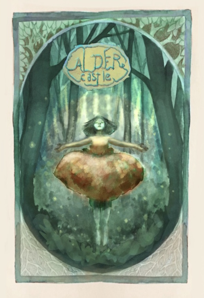
                If you want to know what it looks like coloured I did a quick paint over... Personally I would darken the background to push your character forward. I added some dark to the lettering too. It still has a nice soft look. Just an idea. 🙂

                https://www.instagram.com/jasonbowenoils/

                1 Reply Last reply Reply Quote 1
                • Pamela Fraley
                  Pamela Fraley SVS OG @evilrobot last edited by

                  @evilrobot Thank you!

                  instagram.com/fraleycreates

                  1 Reply Last reply Reply Quote 0
                  • Pamela Fraley
                    Pamela Fraley SVS OG @bnewman last edited by

                    @bnewman @Chip-Valecek Thanks for the input! I think I'm going to do a couple little thumbnail color studies and see what I like. @Jason-Bowen Thank you! That looks really cool. I have a tendency to lose the focal point a bit when I start coloring. I like the idea of coloring her and darkening the background. I did a little painting on it in procreate and I think I put a dark green in the corners and blue on her bow. I'll post y ideas when I have a few.

                    instagram.com/fraleycreates

                    Jason Bowen 1 Reply Last reply Reply Quote 1
                    • Jason Bowen
                      Jason Bowen SVS OG @Pamela Fraley last edited by

                      @pamela-fraley sounds good 🙂

                      https://www.instagram.com/jasonbowenoils/

                      1 Reply Last reply Reply Quote 0
                      • Kevin Longueil
                        Kevin Longueil SVS OG @Pamela Fraley last edited by Kevin Longueil

                        @pamela-fraley I love this piece! I am in a similar place with my work i think - mostly working in black and white and knowing i want to work in color more - i hope you don't mind my trying to color your drawing! My goal was a muted complimentary color scheme - just a quick thumbnail in Procreate with the Water Brush.... i don't think i really pulled it off ..too saturated?? ...(but i do think that fireflies would look very good in the image) I look forward to seeing where you go with this 🙂

                        0_1520366953414_Untitled_Artwork-39.jpg

                        Portfolio: kevinlongueil.com
                        https://www.instagram.com/kevinlongueil/

                        Pamela Fraley 1 Reply Last reply Reply Quote 4
                        • Pamela Fraley
                          Pamela Fraley SVS OG @Kevin Longueil last edited by

                          @kevin-longueil I love that! I was actually hoping people would want to color it. And I was going to try to add in some glowy white flecks to push the magic a bit. I love the idea of fireflies.

                          instagram.com/fraleycreates

                          1 Reply Last reply Reply Quote 1
                          • First post
                            Last post