Help with background
-
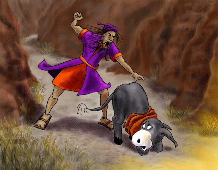
I’ve been working on a Children’s book on the biblical story of Balaam’s Donkey for my niece and when I started (pre-SVS) I was outlining everything in ink. I wish I could change that now because it’s too heavy and uniform but I don’t want to change style mid-book. The problem I’m having is with the background — outlining that in ink too looks stupid but I can’t get the edges to not look blurry in contrast to the characters. Any suggestions? (I may try adding some cross hatching to the canyon rocks to see if that helps.)
-
What about doing the lines in a different color? Like brown, not as dark as the blacks, it will not stand out as much as the foreground ink.
-
I think @stringfellowart makes a really great suggestion. Check out Beatrix Potter's Peter Rabbit illustrations for a good example of how to do this. She uses black linework on her focal points and then progressively fades the color and value of her linework as she moves away from her focal points- even with foreground elements in some cases.
I would also suggest simplifying the rock texture and colors. Your main characters are very simplified in terms of texture and color, but it feels like you've spent a lot more attention to the rocks. I would maybe tone down the warm just a bit, or have less contrast between the warmer and cooler tones of the rocks.
-
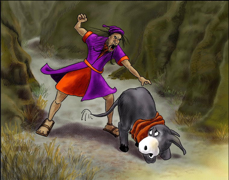
I tried adding some color line work to the background but also did a quick change of hue and saturation to those layers as well to make it all more neutral. It certainly helps the characters stand out more. I’ll need to tone down some of the crosshatching in the back if I go with this palette. What do you think? (By the way, the yellow in the bottom right is from an angel who confronted them in the last scene. I toned it down though because it was too bright against the neutral rocks.)
-
Just that quick color fix made massive improvement in my opinion..Nice job.
-
@djlambson I’ve been working on paying more attention to values in my paintings but now I also have to learn to pay attention the interplay of warm and cool. I’ve heard Will Terry say it enough but hearing it and doing it are clearly two different things!