Looking for critique: If my art were your art, what would you try and improve?
-
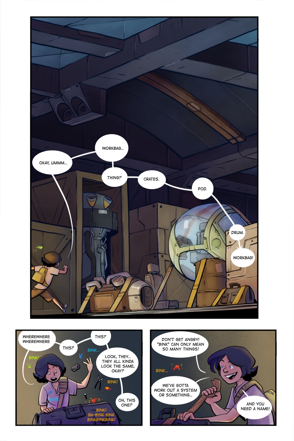
Here's the most recent page from my comic (I use it primarily as a vehicle for practice). If you were interested in kinda taking the art to the next level, what would you try and work on and/or improve?
Thanks in advance!
-
These are absolute awesome examples of mid-grade comic style. So my question would be...where do you want to go? What kind of art do you want to be doing?
There is nothing to “improve” here if what you want to do is children´s comics. This style is perfect for that and is professional level. If you have a manuscript and six sample pages, you can pitch this to editors that work in that area. I´m sure you know these titles: this reminds of “Zita the space girl” and “The little robot” by Ben Hatke and “Space Dumplins” by Craig Thomson as well as all non-fiction mid-grade comics I´ve ever seen -and it´s much better than most of them! -
Oh wow! Thank you for the compliments
")
I guess as to where I want to be going I'm really not sure... I just know I'm not there yet and sometimes people have a tidbit of insight as to what direction I should start steering. I'm kinda looking for advice on where to leap to the next scaffold if you get what I mean.
Thank you, though, for taking a look. I've been thinking about starting to pitch, or finding an agent or something and it's good to know I'm on/approaching that level.
-
@art-of-b Looks very professional to me - really nice work!
-
Thanks, Kevin
-
Really nice work. The only thing I can see on this page is the coloring on the top panel is throwing the story off. It almost looks like the character's hair is a brown hat and the shirt is reading as white to me instead of purple like in the bottom two panels. So to me it's reading as a different character. Besides that I think it looks really good.
-
I thought it was a different character as well... I'm no expert, but to me this has a professional looking presentation and very skilled/well-practiced feeling to it.
-
Thanks for taking a look
I never would have identified the colouring in the first panel as a problem, but you're right! It really looks like the character in the first panel is different than in the bottom two panels. I think I really need to work on how much local colour to keep even in strong directional light.
-
Thanks for takin' a look and for the compliments
Interesting to know that colour is having that much of an effect on character recognition (and that I had no idea at all
) I think it's because I work with the character so often that I can't take a step back if you get what I mean.Lots to think about