Society of Visual Storytelling

    SVSLearn Forums

    • Register
    • Login
    • Search
    • Recent
    • Tags
    • Popular
    • Users
    • Groups
    • Search

    Mixed media experiments

    Artwork
    16
    25
    3076
    Loading More Posts
    • Oldest to Newest
    • Newest to Oldest
    • Most Votes
    Reply
    • Reply as topic
    Log in to reply
    This topic has been deleted. Only users with topic management privileges can see it.
    • smceccarelli
      smceccarelli Pro SVS OG last edited by

      I haven't posted art here in a long long while....and time for personal project in general is getting very rare.
      However, I have this story I would like to illustrate - about a boy's adventures in a world of paper. I have been toying with it for a couple of months, trying to find ways to match the paper elements and the character. This past week I've had some free time and got really experimental - playing with collage, something I've never done once in my life.
      So I'm not sure even if it works....It's so new for me I don't even know if I like it or hate it. Opinions, therefore, very welcome!
      0_1524259436767_TEST_4_SMALL.jpg

      Kevin Longueil Miriam Christine Garner AirenHall K 5 Replies Last reply Reply Quote 18
      • Kevin Longueil
        Kevin Longueil SVS OG @smceccarelli last edited by

        @smceccarelli This looks very good to me - it feels like possibly the folded paper in the air closest to the boy could maybe move to the right? A "steelyard" composition I think it would be called (I am drawn to the left of the page and it is hard to break away from it for me) I really like this style a lot (Oliver Jeffers is one of my favorite artists) - I look forward to seeing more of this!

        Portfolio: kevinlongueil.com
        https://www.instagram.com/kevinlongueil/

        1 Reply Last reply Reply Quote 3
        • Miriam
          Miriam @smceccarelli last edited by

          @smceccarelli
          I love the dimensional look of the folded paper pieces, & the illustration is great as well! I want to see more of this story.

          W-Coats 1 Reply Last reply Reply Quote 2
          • W-Coats
            W-Coats @Miriam last edited by

            @miriam I like it very much. I like the lined paper with a child's writing on them. Will this be animated? i can see the little paper boat rocking the flag fluttering, and the waves rolling. Is this 3D software?

            Will Coats
            http://willcoatsart.com/
            https://www.scbwi.org/members-public/william-coats
            https://www.behance.net/willcoats7c247
            https://www.instagram.com/willcoatsart/

            smceccarelli 1 Reply Last reply Reply Quote 2
            • Margarita Levina
              Margarita Levina last edited by

              This work looks so unusual and interesting! It reminds me of pop-up books with layered paper backgrounds and mooving objects.

              http://www.margaritalevina.com/
              https://www.instagram.com/margaritalevina/

              1 Reply Last reply Reply Quote 2
              • Christine Garner
                Christine Garner @smceccarelli last edited by

                @smceccarelli It looks really great and almost like a frame out of a stop motion film or something. I think you should explore this.

                website: https://thimblefolio.com

                1 Reply Last reply Reply Quote 2
                • AirenHall
                  AirenHall @smceccarelli last edited by

                  @smceccarelli I love this! Definitely keep going on this track and keep sharing!

                  https://www.instagram.com/withoutaladder/

                  https://twitter.com/withoutaladder

                  1 Reply Last reply Reply Quote 1
                  • demotlj
                    demotlj SVS OG last edited by

                    I think it's very cool and it looks like it takes a lot of work!

                    Laurie DeMott
                    instagram.com/demotlj

                    1 Reply Last reply Reply Quote 1
                    • Eli
                      Eli last edited by

                      I love this--it looks amazing. I am a big fan of collage and this is awesome

                      1 Reply Last reply Reply Quote 1
                      • lidia-ull
                        lidia-ull last edited by

                        @smceccarelli Definitely continue on with this! Love looking at all the dimensions, textures, marks, etc.

                        1 Reply Last reply Reply Quote 1
                        • K
                          Kat SVS OG @smceccarelli last edited by

                          @smceccarelli this is really cool! I love the layers, it's such an interesting image to look at. Keep going with the project, it will be great t see more.

                          1 Reply Last reply Reply Quote 1
                          • ?
                            A Former User last edited by

                            Wonderful concept. I think the illustration style is "fresh" and very expressive. I look forward to seeing more!

                            1 Reply Last reply Reply Quote 1
                            • smceccarelli
                              smceccarelli Pro SVS OG @W-Coats last edited by

                              @w-coats Thank you! Animation is a good idea (and would be fairly easy to do on this one) but I'm just experimenting at the moment. No 3D software - just plain paper folding. I've actually looked into doing origami with 3D software but it's about 100 times more work than doing it by hand in the real world...

                              1 Reply Last reply Reply Quote 1
                              • smceccarelli
                                smceccarelli Pro SVS OG last edited by

                                Thank you all for the encouragement!! I didn't expect such a positive reaction - it feels so weird to work this way. But I'll keep experimenting and seeing what suits best to the story. I've tried fully painted versions and maybe there is more to be done there, but for the moment I'll dig a bit deeper into this approach.
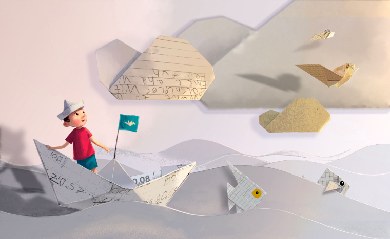
                                Another source of feedback told me that the boy it's too stylized and doesn't fit with the realistic paper shapes - and I think they're right. So either the boy can get more realistic or the paper shapes more stylized (and not done with collage anymore, obviously).
                                Here is a version with a more realistic boy. Curious which one you like best...

                                0_1524552712938_TEST_4b_SMALL.jpg

                                W-Coats Miriam Gary Wilkinson LauraA 4 Replies Last reply Reply Quote 6
                                • DOTTYP
                                  DOTTYP last edited by

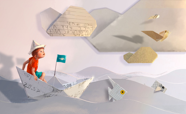
                                  I love this idea I actually prefer the first boy,but both are good.It is a original and interesting idea.

                                  scribbles.artstation.com
                                  www.instagram.com/dottypaints

                                  1 Reply Last reply Reply Quote 1
                                  • demotlj
                                    demotlj SVS OG last edited by

                                    I like the second, but it may be as much the expression on his face as it is style. In the first one, I was looking more at the paper cut outs but in the second, my eye was drawn immediately to the boy.

                                    Laurie DeMott
                                    instagram.com/demotlj

                                    1 Reply Last reply Reply Quote 3
                                    • W-Coats
                                      W-Coats @smceccarelli last edited by

                                      @smceccarelli fabulous! fabulous! Simona to my eye this one is much better, his expression makes me think of wonder. so I'm more drawn into the story (which is after all the point). Excellent!
                                      If you wanted to animate you could use a 2D software because this scene is essentially flat. I would use Adobe After Effects, but I think there are other options.

                                      Will Coats
                                      http://willcoatsart.com/
                                      https://www.scbwi.org/members-public/william-coats
                                      https://www.behance.net/willcoats7c247
                                      https://www.instagram.com/willcoatsart/

                                      1 Reply Last reply Reply Quote 1
                                      • Miriam
                                        Miriam @smceccarelli last edited by Miriam

                                        @smceccarelli
                                        Both look great! I think it depends on the feel of the story. The first one would go well with light, fun, silly, & playful stories and the second one might be better for more serious, deeper, heart felt, &/or mysterious types of stories. The both have a sense of wonder, curiosity, creativity, and imagination.

                                        In the first one, I think the simplicity of the drawing and the flatter look of the character pair well with the basic shapes of the origami and the common quality and flatness of paper. I like the contrast of the realistic paper with the stylized character.

                                        The pose and rendering on the second drawing give it a beautiful, 3D look. It has a nice contrast as well with the soft, round shapes of the boy against the sharp, flat lines of the paper.

                                        I think the second boy does stand out more than the first boy, but adding a little sharpness / crispness to the lines on the first boy might pull more attention to him. Maybe you could try defining the edges of his face and arm a little more where they are blending into the background. You could also try softening the cloud with the writing on it, to drop it back a little.

                                        Just something to think about in comparison with the story: The boy in the second version looks younger with a rounder face. To me, he looks like he probably couldn't have folded the origami on his own. The boy in the first illustration looks old enough to have made them.

                                        It's great to be able to see you work on this. Thanks for sharing!

                                        1 Reply Last reply Reply Quote 1
                                        • Gary Wilkinson
                                          Gary Wilkinson @smceccarelli last edited by

                                          @smceccarelli I really like the 2nd version as the boy feels like he is interacting with his surrounds a lot more and I think going more realistic with the design fits well. I find the flag in the middle of the boat to be a slight distraction though as it feels as though I focus more on that when looking at the picture than at the boy.

                                          Have you thought about the text on the paper being more relatable to the story as though he has become part of what he has written?

                                          www.garywilkinsonart.com
                                          www.instagram.com/gwillustration/
                                          www.twitter.com/GWillustration

                                          1 Reply Last reply Reply Quote 1
                                          • LauraA
                                            LauraA SVS OG @smceccarelli last edited by LauraA

                                            @smceccarelli I really like the second one! I'm not really analyzing my response so much as reacting, but I think it has to do with the dynamic pose and the boy's expression of wonder. He's looking right at that bird, which gives a great site line and makes the viewer's eye travel across the painting. It doesn't bother me at all that some parts are more realistic while others are flatter. It makes sense because it's all stuff that seems like it's going on in the child's mind. I like the handwriting details a lot, too.

                                            Instagram: https://www.instagram.com/lauraintorino/
                                            http://lauraaldersonart.com/

                                            1 Reply Last reply Reply Quote 1
                                            • First post
                                              Last post