Society of Visual Storytelling

    SVSLearn Forums

    • Register
    • Login
    • Search
    • Recent
    • Tags
    • Popular
    • Users
    • Groups
    • Search

    Dorothy's Gingham - looking for value opinions

    Artwork
    13
    19
    2360
    Loading More Posts
    • Oldest to Newest
    • Newest to Oldest
    • Most Votes
    Reply
    • Reply as topic
    Log in to reply
    This topic has been deleted. Only users with topic management privileges can see it.
    • Kevin Longueil
      Kevin Longueil SVS OG last edited by Kevin Longueil

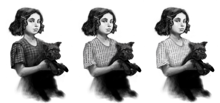
      I've started to work on the gingham dress and it struck me that the value may be way too dark - i did a quick sketch of the dress in lighter values - was hoping for feedback if possible as to which reads best - The feedback i've received so far is to leave it dark...

      thanks! (i did a bit of work on Toto too 🙂

      0_1524693103327_Untitled_Artwork-36.png

      Portfolio: kevinlongueil.com
      https://www.instagram.com/kevinlongueil/

      Johanna Kim 1 Reply Last reply Reply Quote 0
      • demotlj
        demotlj SVS OG last edited by

        I like the second one best because Toto doesn't morph into the dress. Also, if you want to be true to the book, Dorothy was wearing a faded blue and white gingham dress and the darker picture doesn't look faded at all. (The lightest actually looks the most faded but I just like the second better.)

        Laurie DeMott
        instagram.com/demotlj

        1 Reply Last reply Reply Quote 2
        • evilrobot
          evilrobot SVS OG last edited by

          2nd one looks good to me has a nice balance.

          http://www.palacioillustration.com/

          https://www.scbwi.org/illustrator-gallery/illustrator-detail/?illustrator_id=84142

          https://www.pinterest.com/evilrobot2/pins/

          https://twitter.com/MyEvilRobot

          1 Reply Last reply Reply Quote 2
          • DOTTYP
            DOTTYP last edited by

            The second one contrasts better with toto

            scribbles.artstation.com
            www.instagram.com/dottypaints

            1 Reply Last reply Reply Quote 1
            • Eli
              Eli last edited by

              Second one

              1 Reply Last reply Reply Quote 1
              • Gary Wilkinson
                Gary Wilkinson last edited by

                I'll go against the flow a little and say that I like the first one as it draws my attention to Dorothy. However, if it was something between 1 and 2, like a 1.5 then it would stop Toto from merging as demotlj mentioned, but still allow the focus to be her face.

                www.garywilkinsonart.com
                www.instagram.com/gwillustration/
                www.twitter.com/GWillustration

                MOO 1 Reply Last reply Reply Quote 4
                • Chip Valecek
                  Chip Valecek SVS Team SVS OG last edited by

                  Number 2


                  https://www.instagram.com/chipvalecek/
                  https://www.facebook.com/cvalecek
                  http://www.cshellmedia.com/

                  1 Reply Last reply Reply Quote 1
                  • KathrynAdebayo
                    KathrynAdebayo last edited by

                    Thanks for sharing the progress of this piece with us. I've enjoyed it so much! The merging of Toto with Dorothy's shirt is actually what I found particularly intriguing about the earlier version, especially when the highlights on the dog were more minimal. I'd vote for #1, but if for story sake it should be lighter, maybe somewhere between 1 and 2 like Gary suggested?

                    1 Reply Last reply Reply Quote 2
                    • Johanna Kim
                      Johanna Kim SVS OG @Kevin Longueil last edited by

                      @kevin-longueil I prefer #2's values. The dress allows for toto to stand out, but the greatest contrast is still in Dorothy's face/hair.

                      http://www.johannakim.com
                      http://instagram.com/johannahkim/

                      1 Reply Last reply Reply Quote 1
                      • demotlj
                        demotlj SVS OG last edited by

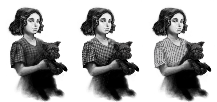
                        I want to change my vote. The more I look at it, the more I find myself vacillating between 1 and 2. 1 is more unified compositionally which I like artistically while 2 is more immediately legible so I think I agree with Gary's 1.5. However, if you wait another week, I'll probably find a reason to vote for #3 🙂

                        Laurie DeMott
                        instagram.com/demotlj

                        1 Reply Last reply Reply Quote 1
                        • Sarah LuAnn
                          Sarah LuAnn SVS OG last edited by

                          Another vote for 1.5.

                          sarahluann.com

                          Kevin Longueil 1 Reply Last reply Reply Quote 1
                          • Kevin Longueil
                            Kevin Longueil SVS OG @Sarah LuAnn last edited by Kevin Longueil

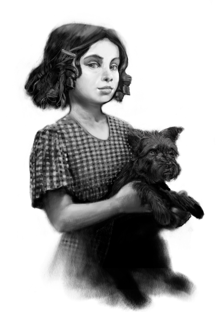
                            Thank you all for sharing your opinions! - i added a 1.5 value as suggested by Gary, Kathryn, Demotlj, and Sarah Luann - I think it is a good compromise between what is good about the darkest one and the slight clarity of the second - i feel like i may be close to finish on this one (i need to tackle her arm and hands next but i don't think that they need too much work)

                            0_1524768327289_Untitled_Artwork 4.png

                            0_1524768417860_Untitled_Artwork 5.png

                            Thanks again! @demotlj @evilrobot @DOTTYP @Eli @Gary-Wilkinson @Chip-Valecek @KathrynAdebayo @Johanna-Kim @Sarah-LuAnn

                            Portfolio: kevinlongueil.com
                            https://www.instagram.com/kevinlongueil/

                            Chip Valecek 1 Reply Last reply Reply Quote 4
                            • Chip Valecek
                              Chip Valecek SVS Team SVS OG @Kevin Longueil last edited by

                              @kevin-longueil I think it looks amazing! That hair on the dog, i just want to pet it.


                              https://www.instagram.com/chipvalecek/
                              https://www.facebook.com/cvalecek
                              http://www.cshellmedia.com/

                              1 Reply Last reply Reply Quote 1
                              • demotlj
                                demotlj SVS OG last edited by

                                The middle one (the 1.5) is very effective and I really like that the best of all of them. Wonderful piece.

                                Laurie DeMott
                                instagram.com/demotlj

                                1 Reply Last reply Reply Quote 1
                                • Eli
                                  Eli last edited by

                                  it looks perfect

                                  1 Reply Last reply Reply Quote 1
                                  • MOO
                                    MOO SVS OG @Gary Wilkinson last edited by

                                    @gary-wilkinson I agree, Gary. I ws thinking the same thing.

                                    Marsha Ottum Owen

                                    1 Reply Last reply Reply Quote 1
                                    • Miriam
                                      Miriam last edited by

                                      I think that #3 looks the most like gingham, but it is a little too light compositionally without lightening the hair & dog. #1 makes me think of a dark green plaid.

                                      I don't know how many changes you want to make, but some other suggestions would be:

                                      • #2 looks like there might be a a ruffle on the sleeve, but that could be more defined by adding a little more to the outside edge. I think a ruffle could look good & would mirror the waves in her hair. (on #3 it looks like maybe a cuff?)
                                      • Toto blending into the dress at Dorothy's waist doesn't make as much sense to me with the lighter dress. Maybe try just lightening it up a bit?

                                      I agree with @Chip-Valecek, the detail on the fur & hair is very realistic!

                                      1 Reply Last reply Reply Quote 1
                                      • Jason Bowen
                                        Jason Bowen SVS OG last edited by

                                        0_1524849367879_test doro.jpg

                                        Hey hope you don't mind the quick paint over... I moved her left eye a little to look at the camera and softened the black line around her neck... might help you out a bit 🙂

                                        https://www.instagram.com/jasonbowenoils/

                                        1 Reply Last reply Reply Quote 1
                                        • MOO
                                          MOO SVS OG last edited by

                                          @kevin-longueil Looks great! Just the right amount of shading and toto looks good too.

                                          Marsha Ottum Owen

                                          1 Reply Last reply Reply Quote 1
                                          • First post
                                            Last post