Postcard to publishers (opinions welcome)
-
I think the choice of illustrations is awesome - just perfect. I’m not sure I understand the „trim and safe line“ concept. Print files have a trim line inside (that would be your green line) and the slug is just the extent of the bleed (the part that will be cut but the image has to be present there too, in case the cut is imprecise). So, on a normal print file, your trim line would be the green one - in which case your website is definitely too low, the image is too big and the tip of the wing would be cut off in an awkward position (near tangent). If this printer follows standard conventions, you have to assume the trim will be at or close to the green line.
-
@smceccarelli Thank you for the feedback! I think the areas that I put the lines made it hard to understand what I was trying to say, plus the fact that I seem to have missed off a line (sorry about that). Here is the template that I downloaded of the website:
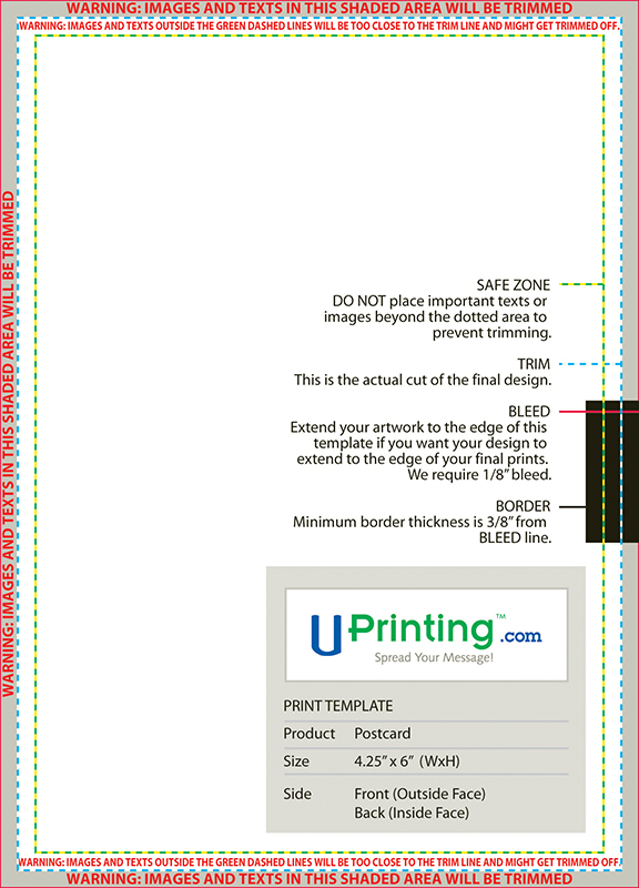
So the area in grey shouldn't have anything in and I guess the area between the green (safe) and blue line (trim) shouldn't have anything important in as it may also get cut, but would having the website just on the edge of it be ok or would I risk some parts being cut off? I wanted the website to be in the middle, between the painting and the bottom of the paper, but should I just move it to between the safe line and bottom of my painting instead meaning that there might be more white space below it than I hoped for and that the tip of the wing may get sliced off?Also, I'm not 100% sure what the border is referring too, is that something I need to worry about?
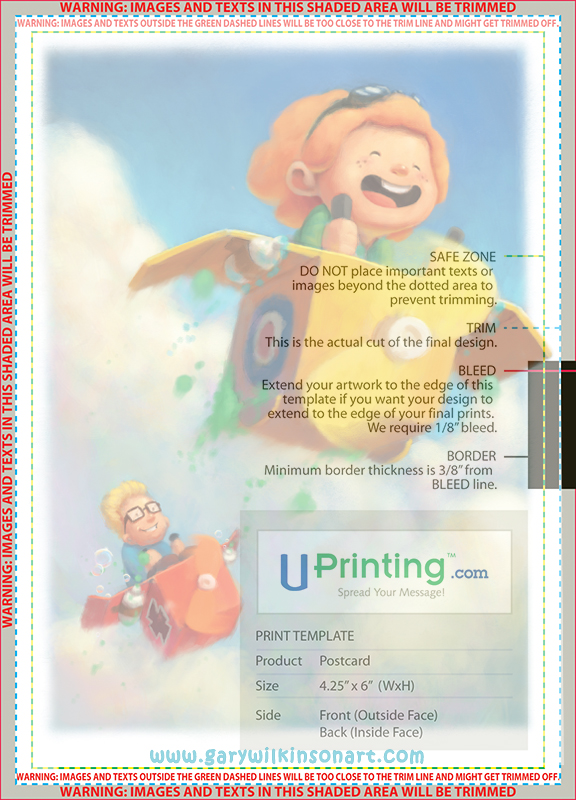
This is my image on top of the template, which I hope shows correctly how it will look .
-
@gary-wilkinson Great image! Just make sure that anything important is within the green line (UPDATE: of the template you uploaded - my reference to green/blue/red is based on the template from uprinting.com you posted)
Inside the green line is the "safe zone", because if it is between the green and blue line, there is the potential that it may get too close to the edge or even cut off due to slight shifts of the paper during the printing or cutting process. (UPDATE: I would probably move the web address up a little, because if the card gets shifted and trimmed, the website, while still showing, will be really close to the new edge. I tend to like to put really important stuff more like 0.25" inside the trim, or at least not right on the 0.125" safety line)
Anything beyond the blue line will be cut off. If you want your clouds/sky to go to the edge of the postcard, you will need to have them go beyond the blue line all the way to the red line (this is the image "bleeding off the edge" to be cut off, because if it doesn't, then there could be slivers of white (or whatever color the paper is) peeking through on the edges if/when the paper shifts. It has to go out at least to that red line to accommodate a 0.125" shift, just like there is the 0.125" area before the safe zone to make sure your important info doesn't get too close to the edge or trimmed off).
When they are saying "border", I believe they are meaning that if you wanted to have a border around the edge of your postcard, you will need it to at least go from the red line and beyond the green line to the place/measurement where that black box stops inside the postcard template.
-
It´s an unusual way to convey the bleed setting, but I think @QuietYell has given you all the information! I would add that being too close to the edges with any element of content gives off a sense of „crowded“ that is not so pleasant. But it may be my saturation with Swiss design speaking here (how they love their „white space“!).
-
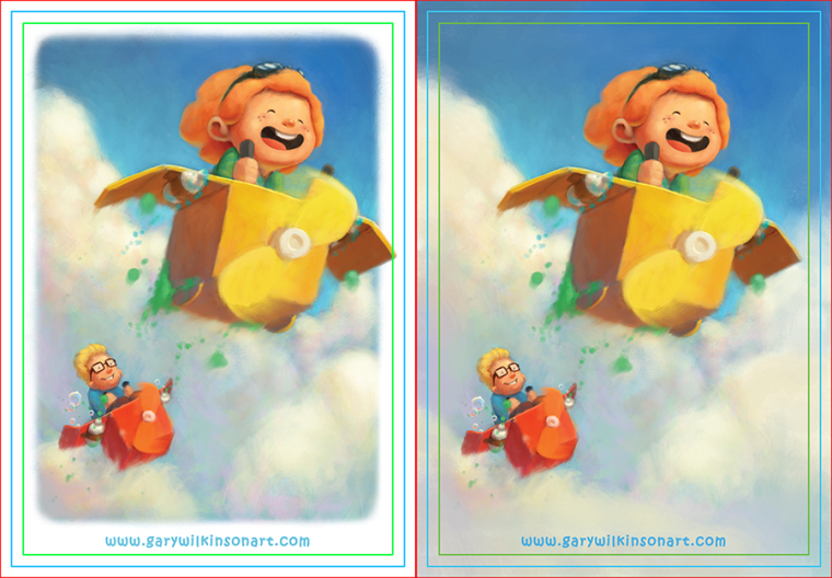
@gary-wilkinson I think the artwork and postcard layouts look great! The back is perfect. The front, I would prefer to see the website superimposed onto the artwork, which would mean extending the clouds down. Here's what I'm imagining (see attached with trim lines shown and without). I extended the sky and clouds all around all the way to the green safe line and let the box corner extend a bit out from the green line, midway between the green and red (trim line). However, I do prefer how your artwork has the box corner extended farther out.
-
I've just noticed that you have war markings on your "planes": the RAF roundel on the front one and the German iron cross on the back one. I don't know about the US, but this is stuff people are very sensitive about in Europe and I'm not sure is a good idea on a children illustration. Just my personal reaction, but maybe something to consider, especially if you plan to send to Europe or UK publishers.
-
@QuietYell Thank you so much for explaining! There is a lot to learn about the printing aspects after a piece has made, but this has been really helpful

@smceccarelli Good point about the war markings! I was unsure whether to add them at first, but I remember that Snoopy had the whole red baron theme too (although come to think of it, aside from the video game I'm not sure they actually showed the markings much...) I think I will remove them to avoid any issues as they don't have a great deal of importance to the painting.
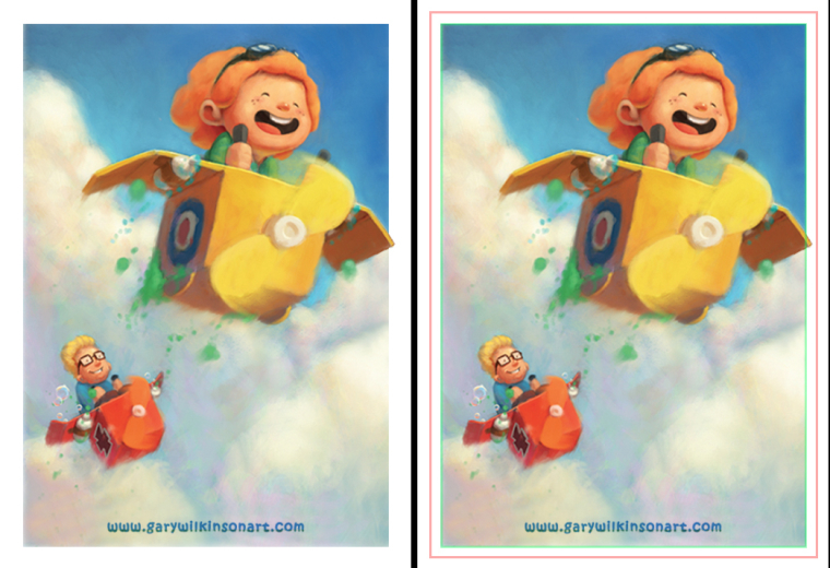
Here is the updated version (I also rounded the corners of the border slightly as I wanted to go with a 1/4inch rounded corner postcard so it might fit in better like that, also I included a version that @Johanna-Kim mentioned. I think if I remove the white borders then I won't have an issue with how the paper is cut etc, but i'm not sure about having the website over the image as I feel that it may distract from the image itself.
I really appreciate all the advice and help. Hopefully with all this new knowledge my 2nd postcard run won't be as stressful

-
@gary-wilkinson Looking now at these two options, I prefer the left one with white behind the website as the website is clearer. If you go with the full bleed version on the right, I'd put a bar of white across the whole bottom area behind the website but keeping the left, right and top as full bleeds.
-
I actually think the second one (full bleed) works very well. The website is quite readable and does not intrude with the image, I feel.
-
@gary-wilkinson Seems like you should move the image a bit left if possible so the wing doesn't get cut off, and I would rather be safe and put your web address a little higher. Love the piece you chose, btw
") Very fun!
Very fun!Marsha Ottum Owen
-
@marsha-kay-ottum-owen Oh! I didn't see the corrected image. Looks great! Ignore my other one
-
The black white illustration is super great, Great texture