Starting on my first children's book, suggestions/critiques appreciated.
-
So a new writer and I got into contact a few weeks ago and she offered me to do the illustrations for her first children's book. We decided on a style I could get into, so as a first we'd start with mechanical pens to show the kid in his hospital room, then slowly move to ink and brush as the story progressed as he starts dreaming.
Now she's happy, but since it's my first time doing this too, I'd love some suggestions or feedback if people have them.


Thanks in advance!
-
Good luck on your first book. It's a big challenge, but really rewarding (currently working on my own at the moment
 )
)I love the idea of changing the media as you progress through the story. I think if you can have the style adjust somewhat with the media change then it would be really interesting.
Just on this piece that you posted, I would be careful of such strong perspective angles and depth unless the story calls for it. The text you makes me feel that the scene should be calm, simple and intentionally boring (in a good way) but you have chose an angle that has too much energy in it. When I look at this I start feeling dizzy due to such a strong perspective convergence, also there is an issue with the sizing of your objects (i'm guessing the boy isn't Tom Thumb).
-
Thanks so much! Honestly there's only going to be two hospital scenes, both of which are rigid and high on perspective, the rest of the story will be a lot softer in tone and taking place in a forest.
So as bored as the kid is, it's supposed to show he's still in a place without any rest.Great pointers and I'll definitely take them to heart. ^^
Quick edit: Now I didn't completely understand your point when it came to the objects, but did you mean the kid was too small in perspective or the toys too big?


(Or both of those issues, possible too)
-
I think the style has a lot of charm and it it interesting to change it as the story progresses. I agree with @Gary-Wilkinson about the composition. Even though you said there are only two hospital scenes, the spread feels like it should be about introducing us to the character yet we don't really see him. This could be a great opportunity to show his personality in his expression and pose.
Without seeing the storyboards or dummy images for the rest of the book it's hard to critique the way the spreads flow into each other, and I don't know the text on he next page, but it could be a good idea to have a medium shot or a close up on the character to start because we are going to be following him on his journey. Then the next page can zoom out as an establishing shot and show us the rest of the space and what's making him so bored. This seems like the first page and I want to really see the character more. His name is the first thing I read, but I'm not sure he's the first thing I see.
I would love to see some transition images from this style into the looser ink one
 Can't wait to see more stuff!
 -
@teju-abiola You're completely right! Originally I was setting up for a front shot like that, but having a little more experience in comics rather than children's books I got lost in establishing the surroundings and settled for a bird eye view, I think I'll discuss with the writer on it and start on that.
Thanks so much! ^^
EDIT: something like this?

-
(sorry for the bump)
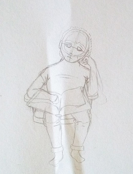
I got around fixing a different perspective, introducing the character a lot more and showing his emotion, still using the same room, kept it as a sketch to make it easier to change things around again, support is always appreciated. And sorry for the uncleaned sketch.

-
I like more the last sketch that you made. I think It fits better as a first page and we can see more of the character.
My only suggestion is that it could be that the boy looks to the side and not directly to the reader, maybe towards the ceilling.
-
My only suggestion is that it could be that the boy looks to the side and not directly to the reader, maybe towards the ceilling.
The kid is actually looking way more up and to the side, the picture doesn't really capture it sadly.
 Thanks a lot! ^^