Society of Visual Storytelling

    SVSLearn Forums

    • Register
    • Login
    • Search
    • Recent
    • Tags
    • Popular
    • Users
    • Groups
    • Search

    May FauxContest WIP -- critiques welcome

    Artwork
    3
    14
    1508
    Loading More Posts
    • Oldest to Newest
    • Newest to Oldest
    • Most Votes
    Reply
    • Reply as topic
    Log in to reply
    This topic has been deleted. Only users with topic management privileges can see it.
    • Miriam
      Miriam @Miriam last edited by

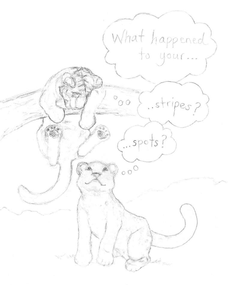
      I am planning on changing the text to make the middle bubble stand out more to correct the hierarchy / reading order. It should read as: Middle bubble 1st, then the other two bubbles.

      I want them to be happy / playful, but I'm also wondering if they should look a little confused, or if it's working with them just kind of wondering.

      1 Reply Last reply Reply Quote 0
      • Jon Anderson
        Jon Anderson SVS OG last edited by

        I like the concept and think making at least one of them have a confused look would be great.

        instagram.com/jonandersonillu

        Miriam 2 Replies Last reply Reply Quote 1
        • Miriam
          Miriam @Jon Anderson last edited by

          @jon-anderson Thanks! I appreciate the feedback! I will work on the confused/curious aspect.

          1 Reply Last reply Reply Quote 0
          • Miriam
            Miriam @Jon Anderson last edited by

            @jon-anderson
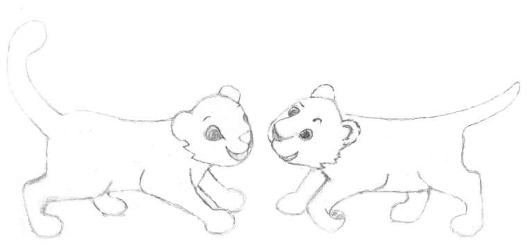
            Ok, here's my attempt at making the one on the right look more curious by giving him a tilted head and raised eyebrow. What do you think?
            0_1527716834610_spots & stripes WIP2.jpg

            Jon Anderson 1 Reply Last reply Reply Quote 2
            • Jon Anderson
              Jon Anderson SVS OG @Miriam last edited by

              @miriam That's cute! I personally would try to exaggerate that curved eyebrow a little more. Looking forward to seeing the stripes and spots.

              instagram.com/jonandersonillu

              1 Reply Last reply Reply Quote 0
              • Gary Wilkinson
                Gary Wilkinson last edited by

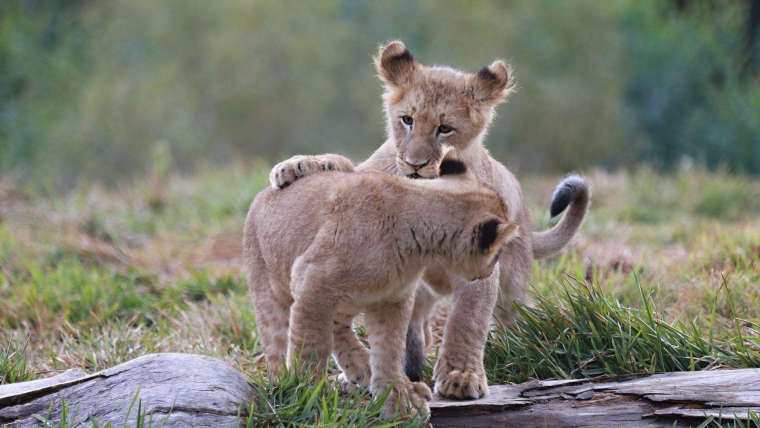
                I like the concept for the piece, but I feel that you have a few issues with the sketch. The pose of the animals is quite static and lacks energy, their faces are also really close to each other which gives me the feeling that it is quite a confrontational stance. I would suggest to have a more playful pose to show their interest in each other which would also fit within a tight composition (as opposed to the long horizontal one you have here). Here is a picture of some lion cubs that, although isn't perfect, may help you explore other poses to help emphasis the curious element you want to achieve.
                0_1527724498559_1920x1080_playing-lion-cubs.jpg

                www.garywilkinsonart.com
                www.instagram.com/gwillustration/
                www.twitter.com/GWillustration

                Miriam 1 Reply Last reply Reply Quote 2
                • Miriam
                  Miriam @Gary Wilkinson last edited by

                  @gary-wilkinson Thanks for taking the time to comment and share the picture!

                  While I was looking at some reference photos yesterday, I started wondering the same thing about the energy / playfulness of the pose. I was also thinking it might be fun if I could have one looking down and the other looking up.

                  I didn't want to start over for a couple reasons--I chose the long format because I thought if it turned out well, I could print it on a mug for my niece; and if I am going to finish it for the fauxcontest, I need to hurry up! But I think you are right--it would be a better composition if I change the pose.

                  1 Reply Last reply Reply Quote 0
                  • Miriam
                    Miriam last edited by

                    0_1527798680327_spots & stripes WIP3.jpg

                    Miriam 1 Reply Last reply Reply Quote 1
                    • Miriam
                      Miriam @Miriam last edited by Miriam

                      I'm thinking I should make the drawing a little more cartoon / simpler style to go with the thought-bubbles and humorous aspect.

                      1 Reply Last reply Reply Quote 0
                      • Miriam
                        Miriam last edited by Miriam

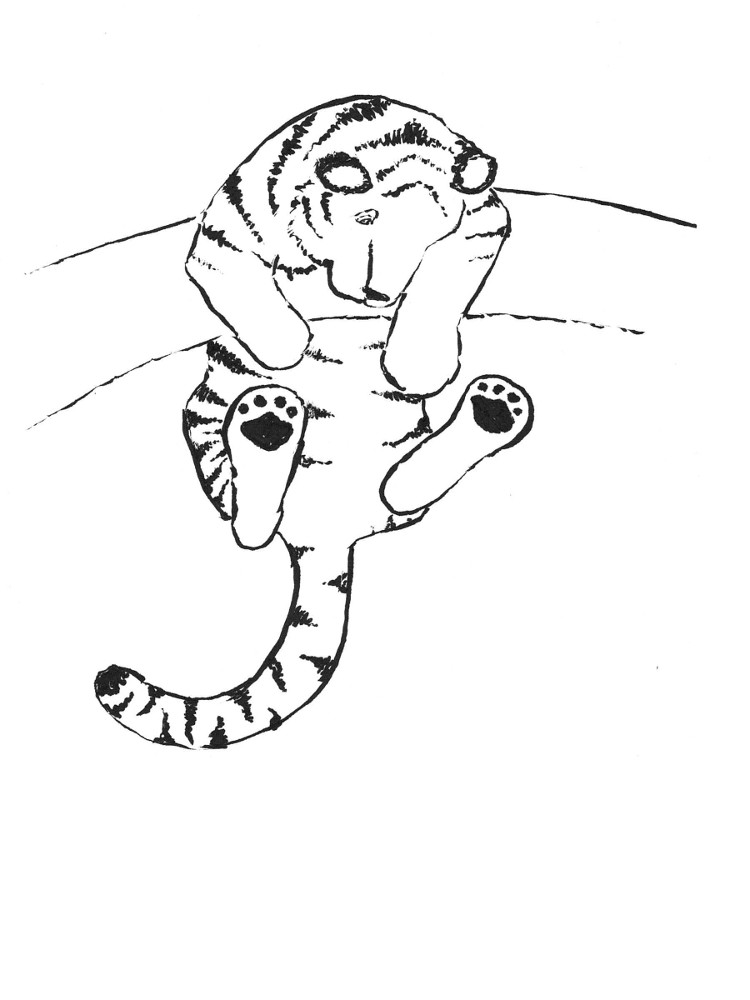
                        Here' my attempt at using a brush pen. I am very new at using brush pens, so I was pleased with this result, even though there are areas that I'm not satisfied with. It's the first drawing I've been able to finish with the brush pen. (Well, semi-finish, since it's only part of this composition!)

                        I need a lot more practice, but it's fun to see that I'm starting to get it!
                        0_1527844320279_spots & stripes scan 5.jpg

                        1 Reply Last reply Reply Quote 1
                        • Miriam
                          Miriam last edited by

                          And here's my Final, completed with Copic Multiliner pens.
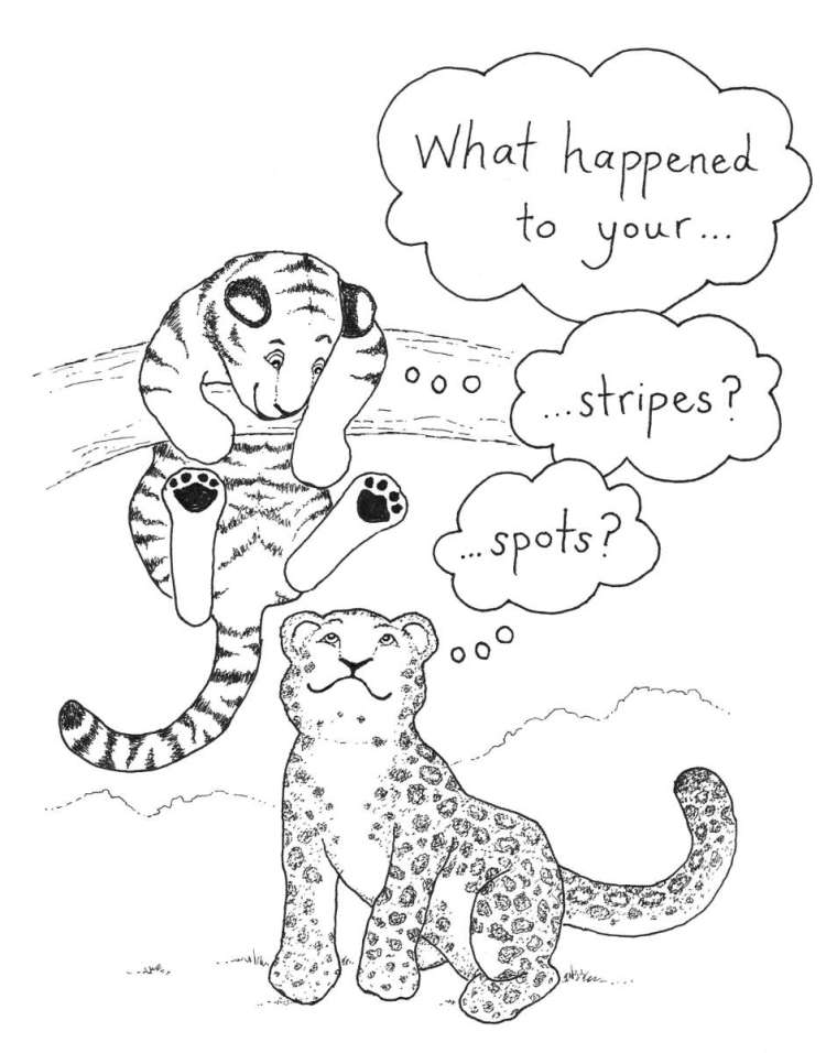
                          0_1527844484455_spots & stripes Final.jpg

                          Thanks for the help & support!

                          Jon Anderson 1 Reply Last reply Reply Quote 5
                          • Jon Anderson
                            Jon Anderson SVS OG @Miriam last edited by

                            @miriam Very cool!

                            instagram.com/jonandersonillu

                            Miriam 1 Reply Last reply Reply Quote 0
                            • Miriam
                              Miriam @Jon Anderson last edited by

                              @jon-anderson Thank you!

                              1 Reply Last reply Reply Quote 0
                              • First post
                                Last post