Mushroom Village WIP looking for some critique
-
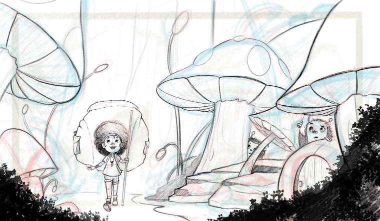
Hello everyone, this is the piece I've been working on. Opossed to making a full village I wanted the illustration to be about a girl who suddenly became tiny and began to explore. The exact moment of the image is when she's near the village but not quite there yet.
I've been taking Jake Parker's courses on how to make creative enviroments and perspective, I still think I'm lacking in composition but only with practice will I get better.
I'm enjoying everyone's work so far, very creative takes on the concept, I hope you guys like it and every comment to further improve is more than welcome.
Mau Voren
-
Hi. I quite like the composition you came up with and am looking forward to seeing the finished piece. I especially like the little creatures' expressions as the little girl approaches the village.
Kayla Groening
Comic/Graphic Novel Artist
Storytelling through Art.
Facebook page: https://www.facebook.com/kaylagroeningillustration
Instagram: https://www.instagram.com/kayla.groening.illustration/ -
@kadelex Thanks a lot! I saw some of your work and it also looks pretty nice, I really liked the idea of the girl releasing spores and the vertical comp, it gives it a super nice flow.
-
@mau-voren I think this looks great! The composition is well balanced. It has a nice strong 1st read, and the environment is fun. I'm guessing you'll work on this when you do values and color, but the foreground is extremely dark, so it's drawing my attention. Also, it kind of looks like the plants on the right might block the little door.
...so was she already on a month-long backpacking trip when she changed size? That's a huge pack on her back! Lucky that she was so prepared for this adventure.
")
The girl has a nice look of wonder and excitement, and your characters are cute!
-
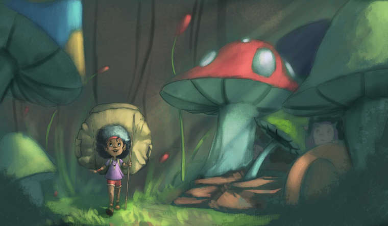
@miriam Thanks a lot on the critique about the plants covering the door, you are right about the foreground being to dark but also about the fact that I'm to work it out during value studies and also I might move them as I want the little door to look more.
About the girl having a huge backpack I also thought about it, but I felt that it wouldn't be as impactful without the huge backpack so I guess we can just imagine that she planned ahead before turning into a tiny person hehe.
Thanks a lot for the feedback and nice comments!
Mau Voren
-
@mau-voren Yeah, I was just giving you a hard time about the pack. It's also so large it would squish her in real life (unless it was filled with balloons or something). But it's a cartoon / storybook style, so you can totally get a way with it!
I'm looking forward to seeing more of this one. -
I really like it! the compostion and character are great. I especially really like the girl's face. Just idea,maybe some mushrooms or grass in the background will add more depth and make it more interesting. I am looking forward to see more!
-
Here is some progress on my piece, so far I've tried different ways of coloring it but I'm not liking my result so far, so I decided to share my progress here because I think I'm gonna try something completely different for the color
Mau Voren
-
I think your lighting and values look quite good. I struggle hard with this aspect, so I'm no expert. But I know what I like.
-
Before talking about the color and value issues I think it might be worth thinking more about the pose and positioning of the girl and her backpack. When I first looked at it I didn't realise it was a backpack, but rather a mushroom. If you turn her slightly it would give her pose more energy and better readability.
Pulling even back further from just the pose I would like to see more of the people living in the village and more of the village itself. Have you thought about rotating the camera around to her back and showing the village she has just discovered? The backpack would make it easy to understand that she is a traveller (you could add hints of her once been full sized still) but showing more of the village itself might work well. A front on view could still work though, but I think you need to add more depth and maybe some more villagers (looking out the window peeking over the roof of their houses etc to show that she isn't someone who is part of their town or their species.
Just talking about the color, I don't think the issue is necessarily only with that, but perhaps more with your values. Everything is quite in the middle grey range so nothing is standing out, thereby reducing the effects of depth. Also you have 1 red mushroom in a very green painting so a lot of attention is been paid to that rather than the girl. You could keep it red but you would have to use the light to make her more the focus of the piece (if that is your aim), but if you make all the mushrooms red and her clothing/backpack an unused color it would also help put the focus back on her
-
@gary-wilkinson Oh now I see I could do so much to improve the painting, I was having a hard time choosing the right colors because I might've been overthinking too much and trying to have the mushrooms look different, but based on what you say I might do a different sketch and composition to improve my original idea, thanks a lot for the advice, you helped me see things that completely went over my head.
-
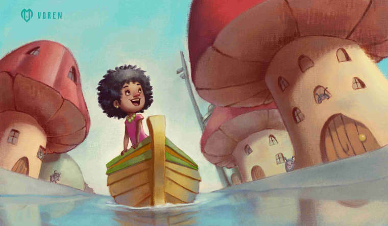
Finally came up with something completely different and barely finished it before the deadline, hope you all like it!
-
I love it! The water element combined with the angle makes it more of a unique concept for the theme of the contest.