Mushroom village - critique appreciated
-
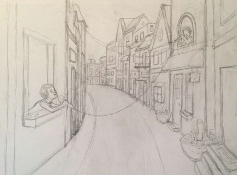
Seeking honest critique for this sketch, which is for the prompt this month. I figured there would be lots of entries where the village buildings were made from mushrooms, so I wanted to make recognizable looking buildings with mushroom and fungi elements (more of those details still need to be sketched in - like maybe paving the road with mushroom caps?). The kids are playing a neighborhood game of telephone. Go figure.
")
-
Nice work. Fun approach to an idea that could easily have been contrived and predictable. Your composition is superb and I am looking forward to seeing how you render the shadows and colors.
I checked out your other work and you are truly gifted and, obviously, dedicated to the craft and art of illustrating.
For this piece, specifically, I am very impressed with the thought that must have happened within you to find a way to deliver the theme but with an unexpected approach.
Where I live, in Florida, there is a town called Coconut Grove. People there do not live in coconuts! Also, Cocoa Beach has no cocoa. It is all sand.
An author who teams up with you as illustrator will have a much better story in the end because of your keen sense of taking an idea and telling the story of that idea in a decidedly clever and intriguing way. Keep it up.
-
Nice Idea, but I feel that the large road shape leading the eye into nothing will be an issue for you since there doesn't appear to be a secondary focus back there.
-
I agree with @rcartwright about the road leading to nothing, however I think you might be able to fix it with an easy solution of bringing the child in the foreground waaaay closer (like moving the viewer to being right next to him outside). I can see that there are other children in the windows holding onto the mushroom telephones, but I can't really see them at first glance that well. I think you can make the 3 points of interest be the 3 closest children.
I hope this makes sense! I feel like I"m not describing what I mean very well, haha. -
Thank you all for the critique - excellent suggestions... I really appreciate it.
@Larry-Whitler Wow, your encouragement is sure appreciated. I've noticed on the forum that you have a very kind and helpful way of sharing your thoughts, and it is very inspirational. Thank you for that!
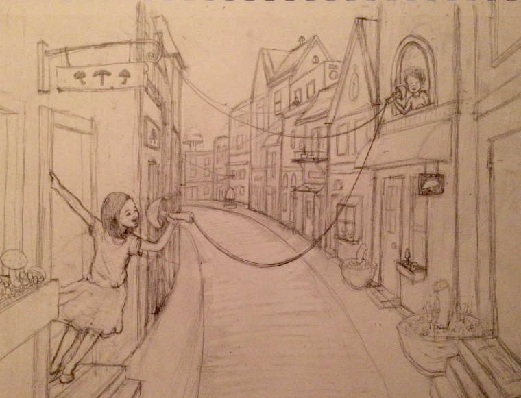
@rcartwright and @Leda-Chung Thank you both so much for pointing that out. I had not thought about the road leading to nothing. I think it definitely weakens the piece.
I really liked your idea, Leda, of bringing the first character further into the foreground. I liked the setup of the buildings, so I tried drawing another character a bit further forward that still hopefully fits into the perspective established by the doors and such on the other side of the street. I put her mushroom telephone at the end of the road so now I think the road leads the eye to her face. Do you think this works?
Thank you all, once again, for your feedback.
Any more suggestions from anyone?
-
@kathrynadebayo I like your interpretation of a mushroom village. I was thinking of something similar--like a town famous for their mushrooms and have mushrooms growing everywhere, but I started another one of my ideas instead (and have seen someone do something along the same lines as that one, too!).
I like the new girl & the way her pose brings action to the piece. It makes more sense than the kid in the window, since the other one made me wonder how they got connected. (Did the kid on the 1st floor go out and get their end, then climb in the window? It still has the same question for the kids down the street, but it's not as obvious to me.) For me, it takes a minute to understand that the children are all connected down the street, so it might help if the 3rd kid is hanging out the window--the strings look like they could be connected to the curling sign rod.
Yes, the road is working better for the composition now, and the sign above the door adds more character to the building.
-
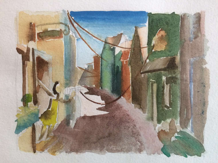
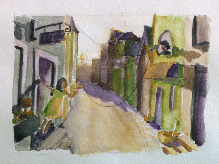
Well, colors are very challenging for me. So far, I like the second lighting setup, but I'm sure there could be improvements.
All input welcome...
-
As is, I like the second color setup better, because the colors are circulated well and it feel very cohesive. That being said, I think it kind of gives the piece a funky feeling, especially it being paired with the idea of a mushroom town. That's not necessarily a bad thing, but if you want a lighter, friendly feel, the first one fits the bill a bit better. I do feel as if the first one could have better color circulation. Perhaps pull in some yellow elements in the buildings going back, bring more saturated orange-browns into the foreground and maybe an accent color, like red, into the plants of the foreground.
Those are my thoughts! Really love the concept you are going for. Super creative.
Website: www.tessawrathall.com
Instagram: www.instagram.com/tessawrathall_art/
-
@tessaw Thank you so much for your input! I'm not going for funky, so I'll definitely try for friendlier colors as you suggested.
-
Im Liking number 1, that blue pops!