Society of Visual Storytelling

    SVSLearn Forums

    • Register
    • Login
    • Search
    • Recent
    • Tags
    • Popular
    • Users
    • Groups
    • Search

    Mushroom Village WIP

    Artwork
    9
    23
    2710
    Loading More Posts
    • Oldest to Newest
    • Newest to Oldest
    • Most Votes
    Reply
    • Reply as topic
    Log in to reply
    This topic has been deleted. Only users with topic management privileges can see it.
    • Miriam
      Miriam @carriecopadraws last edited by

      @carriecopa Straight lines draw attention, so maybe you could try an arched bridge to soften it up a little? It could either be a structured bridge arching up, or a simpler bridge (like a rope bridge) that hangs down more in the middle.

      I'm not good with perspective, but I think the fox is tilted a little more towards the viewer than the rest of the image. See how you can see more of the side of the vehicles in these photos?
      0_1529445336834_3e859047-2c99-40e0-b52c-f17245c670f7-image.png
      0_1529445917580_4c232e48-bbbe-45ff-bbd0-525cb0e27943-image.png

      I like your sketches & the fun whimsical feel.

      carriecopadraws 1 Reply Last reply Reply Quote 0
      • demotlj
        demotlj SVS OG @carriecopadraws last edited by

        @carriecopa Fascinating and beautiful plant and I think you did a great job of incorporating that look in the painting.

        Laurie DeMott
        instagram.com/demotlj

        1 Reply Last reply Reply Quote 0
        • carriecopadraws
          carriecopadraws SVS OG @Miriam last edited by

          @miriam yes, I think dipping the bridge one direction or another will work nicely! Thank you. I will tweak the perspective on the fox as well.

          Carrie Copa
          https://carriecopadraws.com/

          Kevin Longueil 1 Reply Last reply Reply Quote 1
          • Kevin Longueil
            Kevin Longueil SVS OG @carriecopadraws last edited by

            @carriecopa I love the image and your value sketch! - hope you don't mind me chiming in on the bridge - i feel that if it just sagged a bit(even a vey small amount) like a rope bridge might or even had two sagging sections on either side of a supported middle - it may read a bit more as being a bridge - the eye catching straight lines would would be gone also - Anyways...feel free to ignore - love the image πŸ™‚

            Portfolio: kevinlongueil.com
            https://www.instagram.com/kevinlongueil/

            carriecopadraws 1 Reply Last reply Reply Quote 0
            • carriecopadraws
              carriecopadraws SVS OG @Kevin Longueil last edited by

              @kevin-longueil I really like the idea of making it more like a rope bridge. That seems like something you'd see in the trees, and it will look more natural.

              Carrie Copa
              https://carriecopadraws.com/

              Miriam 1 Reply Last reply Reply Quote 1
              • Miriam
                Miriam @carriecopadraws last edited by

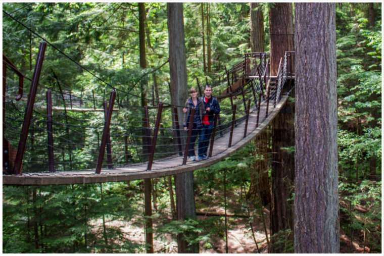
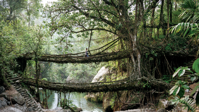
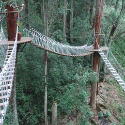
                @carriecopa Here are some photos that might help with ideas:
                0_1529459424158_874f7742-19a6-4d87-abfd-6fdce6550244-image.png

                0_1529459662587_4a1e945b-d28d-4447-b85d-9f8b7e5f2cb4-image.png

                0_1529460028818_aeba3285-d699-4eea-9956-f02fde8f3ac1-image.png

                1 Reply Last reply Reply Quote 0
                • carriecopadraws
                  carriecopadraws SVS OG last edited by

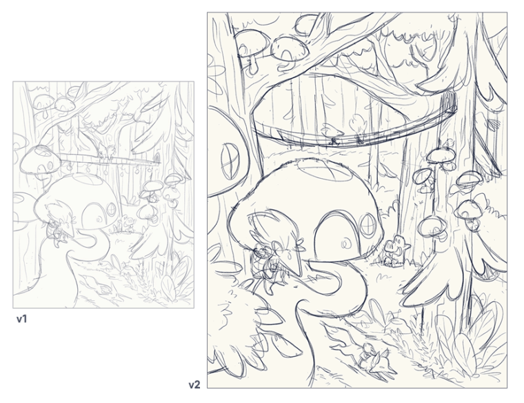
                  Updated my sketch based on your feedback, I'm feeling pretty good about it!

                  I noticed that giving myself several days to develop a sketch (taking time to walk away for a bit, think about it, get your feedback, and add more details) has been working really well. I'm much happier with my drawings than trying to rush something out in one sitting (like when I feel pressure to create something for social media). It may be slower, but the results are much better.

                  0_1529607886490_round2-mushroom-tree2.png

                  Carrie Copa
                  https://carriecopadraws.com/

                  lei Chip Valecek 2 Replies Last reply Reply Quote 3
                  • lei
                    lei @carriecopadraws last edited by

                    @carriecopa Wow I love seeing the progress of how you improved the piece with everyone's feedback πŸ™‚ It's much clearer to read the image now. Looking forward to this in colour!

                    1 Reply Last reply Reply Quote 0
                    • Chip Valecek
                      Chip Valecek SVS Team SVS OG @carriecopadraws last edited by

                      @carriecopa I think it looks great! I started to sit on my larger pieces as well. Give a day or two and come back. Then on the weekends I will knock a quick one out in a couple hours. I feel it really gets my imagination flowing. Looking forward to how you color it.


                      https://www.instagram.com/chipvalecek/
                      https://www.facebook.com/cvalecek
                      http://www.cshellmedia.com/

                      1 Reply Last reply Reply Quote 1
                      • carriecopadraws
                        carriecopadraws SVS OG last edited by

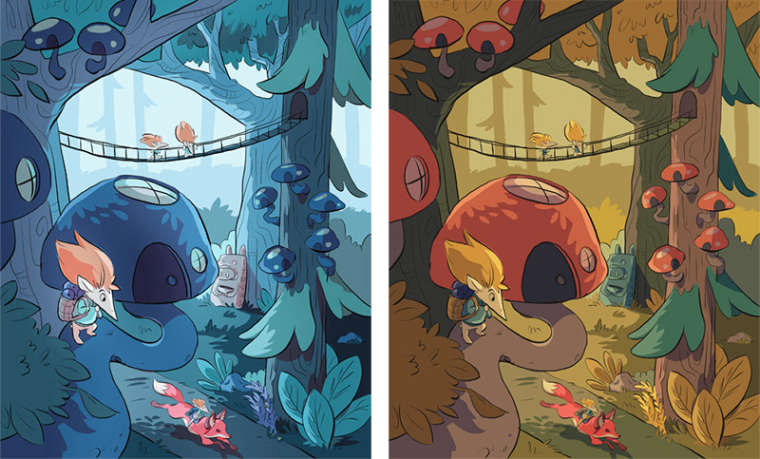
                        Hey all, I have color tests and would love your feedback! One is a cool blue look (which makes the red fox stand out more), and one is normal autumn afternoon. I'll be doing more with lighting and line coloring.

                        0_1530205067011_color-test.jpg

                        Carrie Copa
                        https://carriecopadraws.com/

                        rcartwright sweta roy choudhury 2 Replies Last reply Reply Quote 0
                        • rcartwright
                          rcartwright @carriecopadraws last edited by rcartwright

                          @carriecopa I prefer the warmer pallet to me the blue is too blue and feels a bit cold

                          https://www.scbwi.org/members/richard-cartwright/
                          https://www.instagram.com/richardwcartwright/
                          https://www.pinterest.ca/richcartwright3/art-of-richard-cartwright/
                          https://www.richardwcartwright.ca/

                          1 Reply Last reply Reply Quote 0
                          • sweta roy choudhury
                            sweta roy choudhury @carriecopadraws last edited by

                            @carriecopa I love the warm color scheme more.

                            https://www.instagram.com/swetarc/

                            carriecopadraws 1 Reply Last reply Reply Quote 0
                            • carriecopadraws
                              carriecopadraws SVS OG @sweta roy choudhury last edited by

                              @sweta-roy-choudhury @rcartwright

                              I did the blue one because I wanted something different, that didn't have the traditional red mushroom that often comes to mind. But the feedback here and elsewhere is hands-down the autumn one, so there must be something really working there! Thanks for your input.

                              Carrie Copa
                              https://carriecopadraws.com/

                              1 Reply Last reply Reply Quote 0
                              • Chip Valecek
                                Chip Valecek SVS Team SVS OG last edited by

                                I prefer the cool blue one.


                                https://www.instagram.com/chipvalecek/
                                https://www.facebook.com/cvalecek
                                http://www.cshellmedia.com/

                                1 Reply Last reply Reply Quote 0
                                • TessaW
                                  TessaW last edited by

                                  I like both. You've done a really great job. I do think it would be worth it to play with the cool one a bit- maybe warm up the oranges of the fox and foreground character a little and possibly add a few more orangy touches or even a few warmer greens here and there. Not enough to overpower the overall scheme, but just to add some variations.

                                  Website: www.tessawrathall.com

                                  Instagram: www.instagram.com/tessawrathall_art/

                                  1 Reply Last reply Reply Quote 0
                                  • carriecopadraws
                                    carriecopadraws SVS OG last edited by

                                    Now the votes coming in are about even lol. That makes it so hard to pick! I do think adding some warmer elements in the blue one will make it more cohesive, and maybe add some light coming out of the mushroom windows. Ugh, I'll probably just end up making both and picking one at random for the contest. Might be a useful portfolio item at least!

                                    Carrie Copa
                                    https://carriecopadraws.com/

                                    1 Reply Last reply Reply Quote 1
                                    • lei
                                      lei last edited by

                                      Another vote for the blue scheme here! Just coz like you mentioned - it’s not the typical kind of colour scheme for this theme. Which makes it more unique. The autumn warm ness is beautiful but more expected/familiar.

                                      1 Reply Last reply Reply Quote 1
                                      • First post
                                        Last post