Society of Visual Storytelling

    SVSLearn Forums

    • Register
    • Login
    • Search
    • Recent
    • Tags
    • Popular
    • Users
    • Groups
    • Search

    Hidden WIP

    Artwork
    16
    41
    4632
    Loading More Posts
    • Oldest to Newest
    • Newest to Oldest
    • Most Votes
    Reply
    • Reply as topic
    Log in to reply
    This topic has been deleted. Only users with topic management privileges can see it.
    • braden H
      braden H last edited by

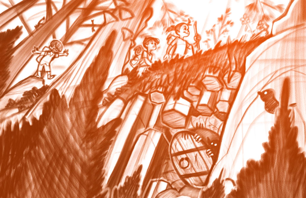
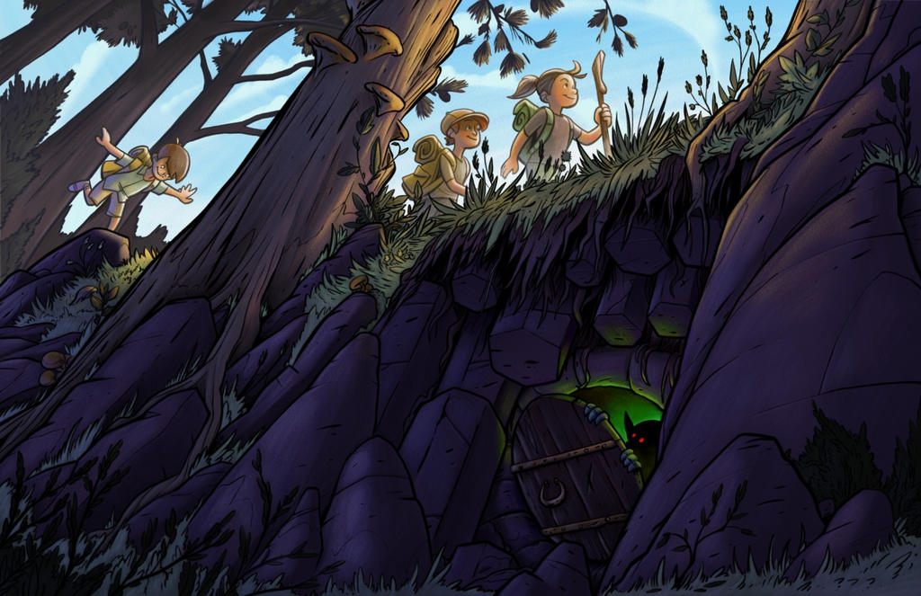
      Made a few changes from suggestions. Monsters are always scarier (but friendlier?) as silhouettes.

      alt text

      1 Reply Last reply Reply Quote 2
      • braden H
        braden H last edited by

        'nother update with super rough values. Last couple of times I've tried painting a la Mr. Terry, but since I want to finish I'm much more comfortable with ink. Changed a few small things. I may just do more foresty clutter instead of close trees in the foreground.
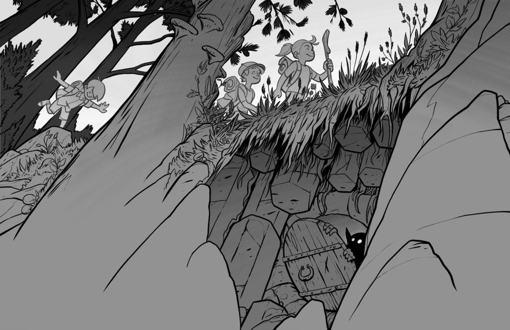
        alt text

        1 Reply Last reply Reply Quote 5
        • braden H
          braden H last edited by

          Work progresses!

          I'm going to restart the colours from scratch and start with a value layer (like, a detailed value layer) first this time (as apparently is good/standard practice). In my comic I just lay down local colour and shade with multiply layers but with an illustration the values need to be much more spot-on.

          alt text

          rcartwright 1 Reply Last reply Reply Quote 4
          • rcartwright
            rcartwright @braden H last edited by

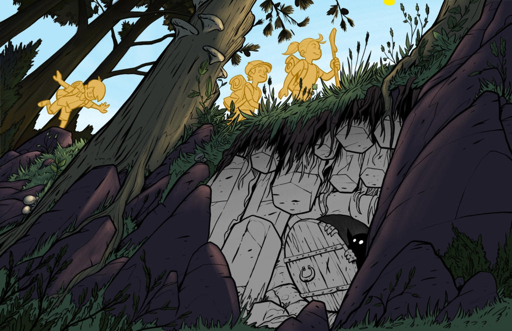
            @art-of-b can I suggest that he cave is glowing so the monster can have a bit of a silhouette this will let you darken all of the underside of the rocks in saturated cool colors

            https://www.scbwi.org/members/richard-cartwright/
            https://www.instagram.com/richardwcartwright/
            https://www.pinterest.ca/richcartwright3/art-of-richard-cartwright/
            https://www.richardwcartwright.ca/

            braden H 1 Reply Last reply Reply Quote 1
            • braden H
              braden H @rcartwright last edited by

              @rcartwright

              That's where I was thinkin' of heading, too, colour-wise. Thanks for the feedback 🙂

              1 Reply Last reply Reply Quote 0
              • braden H
                braden H last edited by

                Work progresses! I like the direction it's heading, but will probably fiddle with colours (dunno if I like the purple for the cave)

                alt text

                Johanna Kim 1 Reply Last reply Reply Quote 4
                • nwaller
                  nwaller last edited by

                  Looks already really nice.

                  www.nielswaller.com
                  https://www.instagram.com/nielswaller/

                  1 Reply Last reply Reply Quote 1
                  • Heather Boyd
                    Heather Boyd last edited by Heather Boyd

                    @Art-of-B Your perspective is really nice. I do wish that the door appear less "human" and more natural or organic working in with the rock or crystal formation. Almost all angles are leading from the left to the right and the door wood growth is going from the right to the left. I don't mind that but the door angle is too extreme and draws my eye first and becomes distracting. But I appreciate line of sight, through the trees to the door, up the staircase rock formation to the last hiker and then your eye moves to the right hiker. Definitely a wandering eye from our perspective, lols. If a creature observing from our /that perspective, would a creature necessarily need to look towards the door, unless they are afraid their "secret" home/door would be discovered. I'm reading deep into this, lols. Your work is definitely fun and pushes your audience to the beyond.

                    • Sorry this response is for your original post. Ill check now your continued work in progress.

                    Commenting on the newer ones, I like the hikers glowing in the sunlight, but I really miss those trees, gave further depth and hid the nakedness of the rocks so to speak lols. And I see you got those mushrooms in.

                    =)Heather B.

                    Instagram: www.instagram.com/heatherboyd.illustration/
                    Website: https://heatherboydillustration.ca
                    Shop: https://www.inprnt.com/search/products?q=HeatherBoydIllustration
                    Ko-Fi: https://ko-fi.com/heatherboydillustration

                    Be blessed,

                    braden H 1 Reply Last reply Reply Quote 1
                    • Johanna Kim
                      Johanna Kim SVS OG @braden H last edited by

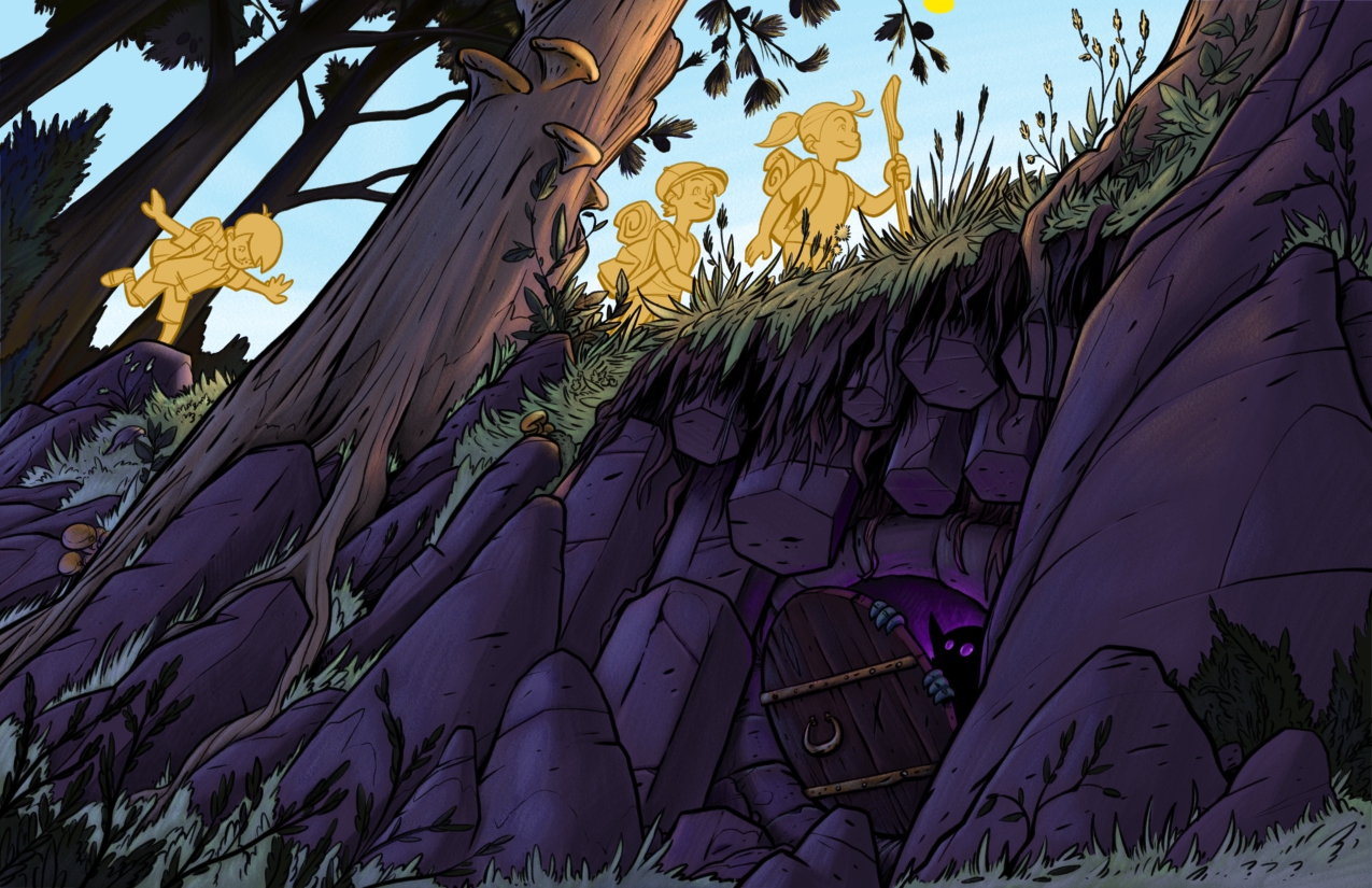
                      @art-of-b Loving this concept and perspective. Would pull back on the darkness of the cave a bit for better visibility.

                      http://www.johannakim.com
                      http://instagram.com/johannahkim/

                      braden H 1 Reply Last reply Reply Quote 1
                      • braden H
                        braden H @Heather Boyd last edited by

                        @heather-boyd

                        Thank you for the feed back 🙂

                        The rocks rather do look naked without the trees/bushes in the foreground. I'll be adding them back in, I think. They definitely add another layer of depth to the piece.

                        1 Reply Last reply Reply Quote 1
                        • braden H
                          braden H @Johanna Kim last edited by

                          @johanna-kim

                          Thanks! That's a good call on the darkness of the cave. I'll lighten it up to make things a bit clearer.

                          1 Reply Last reply Reply Quote 0
                          • TessaW
                            TessaW last edited by

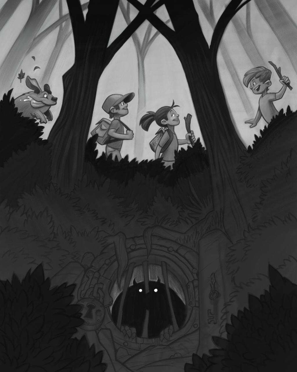
                            This is shaping up really beautifully! I do admit I miss the psychedelic quality of the first sketch where it looked like that door was high up a cliff, and gravity defying. But, your changes still make for a really strong illustration. It's really fun seeing this shape up.

                            Website: www.tessawrathall.com

                            Instagram: www.instagram.com/tessawrathall_art/

                            1 Reply Last reply Reply Quote 1
                            • braden H
                              braden H last edited by

                              Work continues! I'm not sure how I feel about it anymore, but I'm gonna keep plugging away at it.

                              alt text

                              Eli Chip Valecek 2 Replies Last reply Reply Quote 7
                              • Eli
                                Eli @braden H last edited by

                                @art-of-b This is really coming along nicely!

                                1 Reply Last reply Reply Quote 1
                                • Donfito
                                  Donfito last edited by

                                  beautiful illustration, the perspective is really impressive waiting to see the final version.

                                  FB: https://www.facebook.com/fitografito/
                                  Instagram : https://www.instagram.com/fitografito

                                  1 Reply Last reply Reply Quote 1
                                  • Chip Valecek
                                    Chip Valecek SVS Team SVS OG @braden H last edited by

                                    @art-of-b I really like that green light coming out. Looking good, you should feel good about it.


                                    https://www.instagram.com/chipvalecek/
                                    https://www.facebook.com/cvalecek
                                    http://www.cshellmedia.com/

                                    1 Reply Last reply Reply Quote 1
                                    • braden H
                                      braden H last edited by

                                      Welp, I restarted.

                                      I finally watched the class on composition and I really wanted to try painting without the safety line of solid inked linework (not that there's anything wrong with solid linework, but I wanna move past it).

                                      A buncha thumbnails later and I've hammered out this so far. Though at least if I don't finish it I can turn in my first attempt 🙂

                                      alt text

                                      Kevin Longueil 1 Reply Last reply Reply Quote 2
                                      • KathrynAdebayo
                                        KathrynAdebayo last edited by

                                        I've actually been marveling at the composition of your first piece, in case that's helpful to hear. It applies the rule of thirds in such an interesting way. The second composition is so mirrored that it seems unnatural to me, but I admittedly haven't watched the composition class myself... so, I'd say, go with what you think stretches you as an artist the most.

                                        braden H 1 Reply Last reply Reply Quote 1
                                        • Kevin Longueil
                                          Kevin Longueil SVS OG @braden H last edited by

                                          @art-of-b Really nice!

                                          Portfolio: kevinlongueil.com
                                          https://www.instagram.com/kevinlongueil/

                                          1 Reply Last reply Reply Quote 1
                                          • braden H
                                            braden H @KathrynAdebayo last edited by

                                            @kathrynadebayo

                                            "go with what stretches you as an artist the most" is most certainly the redo. I'm glad that the first one was working. There was just something about it that was off, though.

                                            1 Reply Last reply Reply Quote 0
                                            • First post
                                              Last post