New book title character design
-
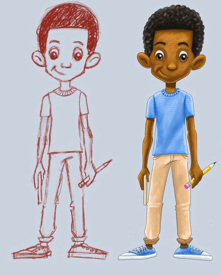
This is the main character of the book I am currently illustration. I will upload the opening illustration. Your thoughts ‘çplease. He is a young artist trying to learn to draw.
-
I love the sketch, simple and clean. I also love how you rendered his shoes and pants.
I think you need to simplify your colored version, use the same style you went with when you colored the shoes, pants and pencil. The t-shirt and skin look too busy and textured. more like a pattern.
I tried something. I brought his eyes a little closer together, also tried to make him look more symmetrical because humans perceive faces that are too asymmetrical to be scary or have something wrong with them. you want him to look cute, relatable and innocent from what I understand. as a kid, his face need to look soft, no harsh lines, no dark creases. he's a young boy. the shoulders need to be less round.
If you want to go with the 1 side smile I suggest you go with little to no rendering, like paper cutouts.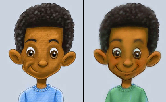
-
Looks great i would remove the line on the crotch it looks dodgy. Good luck with your book.
-
I agree with @Heidi-Ahmad
Human faces tend to have one eye-width in between their eyes. Your version is just a tad too wide in the eye-department.
@Jason-Bowen is also on point with the line between the legs. If you put a gap in between his legs, you can keep the line. If the legs come together naturally (as you have here) you probably don't need the line.
Overall it's a good design, though! My favourite part is the shoes. There's something I really like about well-rendered shoes.
-
@art-of-b said in New book title character design:
Overall it's a good design, though! My favourite part is the shoes. There's something I really like about well-rendered shoes.
Ironically, my favorite part was the pant cuffs. I thought they added a nice little touch, and looked like something a kid would be wearing.
")
-
Love it, but be aware of his gaze. To me, it doesn't look like he's quite looking at us, it looks like he's lost in thought a little. That might have been your intention however!