Postcard for Publishers
-
I think this is looking great. I love the Halloween theme, yay!
I agree with others about the shelf perspective. Also, the center of the window and the table post are so close to creating an implied line. Might read better if you scoot the table over just a bit. Similarly, the post, crystal ball and cloth on the table are all very symmetrical-- you might shift them around a bit as well.
As for the busy-ness-- I think all the details are great and add a lot of story to the image. I think as long as you use value grouping when you color, the image won't feel cluttered.
-
Ah, great eye on the table and window Maile! Didn't see that at all
 And you're right about the color and value with all the detail, I will be sure to keep ab eye out for that. Thanks for your help!
 -
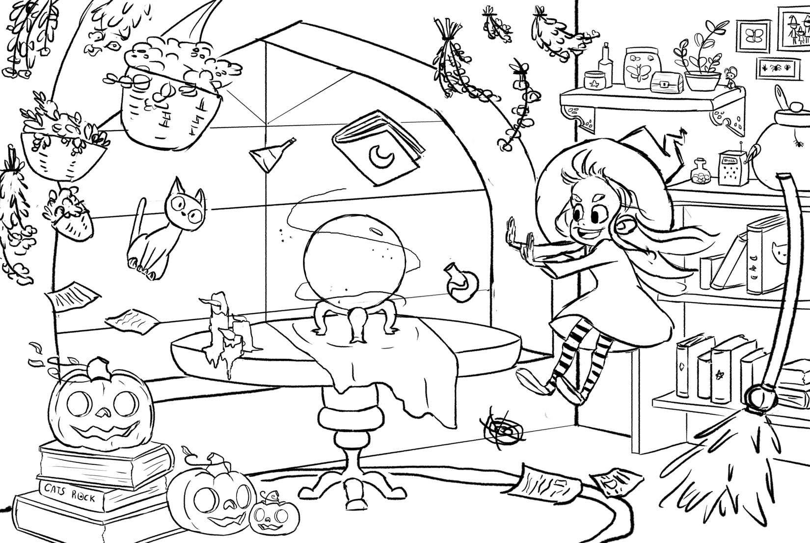
Some more progress on the postcard!
Now I'm working on what kind lighting I should do for this piece.
-
Love this so far. My only suggestions would be to have the cat in a more active pose. (clawing at the table, wriggling in the air, holding his tail cause it's scared...)
-
This is really cool--can't wait to see your color/lighting choices
EDIT: One idea would be to have cool moonlight through that window, the pumpkins could have a warm candle light coming out of them, and that magic ball thing could be another (green? purple?) light. Also--it might be cool to check out stills of the Sword and the Stone for some background item ideas.
-
Nice! cant wait to see the colored version!
-
Very nice work Sharon! I think your drawing ability really shines and your linework is exceptional!
Of course, I do have some notes for ya (that's my job after all!). : )
The first thing I wanted to mention is the actual process of sending out a postcard. Postcards are great advertising and should definitely be used. I'm not sure of your plans, but I thought I should mention this next bit to everyone who is considering postcards. You should never plan on sending just one postcard as a mailer. Postcards should be thought of in terms of doing like 6 a year if you are just starting, or 4 per year (quarterly) if you are already established.
The response rate of a GOOD postcard is around 2%, so if you send out 1000, you can expect maybe 20 people to actually visit your website. Once clients get used to seeing your name on the postcards, the rate goes up and is much more effective. Typically people see results after sending 5-6 postcards, so it really is a long slow burn. I can talk more about this if people are interested...
On to your image, Love the character! Her pose is cool, but try to vary the hands and leg positions, even if it's just slightly. When they match as yours do here it can really make the pose look a bit stiff.
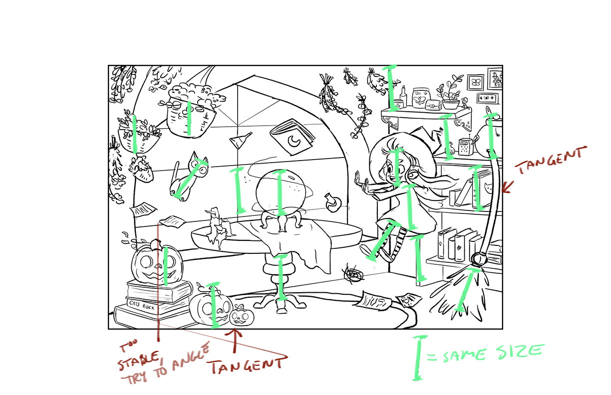
There are a few tangents where objects sit right on the frame of the compostion (which I've noted here). You should include a border so we can see how objects sit in relation to the outside edge.
Now on to the biggie, in terms of shape design, it's always going to be advantageous to use big shapes (which ground the composition), medium shapes, and small shapes. I made a green line in photoshop and just copied and dragged it around your image to show how many shapes take up the same amount of size and weight (strangely, this tendency will match the head size of a character which this one does). So, I would try to vary those shapes up a bit to get a better sense of big, medium, and small shapes.
Doing a quick value study will also show how lighting might affect the perceived sizes of things, so I always recommend doing that before moving to final linework so you don't waste time.
Again, lovely drawing style. I can't wait to see this as a finished piece! : )
SVS Faculty Instructor
www.leewhiteillustration.com -
@Lee-White Very interesting how you've noticed the things that are the same size!
-
I, for one, would love to hear more thoughts and advice about sending postcards.
-
@Leontine Anytime there is a complicated scene with a lot of objects, size relationships and tangents are the first thing I notice. Being a teacher for so long, I now know that it's one area that trips a lot of people up. It's very hard to avoid it actually if you aren't thinking about it. It's a natural tendency to create order. If you ever try to paint stars in the sky you will notice that they are all the same distance apart until you really try to create a random pattern. : )
@Sarah LuAnn Postcard campaigns are awesome, especially in the digital age. People like receiving something in the mail. It also shows you are a professional because it aint cheap! It shows you are serious.
I recommend using a mailing list company like Adbase http://www.adbase.com/ (unless you have an agent that may have a better list). Adbase is expensive, but there really isn't any better way to get a huge list of client addresses that are current. Trying to do it on your own is overwhelming. Also, the people in the industry move around so much you would never be able to keep track of them.
Like I mentioned before, plan a whole campaign. A single mailing is useless and many people give up after one or two mailings. Think about it this way, how many times do big companies hit you with their ads? Over and over right! They know it takes a certain amount of exposure to have something sink in. Unfortunately illustrators think that when they send a postcard it's going to stop the presses and you will be "the next BIG thing"! I wish it worked that way, but it takes time just like advertising does for any business.
On top of postcards, I suggest a small (20 clients or less) targeted mailing that is custom and a bit fancier than a postcard. I sent a handmade book to 21 potential clients and actually got 13 face to face meetings with them. A few I ended up working with right away. One of them took 10 years to call me, but eventually the call came! Like I said, it's a marathon and not a sprint so plan accordingly.
SVS Faculty Instructor
www.leewhiteillustration.com -
Hey @Lee-White
Very insightful stuff here. I'd be interested (as I'm sure would others) for you to put together a SVS course about marketing and actually getting work and keeping it coming in.
Take care,
Ace -
Thanks @Lee-White you're responses to and critiques of peoples posts on here are always super helpful.
-
I second a marketing class @Lee-White
-
Funny you guys should mention that. I have a storytelling video coming out in two weeks, then after that I'm beginning a business video! : )
-
@Lee-White awesome! I'm curious about how you chose which clients to send your targeted handmade books to. Were they each to a specific publisher, or to an art director, or what? Were they people you had met or just people whose work you liked?
-
I can't wait!
-
@Lee-White Wow thanks so much for all the tips! I wished I would've checked back on this because I already went and worked out the basic lighting and started blocking in color! lol! No problem though, I'm so glad you pointed out the size issue, I have never thought about it before, but I will definitely go back and make all the adjustments.
Thanks also for the tips on postcards. I know it can take a while to hear back and you must send them regularly. I'm going to try and send them out every 3 months, since it can get a bit expensive.
I'm so pumped to have gotten my piece critiqued by you! I've been needing a good, honest, and helpful critique. I might not be able to send this out for Halloween in time, but at the very least it will make a good portfolio piece.
-
Witches are my weakness, so I love everything about this postcard! I do agree about your main character's pose though... Changing it up would help her look more lively. Then, to contrast, I actually love the fact that the cat is just so still, with his eyes all big, like he's just in shock. To me it's amusing. He's kind of got a Jiji vibe going on.
Can't wait for the finished piece!
-
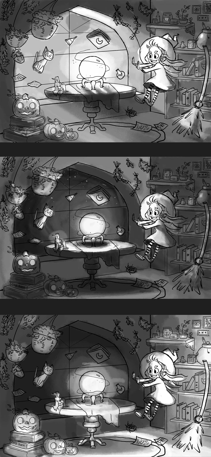
Here is the 3 lighting situations I came up with before I began adding color. I ended up using the middle one.
-
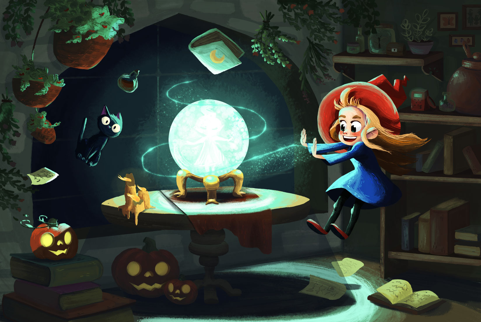
Here is the final!
I changed the items Lee pointed out. They really made a huge difference!