Looking for critique
-
Hi everyone,
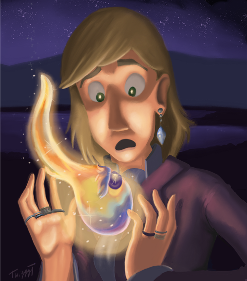
I'm not sure how, but I ended up randomly doing a fanart piece of one of my favorite books, Howl's Moving Castle. It's not finished yet, but I was wondering if anyone could give me some critique on it. I've never really done a piece like this with just a small light source, and I have a bit of difficulty drawing people and using tonal variation, too. I'm also concerned with the background (which I haven't really touched yet). I want to put a little bit of light on the grass in the forefront of the background, but I don't know how to do it without overdoing it. Also I need to add stars and such in the sky and some variation in the water in the background.
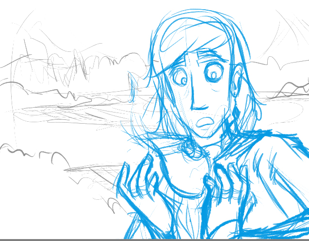
Here is my sketch:
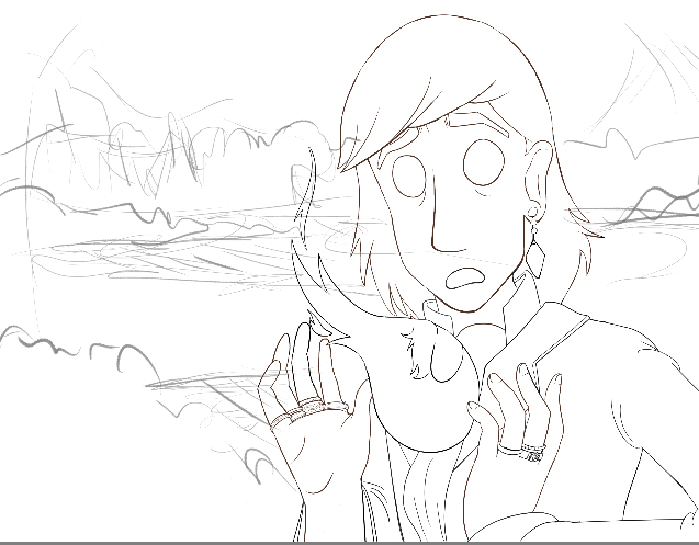
Here are some inks:
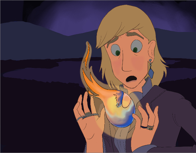
Some base colors:
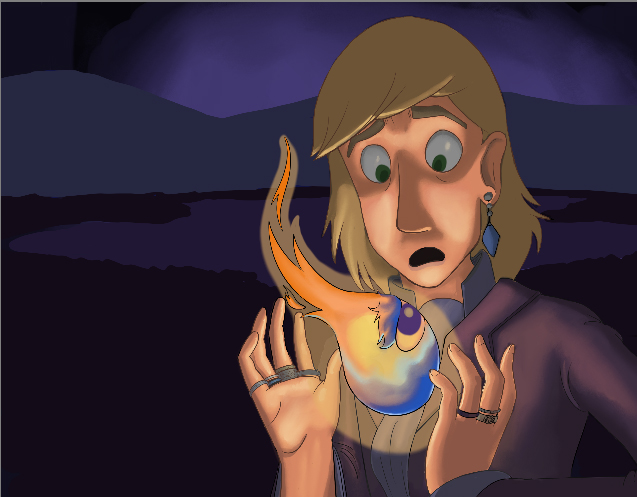
This is where I am now:
And for reference, here are some of my reference images:
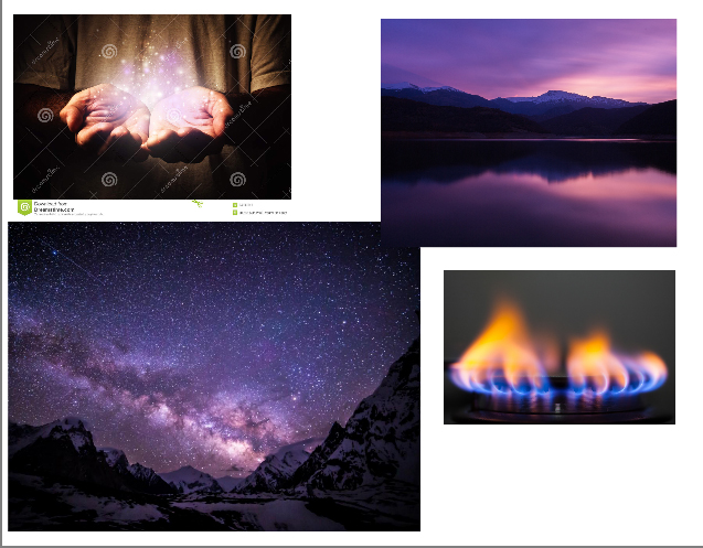
Any feedback anyone can give is much appreciated.
PS: I feel like I'm in algebra class, showing my steps so people can see where I went wrong. XD
-
Great work! I really like the lighting on the their face. remember that the part of the eyeball closest to the flame would be the most reflective. but you've really given there face a lot of depth.
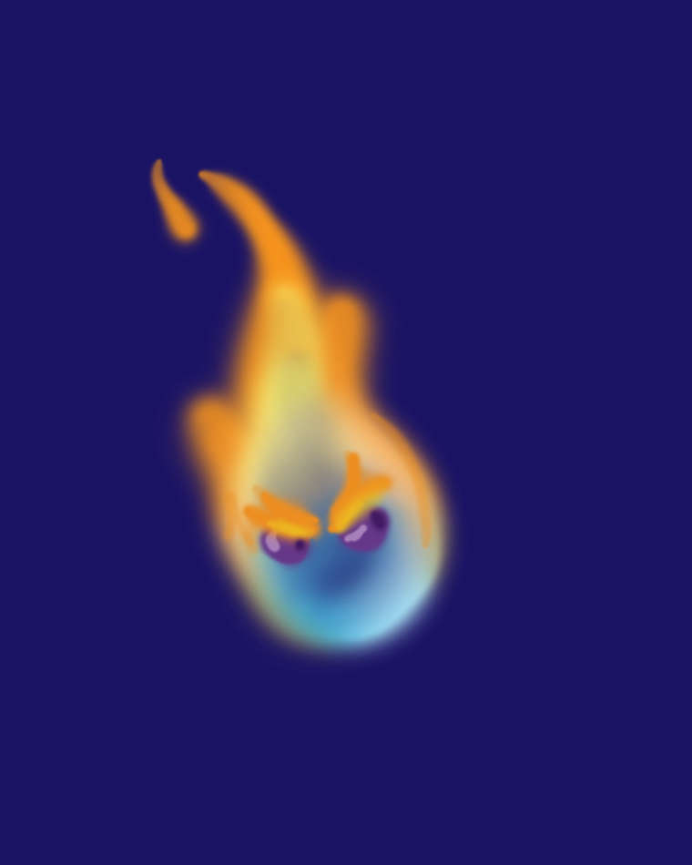
The other thing I would sugest is to take out the line work on the flame. and maybe spin they eyes around so the read better. I sketched this up using a couple layers in photoshop and played with the brush hardness and the opacity of the layer. pretty simple effect but it seems to work when drawing flames.
well done thought.
-
I like the ink and composition.
The lighting needs tweaking though. The ball of flame is the main light source but looks darker than the face. It doesn't stand out against the character.
A useful technique for lineart is using a screen layer to colour the line. This might help the illusion of light in the flame.
-
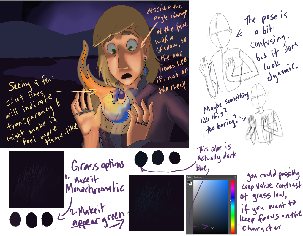
Hi twiggyt. This is really beautiful so far. First suggestion- possibly make it a portrait format? The current format seems arbitrary and I don't think contributes the the impact of the wonderful illustration you're building up. @Naters-Calderone makes some great suggestions.
I have a few notes for you. Hope you don't mind.
-
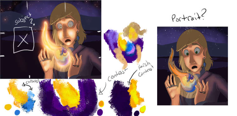
@twiggyt I know you said you wanted a small light source but that fire is going to need a stronger outer glow. The moment I saw the fire my brain was telling me something is wrong with the light source. The bg is so dark that the fire should be emitting a strong glow. I think the fire needs a stronger outer glow.
Since I think the fire needs stronger glow his face should be lit up a bit more.
I love that hint of blue from the fire. I love color so I love it when color contrast with each other. I love the orange and blue contrasting, and I love the yellow orange fire contrasting with the purple bg.
Something needs to be put in the bg to contrast with the character. Like my eyes gravitate to the back because it wants me to look at something since you left some space there for something. I know you said grass but I almost want to see the castle silhouette in the bg contrasting with the night sky. Or you can just keep it portrait and crop out the bg.
That my take.
-
Wow, this is great. Thanks for the great ideas, everyone!
@Simon-Prime I realized as I read your comment that I didn't paint the lines on the flame at all. Usually I lock the transparency for the lineart layer and paint it a different color once I have the characters painted. I wonder if @Naters-Calderone has a good point in taking the lineart off the flame completely. I might try it both ways and see what works.
@TessaW and @MoonaticDestiny I will consider cropping it since both of you commented about it. I originally thought I wanted to frame him with trees or shrubbery, but then I thought, "No, I'll just give a subtle impression of grass," but it's just not working out that way, so I think cropping might be the best option.
@TessaW Those hands have been a pain! XD I originally wanted to do cupped hands, but then that obscures the flame, plus I couldn't find a reference image from the angle I needed. I must've re-drawn those hands in different positions at least ten times. I think I'm going to cut my losses with that one, ha ha.
@MoonaticDestiny Ohhh, I really like what you did with that glow. Thanks a lot for that!
Thanks for the help, everyone!

-
@twiggyt You're welcome. And just for the record, I think the hands are pretty good, it was just the way the arms were angled in the relation to the hand that I questioned.
Cheers!
-
Oh, I love the expression Howl's got, and I think you did a phenomenal job of rendering Calcifer! I'm a little inexperienced to be giving advice on all these lighting things, but I think Tessa was on the money with the positioning of Howl there. The other position that might work out for you would be to keep the arm where it is and rotate the hand so it's slightly cradling Calcifer. Although, it might be less work to take Tessa's route over mine

Can't wait to see how this rounds out!
-
@Jabbernewt - When I started this drawing I tried to draw Howl's hands cradling Calcifer. Somehow it evolved into this instead.
@TessaW - Oh, OK, I understand what you mean.
What if I moved his right hand down? Would that help?
I've finally got back around to working on this, and here's where I am now. I decided to nix the lines completely, and I think it helped.
-
@twiggyt Not sure! Maybe it doesn't even matter. You could always just take your own reference photos for hand and arm positioning. It personally looks a bit awkward to me, and when I try to put my arms and hands in the same position, it feels awkward as well. The left arm (his right) looks pinned against his torso, the right arm (his left) is jutting out at a high angle. This position feels a bit nonsensical for this situation, even if you are stylizing the gesture. I also think his ear still looks like it's growing out of his cheek. Perhaps it's only distracting to me. One last thought- maybe adding a hint of fingernails would polish off the piece?
Even if those things are distracting to me, it's still an appealing image overall. I like the format change and you did a great job tackling this lighting situation.