Society of Visual Storytelling

    SVSLearn Forums

    • Register
    • Login
    • Search
    • Recent
    • Tags
    • Popular
    • Users
    • Groups
    • Search

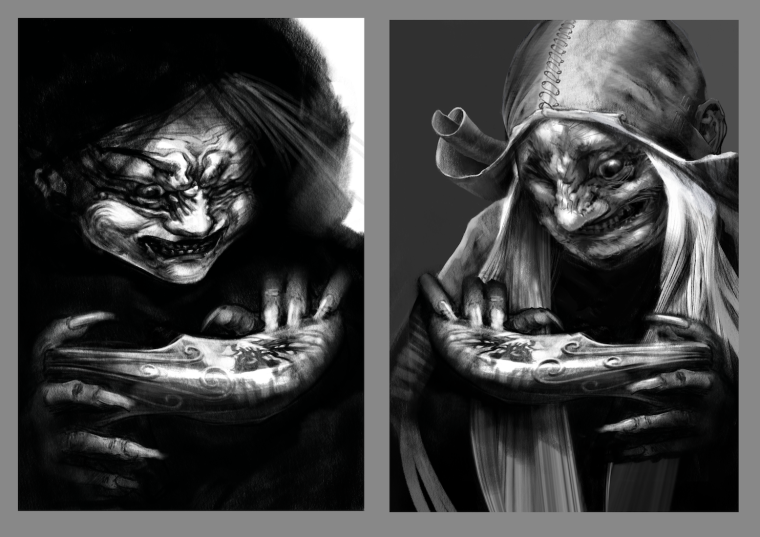
    Wicked Witch - Take Two

    Artwork
    11
    22
    2358
    Loading More Posts
    • Oldest to Newest
    • Newest to Oldest
    • Most Votes
    Reply
    • Reply as topic
    Log in to reply
    This topic has been deleted. Only users with topic management privileges can see it.
    • Kevin Longueil
      Kevin Longueil SVS OG last edited by Kevin Longueil

      It suddenly occurred to me that my Wicked Witch of the West drawing was not a very good drawing ... just hit me while looking at my portfolio site - all at once - took it down in a panic really - hard to believe i called it finished and good - i think the new one is looking better - i think also that i've lost a bit of trust in my ability to self critique though...there is still much to do on the new one - wrinkles, hair, stitching, hands..... but i feel like it is looking a lot better than the first one? Any thoughts or feedback are always very much appreciated πŸ™‚

      0_1535345685884_small Witch 2.png

      0_1535394202700_Flattened.png

      Portfolio: kevinlongueil.com
      https://www.instagram.com/kevinlongueil/

      Chip Valecek 1 Reply Last reply Reply Quote 2
      • Chip Valecek
        Chip Valecek SVS Team SVS OG @Kevin Longueil last edited by

        @kevin-longueil its definitely more creepy. I love the hat design.


        https://www.instagram.com/chipvalecek/
        https://www.facebook.com/cvalecek
        http://www.cshellmedia.com/

        Kevin Longueil 1 Reply Last reply Reply Quote 1
        • smceccarelli
          smceccarelli Pro SVS OG last edited by

          I think you're being too harsh on yourself, but I do know that feeling!
          I think the drawing technique may be better in the second, but I personally prefer the design of the first. There is something about the darkness around the face that makes it look more ominous. The hat in the second reminds me of the Dutch traditional costume and somehow ruins the effect for me (I think of tulips and windmills rather than scary witches).
          My bet would be on refining the drawing of the first one.

          1 Reply Last reply Reply Quote 1
          • Kevin Longueil
            Kevin Longueil SVS OG @Chip Valecek last edited by Kevin Longueil

            @chip-valecek Thank you for the feedback Chip!
            @smceccarelli Thank you Simona - i just looked up "Dutch traditional costume" Wow - i get it now! - Cryptomnesia is actually one of my greatest fears as an artist... i'm sure i must have seen these hats in the past but have no recollection of it.... that being said i do really like her hat (i am changing it a bit though)..... i will try to make here more ominous for sure - really appreciate the feedback!

            Portfolio: kevinlongueil.com
            https://www.instagram.com/kevinlongueil/

            1 Reply Last reply Reply Quote 0
            • Jason Bowen
              Jason Bowen SVS OG last edited by

              Your definitely progressing with your art skills!! I'm loving the creepy design.

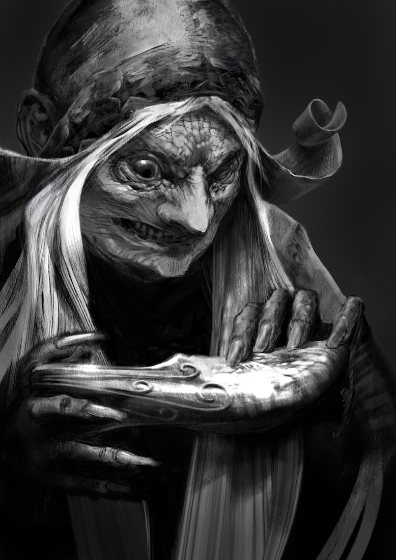
              Hope you don't mind I think there is a couple of opportunities to get some lost edges in your design. It might give you an idea πŸ™‚0_1535396336035_kevin.jpg

              https://www.instagram.com/jasonbowenoils/

              1 Reply Last reply Reply Quote 2
              • TessaW
                TessaW last edited by TessaW

                Loving the changes. The grin has a lot more personality. Additionally, I believe she's missing an eye? I think you've clarified that point better as well. While I don't think the first version is bad by any means, the update is more subtly handled. Don't be too hard on yourself! I think it's inevitable to look back on pieces and find problems, because we've advanced as artists.

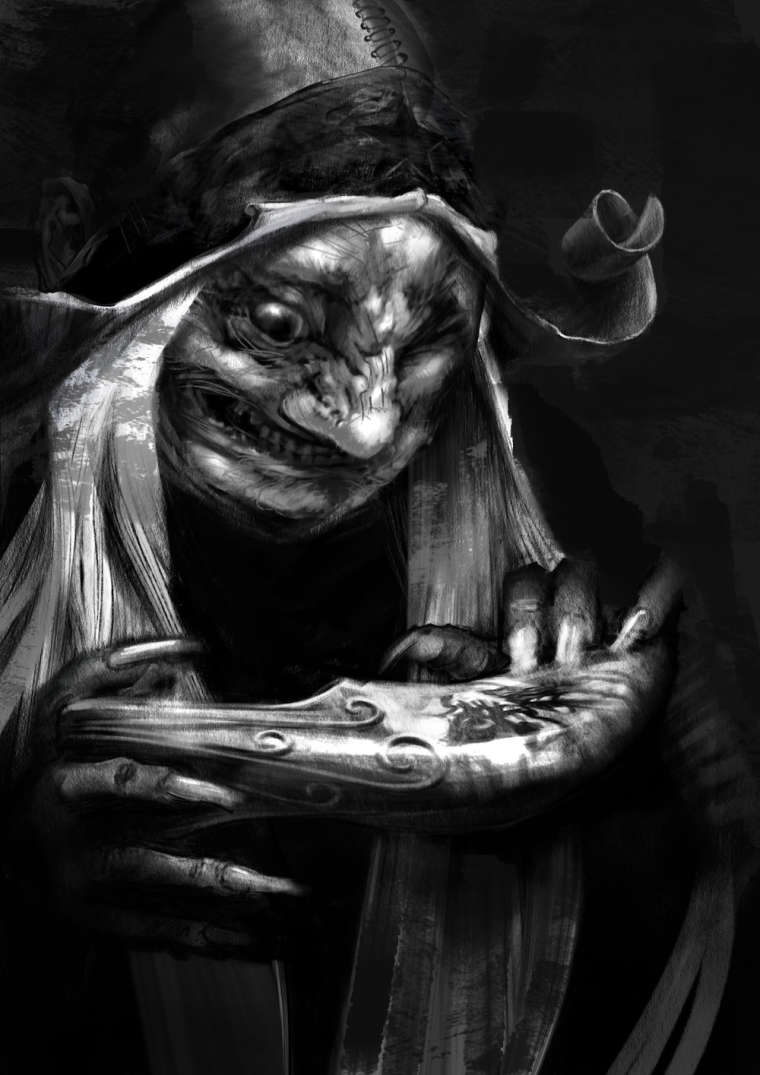
                I do like how @Jason-Bowen has given it a darker background. It helps to really focus in on the character and sells the mood of her character better.

                Well done! You've really developed a very cool rendering style.

                Website: www.tessawrathall.com

                Instagram: www.instagram.com/tessawrathall_art/

                1 Reply Last reply Reply Quote 1
                • Eli
                  Eli last edited by

                  WOW --she looks great! I actually had no problem with the first one and thought it was a cool rendering but I like the new one also. I really like the hat, it's just bizarre and looks old world and cobbled and perfect. I REALLY love the stitched leather and the star. I'm not sure how you could make her MORE ominous. She's pretty darned ominous now--ha ha! Oh my god, are those little needles or hatpins? Wow. Cool detail. I definitely think the new one goes (even) better with the rest of your Oz images.

                  1 Reply Last reply Reply Quote 1
                  • nasvikdraws
                    nasvikdraws last edited by

                    It looks amazing. Works better with the darker background from Jason. My only comment is the eye. It is a bit glazy. But maybe that was intentional. Otherwise looks great. 😎

                    www.instagram.com/nasvikdraws
                    www.facebook.com/nasvikdraws

                    1 Reply Last reply Reply Quote 1
                    • kaitlinmakes
                      kaitlinmakes last edited by

                      I think the first one definitely has character and a voice and I love it. But I can also see your progression in the second one, and it looks like the same hand made the whole image, whereas the first one is slightly disjointed between face and object.
                      So exciting to see a different and fascinating rendition of the wicked witch and I am very excited to check out and see more work in this universe.

                      https://www.instagram.com/kaitlin.kahn.art
                      Https://www.kaitlinkahn.com

                      1 Reply Last reply Reply Quote 1
                      • Kevin Longueil
                        Kevin Longueil SVS OG last edited by

                        Thank you all for taking the time to share your feedback - it is So helpful to me!! especially when feel i cannot see a piece clearly anymore -

                        @jason-bowen Thanks for the paint over and the kind words Jason! - i like a lot of what you've done to it
                        @TessaW Thank you so much for the feedback! (And thank you for the rendering style compliment too πŸ™‚
                        @Eli Thank you for taking the time to share your feedback Eli! - it is always good to hear your input πŸ™‚
                        @nasvikdraws Thank you for your feedback on this! I definitely have gone back and forth with that eye....a lot...so it is good to hear your opinion to add to the scales - thanks again!
                        @kaitlinmakes Thank you for your feedback and thoughts on this - very much appreciated!

                        Portfolio: kevinlongueil.com
                        https://www.instagram.com/kevinlongueil/

                        1 Reply Last reply Reply Quote 2
                        • SarahLuAnn
                          SarahLuAnn last edited by

                          I like your first but do think your second is improvement. I like what Jason did with adding more dark to it--I'm excited to see what you end up doing with it!

                          sarahluann.com

                          Kevin Longueil 1 Reply Last reply Reply Quote 1
                          • Kevin Longueil
                            Kevin Longueil SVS OG @SarahLuAnn last edited by

                            @sarahluann Thank you for the feedback SarahLuann! I will definitely darken the background in the final πŸ™‚

                            Portfolio: kevinlongueil.com
                            https://www.instagram.com/kevinlongueil/

                            1 Reply Last reply Reply Quote 0
                            • ArtofAleksey
                              ArtofAleksey last edited by

                              I looked at them closely and then stepped away then compared them again. It really just feels like either 2 different versions of a character or 2 characters that are part of a duo together. I can’t say if either of them are better or worse just 2 different versions of equal quality. If that makes sense. They both give me a similar feel, they have a similar pose, similar features. I can see how you added detail but unless someone is really comparing these closely, there aren’t any major differences that make me go β€œthis is definitely better” other than the switch in black and white.

                              instagram and twitter: @artofaleksey
                              alekseyillustration.com

                              Kevin Longueil 1 Reply Last reply Reply Quote 1
                              • Kevin Longueil
                                Kevin Longueil SVS OG @ArtofAleksey last edited by

                                @swordofodin Thank you for the feedback - i really appreciate it!

                                Portfolio: kevinlongueil.com
                                https://www.instagram.com/kevinlongueil/

                                Kevin Longueil 1 Reply Last reply Reply Quote 0
                                • Kevin Longueil
                                  Kevin Longueil SVS OG @Kevin Longueil last edited by Kevin Longueil

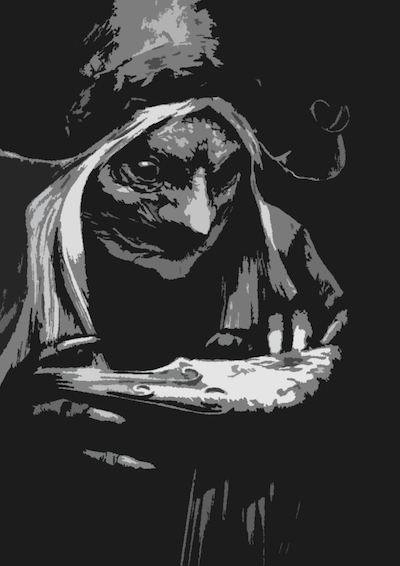
                                  I think i've made a breakthrough on the Witch's face - much more sinister - i think i was trying to keep her slightly sympathetic by having rounded forms in her features - discarding that idea is helping a lot! Still a work in progress of course but i finally am feeling good about her!

                                  0_1536176185256_Flattened 6 small.png

                                  Here it is sent through the cut-out filter in photoshop a la Lee White - set to 3 levels ...looks pretty close - maybe a bit more light around the eyes ...

                                  0_1536011082799_cuttout 3 levels.png

                                  Portfolio: kevinlongueil.com
                                  https://www.instagram.com/kevinlongueil/

                                  1 Reply Last reply Reply Quote 2
                                  • TessaW
                                    TessaW last edited by

                                    This is looking great Kevin!

                                    As a side note, I've noticed your website brings us to a landing page that says OZ and Not OZ. I wonder if this diminishes your other work by labeling it like this?

                                    Website: www.tessawrathall.com

                                    Instagram: www.instagram.com/tessawrathall_art/

                                    Kevin Longueil 1 Reply Last reply Reply Quote 1
                                    • Kevin Longueil
                                      Kevin Longueil SVS OG @TessaW last edited by Kevin Longueil

                                      @tessaw Thank you so much Tessa! I have been working on changing my website all morning - part of the feedback i got from Stephen Silver's skype mentorship was to make a landing page on my website and break up the content into a couple different pages - Oz related images on one page and my other work on the other page ...... can you think of a good way to label the two buttons? I just now changed the buttons to "oz series" and "illustrations"....do you think that might work better?

                                      Portfolio: kevinlongueil.com
                                      https://www.instagram.com/kevinlongueil/

                                      Chip Valecek 1 Reply Last reply Reply Quote 1
                                      • Chip Valecek
                                        Chip Valecek SVS Team SVS OG @Kevin Longueil last edited by

                                        @kevin-longueil I think those buttons work.


                                        https://www.instagram.com/chipvalecek/
                                        https://www.facebook.com/cvalecek
                                        http://www.cshellmedia.com/

                                        1 Reply Last reply Reply Quote 1
                                        • kaitlinmakes
                                          kaitlinmakes last edited by

                                          Please let us know when this book is available! I'd love to get a copy!

                                          https://www.instagram.com/kaitlin.kahn.art
                                          Https://www.kaitlinkahn.com

                                          Kevin Longueil 1 Reply Last reply Reply Quote 1
                                          • Eli
                                            Eli last edited by

                                            Ok, I was wrong! She CAN be more ominous!!! Phenomenal work as usual...

                                            1 Reply Last reply Reply Quote 1
                                            • First post
                                              Last post