Society of Visual Storytelling

    SVSLearn Forums

    • Register
    • Login
    • Search
    • Recent
    • Tags
    • Popular
    • Users
    • Groups
    • Search

    Music Wip- Update- Color Help

    Artwork
    29
    73
    6887
    Loading More Posts
    • Oldest to Newest
    • Newest to Oldest
    • Most Votes
    Reply
    • Reply as topic
    Log in to reply
    This topic has been deleted. Only users with topic management privileges can see it.
    • TessaW
      TessaW last edited by

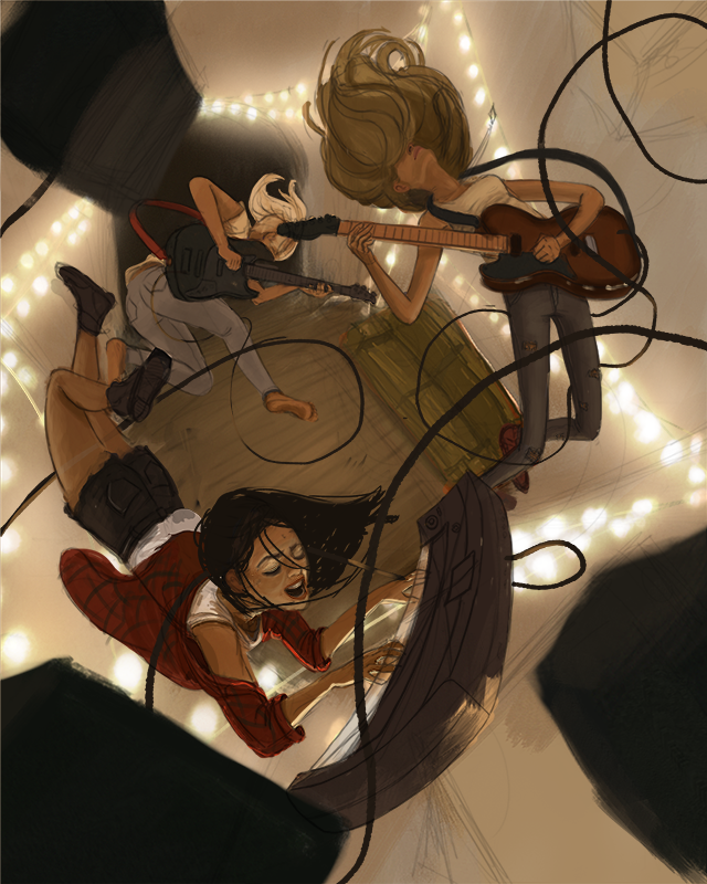
      Thanks guys! I bit more progress. I'm trying to figure out the design of the cords. Not sure if I can get this done in time.
      0_1535390408573_Music 2018 Color Final First Pass Backup copy.png

      Website: www.tessawrathall.com

      Instagram: www.instagram.com/tessawrathall_art/

      Chip Valecek Jason Bowen 2 Replies Last reply Reply Quote 12
      • Chip Valecek
        Chip Valecek SVS Team SVS OG @TessaW last edited by

        @tessaw I love watching your progress. Its going to be a great piece when you are done. One thing I would watch out for is the cord going around the neck of the keyboard player. Maybe move it lower of her back so its not going to choke her. Also the cord at the top right leads my eye of the page, maybe bring that around to the left side to keep the viewers eye moving around the piece.


        https://www.instagram.com/chipvalecek/
        https://www.facebook.com/cvalecek
        http://www.cshellmedia.com/

        1 Reply Last reply Reply Quote 1
        • Jason Bowen
          Jason Bowen SVS OG @TessaW last edited by

          @tessaw Keep going this is looking awesome!

          https://www.instagram.com/jasonbowenoils/

          1 Reply Last reply Reply Quote 1
          • kaitlinmakes
            kaitlinmakes last edited by

            Oh my gosh - this piece is awesome!

            https://www.instagram.com/kaitlin.kahn.art
            Https://www.kaitlinkahn.com

            1 Reply Last reply Reply Quote 1
            • lmrush
              lmrush Pro SVS OG last edited by

              Looks great, the lighting is amazing!

              Lisa Rush
              www.lisarushgallery.com
              www.facebook.com/ArtbyLisaRush/
              www.instagram.com/lisarush11/

              1 Reply Last reply Reply Quote 1
              • Nyrryl  Cadiz
                Nyrryl Cadiz SVS OG @TessaW last edited by

                @tessaw oh my gosh! This is Gorgeous! AMAZING!!!!! I love you color! I love your composition! I love it all!!!

                Portfolio: nyrrylcadiz.com
                Instagram: https://www.instagram.com/nyrryl_cadiz/
                YouTube: https://www.youtube.com/channel/UCbJCF1Im8ZO7hpGWTKOJMuA

                1 Reply Last reply Reply Quote 1
                • TessaW
                  TessaW last edited by

                  Thank you!

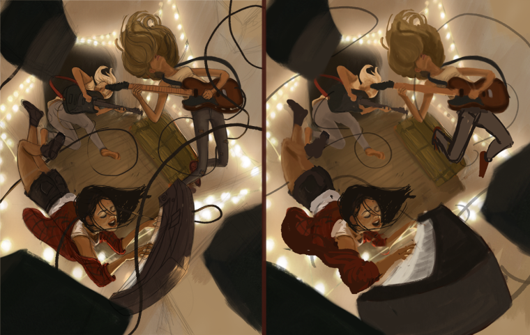
                  I had a bit of a set back. Someone on my online sketchbook suggested pushing the perspective a bit more, so I've spent some time figuring out how that would work. Thoughts? Left side is the original direction, right side is a rough lay-in of tweaked perspective.
                  0_1535490591824_Music 2018 Color Final Perspective change.png

                  Website: www.tessawrathall.com

                  Instagram: www.instagram.com/tessawrathall_art/

                  Kevin Longueil 1 Reply Last reply Reply Quote 3
                  • KathrynAdebayo
                    KathrynAdebayo last edited by

                    It's awesome that you're up for experimenting with new ideas throughout the process of making this piece. I learn so much from people who take suggestions to heart. Personally, I think your original image looks more cohesive. The perspective in the piece is already very dynamic, to my eye, because of the environment. Having the musicians as a separate middle ground seems to let my mind settle in and enjoy the piece. With the keyboard becoming more of a foreground element, I think it draws the eyes to the other foreground objects (speakers) which actually aren't as important. Some thoughts to consider. đŸ™‚

                    1 Reply Last reply Reply Quote 2
                    • Kevin Longueil
                      Kevin Longueil SVS OG @TessaW last edited by

                      @tessaw I think it will be great whichever way you go but i do like the original of the two - forced perspective is a cool thing for sure - i think though that it becomes an extra element in a way which invites scrutiny beyond the composition itself - i find myself looking at the scale of a thing in the foreground and comparing it to the background...the edge of the keyboard closest to us is about four time as long as its' other edge...to me it seems like a dramatic change over a short distance but nothing else is quite following this rule - it is probably just me over thinking it though but the first one did not make me wonder about consistency of perspective and it looks really awesome - super nice piece!!

                      Portfolio: kevinlongueil.com
                      https://www.instagram.com/kevinlongueil/

                      1 Reply Last reply Reply Quote 2
                      • kylebeaudette
                        kylebeaudette last edited by

                        It's soooo good. Love the string lights!

                        Instagram- www.instagram.com/kyle_beaudette/
                        Www.twitter.com/kylebeautweet
                        Www.etsy.com/shop/Artofkylebeaudette
                        https://youtube.com/@kylebeaudette?si=ComtMDsVyK1HPn55

                        1 Reply Last reply Reply Quote 1
                        • Jason Bowen
                          Jason Bowen SVS OG last edited by

                          I personally prefer the original.

                          https://www.instagram.com/jasonbowenoils/

                          1 Reply Last reply Reply Quote 1
                          • Nyrryl  Cadiz
                            Nyrryl Cadiz SVS OG last edited by Nyrryl Cadiz

                            I agree. The first version looks better. However, i do like how the front guitarist’s leg is positioned in the new version than the previous.

                            Portfolio: nyrrylcadiz.com
                            Instagram: https://www.instagram.com/nyrryl_cadiz/
                            YouTube: https://www.youtube.com/channel/UCbJCF1Im8ZO7hpGWTKOJMuA

                            1 Reply Last reply Reply Quote 3
                            • bnewman
                              bnewman last edited by

                              Late to the party. As usual. This is super cool! I agree that the original is looking best but also agreeing with @nyrrylcadiz that the legs of the front guitarist is best in version 2.

                              1 Reply Last reply Reply Quote 1
                              • W-Coats
                                W-Coats last edited by

                                Great concept and you are working it out so well. As far as the two versions they are both good the keyboard is coming out at us (IMHO) is an improvement. Good work Tessa this composition is starting to sing!

                                Will Coats
                                http://willcoatsart.com/
                                https://www.scbwi.org/members-public/william-coats
                                https://www.behance.net/willcoats7c247
                                https://www.instagram.com/willcoatsart/

                                1 Reply Last reply Reply Quote 1
                                • theemkat
                                  theemkat last edited by

                                  Those lights are so beautiful! This whole piece is done so well. I'd have echo a few others and say I like the first version the best, but with the guitarist's legs in version 2.

                                  1 Reply Last reply Reply Quote 1
                                  • lmrush
                                    lmrush Pro SVS OG last edited by

                                    I agree with @nyrrylcadiz I like the original, but really like the guitarist's leg positioning in the second đŸ™‚

                                    Lisa Rush
                                    www.lisarushgallery.com
                                    www.facebook.com/ArtbyLisaRush/
                                    www.instagram.com/lisarush11/

                                    1 Reply Last reply Reply Quote 1
                                    • Eli
                                      Eli last edited by

                                      Another vote for the first version

                                      1 Reply Last reply Reply Quote 1
                                      • First post
                                        Last post