Society of Visual Storytelling

    SVSLearn Forums

    • Register
    • Login
    • Search
    • Recent
    • Tags
    • Popular
    • Users
    • Groups
    • Search

    Character Design - Feedback Welcome

    Artwork
    37
    47
    4488
    Loading More Posts
    • Oldest to Newest
    • Newest to Oldest
    • Most Votes
    Reply
    • Reply as topic
    Log in to reply
    This topic has been deleted. Only users with topic management privileges can see it.
    • kaitlinmakes
      kaitlinmakes last edited by

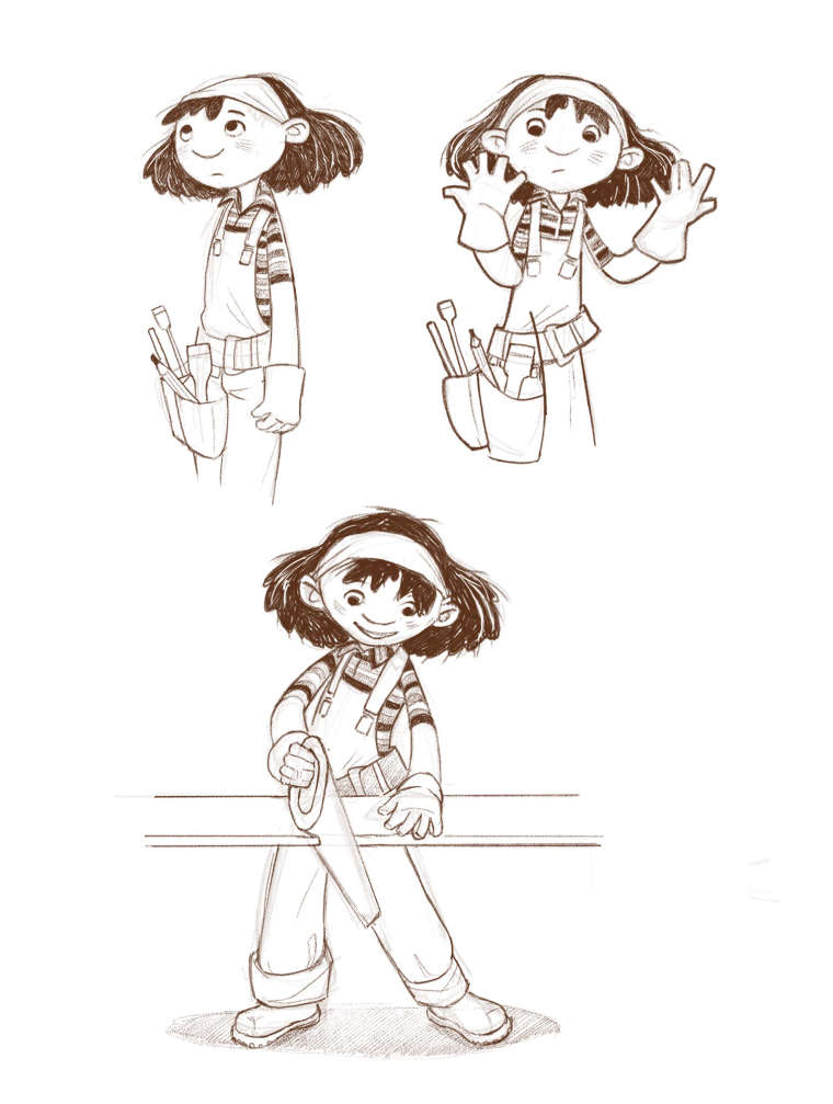
      Number 1 - she just looks so smart and determined! But they all have wonderful charm.
      If the clientele is so young, is it best to go with a more simplistic version like number 6?

      https://www.instagram.com/kaitlin.kahn.art
      Https://www.kaitlinkahn.com

      1 Reply Last reply Reply Quote 1
      • markoman
        markoman last edited by

        number 3

        https://markomancic.weebly.com/
        https://www.facebook.com/marko.mancic.9
        https://www.instagram.com/markomancic11/

        1 Reply Last reply Reply Quote 1
        • demotlj
          demotlj SVS OG last edited by

          Clearly from the diversity of opinions, you are going to have to write 6 books or give your character five friends! I love them all.

          Laurie DeMott
          instagram.com/demotlj

          1 Reply Last reply Reply Quote 1
          • K
            Kat SVS OG last edited by

            I like #5 the best. Love the hair!

            1 Reply Last reply Reply Quote 1
            • smceccarelli
              smceccarelli Pro SVS OG last edited by

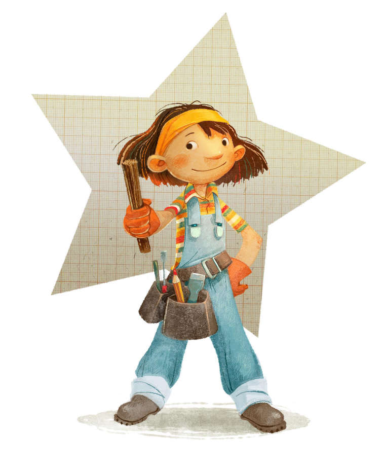
              Thank you all so much for the great feedback and comments! That made the next step so much easier. So I went for 5 but bringing in elements of 3 and 6. Here is a color (final) version, a couple of sketches and one sample spread I'm probably going to bring to finish....if I manage in the time left.
              Obviously I don't have a lot of time to incorporate any feedback, but if you see glaring opportunities for improvement, let me know!
              Ah, the stick she's holding is sort of the core of the story πŸ™‚

              0_1535472996316_FIONA_COLOR.jpg
              0_1535473021285_FIONA_CHARACTER.jpg
              0_1535473065946_SAMPLESPREAD.jpg

              1 Reply Last reply Reply Quote 14
              • TessaW
                TessaW last edited by

                Love it! Thanks for sharing it here. πŸ˜ƒ

                Website: www.tessawrathall.com

                Instagram: www.instagram.com/tessawrathall_art/

                1 Reply Last reply Reply Quote 1
                • ScribblesByMike
                  ScribblesByMike last edited by

                  3 and 6 were my top choices but i love what you've done to get the final result. She looks great!

                  Strange things are afoot at the Circle K!

                  Portfolio: www.scribblesbymike.com
                  Instagram: www.instagram.com/mikehartigan
                  Twitter: www.twitter.com/mikehartigan
                  Facebook: www.facebook.com/cartoonsbymike
                  Tumblr: www.tumblr.com/blog/mikehartigan

                  1 Reply Last reply Reply Quote 1
                  • ArtofJoseGalue
                    ArtofJoseGalue last edited by

                    This post is deleted!
                    1 Reply Last reply Reply Quote 0
                    • chrisaakins
                      chrisaakins last edited by

                      I really like it. She looks like a hard worker and super smart. I still miss the freckles, though. I look forward to seeing what you do with your story.

                      Chris Akins
                      www.chrisakinsart.com
                      www.instagram.com/chrisakinsart/

                      1 Reply Last reply Reply Quote 1
                      • smceccarelli
                        smceccarelli Pro SVS OG last edited by

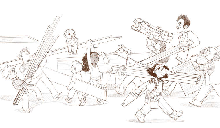
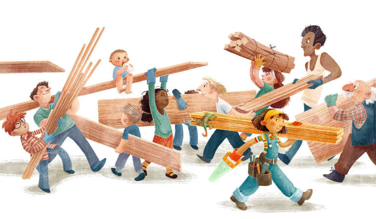
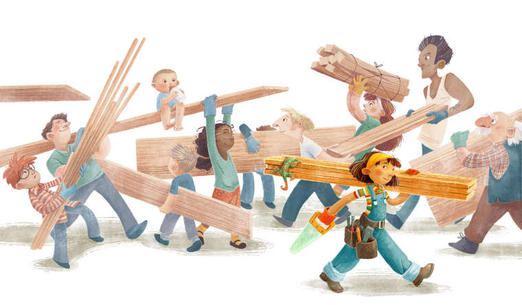
                        Last update and last piece of feedback: which version would you use? It's only slight changes in the BG vs FG balance.
                        0_1535572915506_SAMPLESPREAD_V1_SMALL.jpg
                        0_1535572965723_SAMPLESPREAD_V2_SMALL.jpg
                        0_1535572984265_SAMPLESPREAD_V3_SMALL.jpg

                        juliepeelart ArtofJoseGalue Jabbernewt LauraA 4 Replies Last reply Reply Quote 3
                        • NoWayMe
                          NoWayMe last edited by

                          The first or last one! Or maybe an in-between ? I like that the BG is pulled back on the first two although in the second one I feel it's definitely too much. The first one is better, but maybe still a tad too much ? Or maybe the FG character is a little too saturated..

                          I love what you came up with for the character! I was too late for the pool, but my pick were also 5 and 3. I love how it turned out!

                          noemiegionetlandry.squarespace.com
                          noemie_illustration on Instagram

                          1 Reply Last reply Reply Quote 0
                          • juliepeelart
                            juliepeelart SVS OG @smceccarelli last edited by

                            @smceccarelli This is fantastic! I love the way you are able to capture so many expressions and people. I like 1 and 3, but it really depends on the story you are telling. To me the first one emphasizes the main character. She is headed off page and seems to have her own idea, and maybe a better idea of what to do than the others. The third shows that she is working together with all of these other people. It is a fun jumble. My kids would have a great time noticing what each person is doing in that one.

                            www.juliepeelart.com
                            www.instagram.com/juliepeelart/
                            www.facebook.com/juliepeelart/
                            www.facebook.com/Wundersplat/
                            www.wundersplat.com

                            1 Reply Last reply Reply Quote 0
                            • A
                              aaimiller last edited by

                              Can you fade out the background just behind her? So it's like #1 behind her, and a little lighter than #3 for the rest?

                              The contrast is very improtant to identify the MC. If this were in the middle of a book, #3 would be fine. At the beginning #1 or #2.

                              1 Reply Last reply Reply Quote 0
                              • Jason Bowen
                                Jason Bowen SVS OG last edited by

                                I like #2 πŸ‘

                                https://www.instagram.com/jasonbowenoils/

                                1 Reply Last reply Reply Quote 0
                                • ArtofJoseGalue
                                  ArtofJoseGalue @smceccarelli last edited by

                                  @smceccarelli definitely number 2, the muted background helps me find the focus of the piece

                                  1 Reply Last reply Reply Quote 0
                                  • Jabbernewt
                                    Jabbernewt @smceccarelli last edited by Jabbernewt

                                    @smceccarelli Really depends on what you mean to emphasisze here. For example, if you mean to emphasize the character and her individuality, I might pick two because she's nicely singled out. If the narrative was more, "just like anyone else," I think I might pick 1 because it's a nice balance between the contrast of 2 and the busyness of 3. 3 is just too similar from background to foreground for me to say it'd be good to use besides maybe the inside cover of the book or something, where the character is already recognized as important, and can be found by the observant reader πŸ™‚

                                    Pax

                                    1 Reply Last reply Reply Quote 0
                                    • Gary Wilkinson
                                      Gary Wilkinson last edited by

                                      I like the 2nd one, although I think the girl is a little too over saturated and perhaps the hues are a touch too yellow in her face which is causing issues by having the yellow planks behind her. Maybe if the bandana was a different colour that may help that issue though. Of course as @Jabbernewt said the choice is based on what, or who you want to emphasis, but if it's the girl then I would say the 2nd one. It's beautifully done though and it's always great seeing your working process πŸ˜ƒ

                                      www.garywilkinsonart.com
                                      www.instagram.com/gwillustration/
                                      www.twitter.com/GWillustration

                                      1 Reply Last reply Reply Quote 1
                                      • Nyrryl  Cadiz
                                        Nyrryl Cadiz SVS OG last edited by

                                        I like the first one. It just has the right amount of saturation. The girl is saturated while the background characters are slightly desaturated but not to the point that makes our protagonist to stand out like a sore thumb. That’s what i feel is happening in image 2 the girl looks too saturated compared to the other characters that she feels out of place. While #3 is just too saturated over all that I don’t know where to focus. Definitely go with #1. I hope this helps. Thanks!

                                        Portfolio: nyrrylcadiz.com
                                        Instagram: https://www.instagram.com/nyrryl_cadiz/
                                        YouTube: https://www.youtube.com/channel/UCbJCF1Im8ZO7hpGWTKOJMuA

                                        1 Reply Last reply Reply Quote 1
                                        • LauraA
                                          LauraA SVS OG @smceccarelli last edited by

                                          @smceccarelli Number 1 gets the balance really well. Love all the variations in characters in this piece!

                                          Instagram: https://www.instagram.com/lauraintorino/
                                          http://lauraaldersonart.com/

                                          1 Reply Last reply Reply Quote 0
                                          • First post
                                            Last post