Society of Visual Storytelling

    SVSLearn Forums

    • Register
    • Login
    • Search
    • Recent
    • Tags
    • Popular
    • Users
    • Groups
    • Search

    Ruined forest critique request

    Artwork
    7
    16
    1106
    Loading More Posts
    • Oldest to Newest
    • Newest to Oldest
    • Most Votes
    Reply
    • Reply as topic
    Log in to reply
    This topic has been deleted. Only users with topic management privileges can see it.
    • Chip Valecek
      Chip Valecek SVS Team SVS OG @braden H last edited by

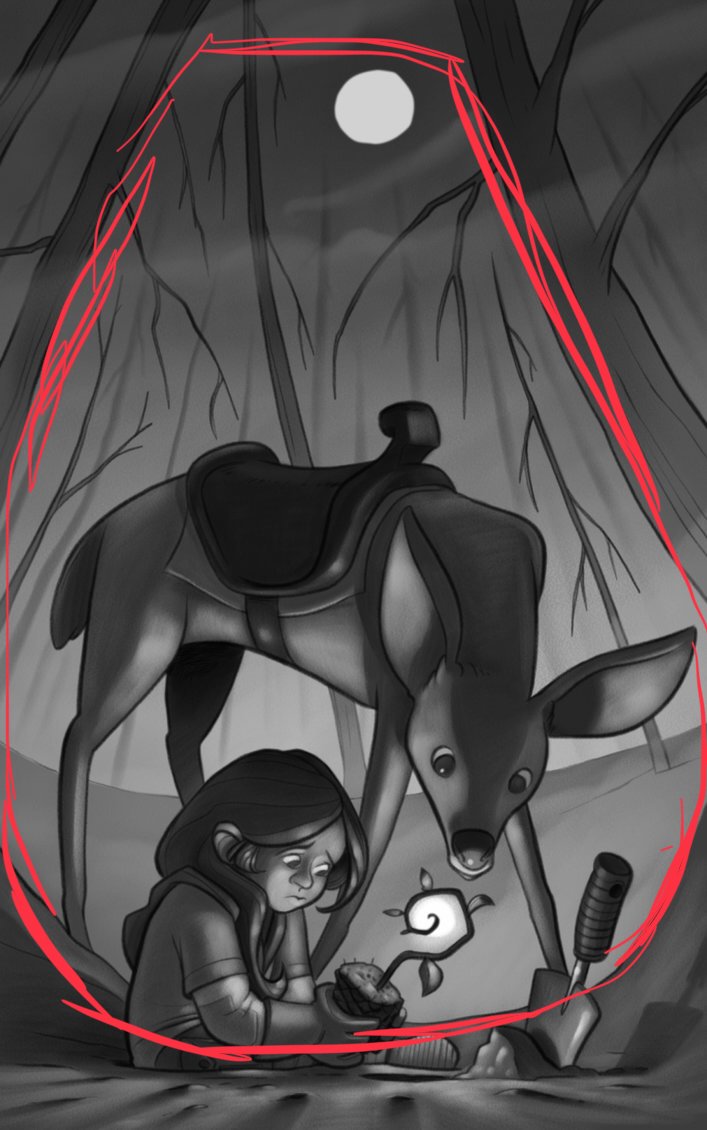
      @art-of-b I think if you made the whole plant stem have a glow it would read more as the plant is glowing. Right now it looks like there is a ball of light behind the plant. I think the lighting on the girl and deer are spot on.


      https://www.instagram.com/chipvalecek/
      https://www.facebook.com/cvalecek
      http://www.cshellmedia.com/

      braden H 1 Reply Last reply Reply Quote 4
      • bnewman
        bnewman last edited by

        Yes it does. It's sad and lovely. Also, what Chip said, it does look like a ball that fits into that space a bit too neatly. For what it's worth, I like this style a lot.

        1 Reply Last reply Reply Quote 1
        • Gary Wilkinson
          Gary Wilkinson last edited by

          I think it works well and the style looks great and consistent with your other pieces. I think the moon could perhaps be a little dimmer and some of the cast shadows from the characters should be stronger (judging by the value of the shadows from the stones), but i'm sure it will come along nicely!

          www.garywilkinsonart.com
          www.instagram.com/gwillustration/
          www.twitter.com/GWillustration

          braden H 1 Reply Last reply Reply Quote 1
          • Nyrryl  Cadiz
            Nyrryl Cadiz SVS OG last edited by Nyrryl Cadiz

            This too adorable and saddening at the same time. The emotions just flow out of the image. Are you planning to color it? I canโ€™t wait. Your work would look great in middle grade books or graphic novels or animations!

            Portfolio: nyrrylcadiz.com
            Instagram: https://www.instagram.com/nyrryl_cadiz/
            YouTube: https://www.youtube.com/channel/UCbJCF1Im8ZO7hpGWTKOJMuA

            braden H 1 Reply Last reply Reply Quote 1
            • A
              aaimiller last edited by

              Howdy!

              As others have mentioned, the values on the girl and deer work perfectly.

              The background does look like night to me. It look like the moon is high on a kinda misty night.

              I think for it to look more overcast / foggy there would be a lot more scattering light in the top of the image. Maybe obscure the moon a little more (like we are look up through the fog more, usually there is a little halo / corona glow looking at bright things through fog), and lighten the top of the sky a bit, to show all the scattering light.

              braden H 1 Reply Last reply Reply Quote 1
              • ArtofAleksey
                ArtofAleksey last edited by

                This looks great overall. Ive been trying to do a thing with my art where I dont put anything in if it doesnโ€™t have a purpose being in the final piece. Itโ€™s very hard. But if I use that filter for yours I would say you can use the trees and their branches to frame the shot. Like branches above where the moon is, overlapping, in black silhouette. Kinda so they form a frame around the moon and the characters. You already have the ground curvig in a way that forms the bottom frame for your characters. I would curve a few (only a few) branches on the top of the image to create a top frame (or you can make it angular branches if you want it to have a spookier vibe.

                instagram and twitter: @artofaleksey
                alekseyillustration.com

                braden H 1 Reply Last reply Reply Quote 0
                • ArtofAleksey
                  ArtofAleksey last edited by

                  This is what I mean by frame
                  0_1535638910102_075419F6-91C1-4B2C-B02C-15D12EB25E80.jpeg

                  instagram and twitter: @artofaleksey
                  alekseyillustration.com

                  1 Reply Last reply Reply Quote 0
                  • braden H
                    braden H @Chip Valecek last edited by

                    @chip-valecek

                    That's a great idea, Chip. I think that's what I'll do!

                    1 Reply Last reply Reply Quote 0
                    • braden H
                      braden H @Gary Wilkinson last edited by

                      @gary-wilkinson

                      Awesome. Thanks for taking a look. I agree that the shadows need to be a little stronger. More contrast better.

                      I'm hoping that with colour the background will look more like a warm smoky haze, (thick thick forest fire smoke) but I may just make it a night scene ๐Ÿ™‚

                      1 Reply Last reply Reply Quote 0
                      • braden H
                        braden H @Nyrryl Cadiz last edited by

                        @nyrrylcadiz

                        Yup, I'm planning on colouring it ๐Ÿ™‚

                        1 Reply Last reply Reply Quote 0
                        • braden H
                          braden H @aaimiller last edited by

                          @aaimiller

                          Awesome advice. Thanks for the feedback ๐Ÿ™‚

                          The halo around the sun through the haze is a great idea.

                          I tried to take reference photos during the thick forest fire smoke where I live, but the poor camera on my phone wasn't up to it. I'm stuck trying to pull reference out of my head (which never really works)

                          1 Reply Last reply Reply Quote 0
                          • braden H
                            braden H @ArtofAleksey last edited by

                            @swordofodin

                            Great feedback, thank you ๐Ÿ™‚

                            Making sure there's nothing that doesn't belong in the final piece IS super hard. I'll try adding some branches to frame the piece a little more. However, I want to keep most (if not all, I may fix a couple) of the branches drooping sadly and mostly pointing at the girl and the deer.

                            I'm willing to bet I can both frame the girl and keep all the branches sad, though.

                            ArtofAleksey 1 Reply Last reply Reply Quote 1
                            • ArtofAleksey
                              ArtofAleksey @braden H last edited by

                              @art-of-b oohhh I see what you mean. Youโ€™re doing the branch droop deliberately.

                              instagram and twitter: @artofaleksey
                              alekseyillustration.com

                              braden H 1 Reply Last reply Reply Quote 2
                              • braden H
                                braden H @ArtofAleksey last edited by

                                @swordofodin

                                Yiss, but that doesn't mean I can't do branch droop and the framing you suggested ๐Ÿ™‚

                                ArtofAleksey 1 Reply Last reply Reply Quote 1
                                • ArtofAleksey
                                  ArtofAleksey @braden H last edited by

                                  @art-of-b droop away. Curious to see how you do it ๐Ÿ˜ƒ

                                  instagram and twitter: @artofaleksey
                                  alekseyillustration.com

                                  1 Reply Last reply Reply Quote 0
                                  • First post
                                    Last post