Fall -- WIP
-
I love this piece.
")
-
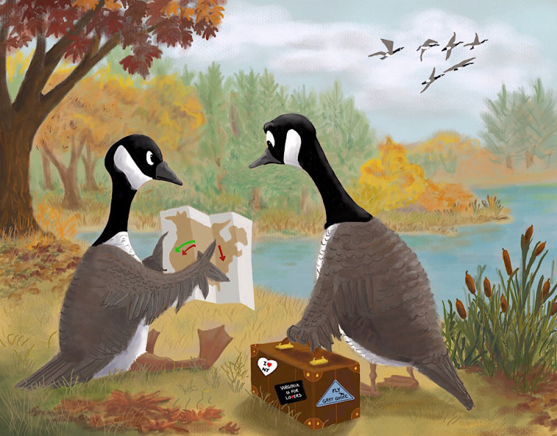
I think this is the final version unless someone sees something that needs to be fixed. Thanks for everyone’s help.
Laurie DeMott
instagram.com/demotlj -
@demotlj Wow this is such a great piece! I love your style, the colors and painterly look of the background remind me a lot of impressionism and it's really well done!
I see a few really simple things that you could do to take this piece to the next level, I hope you don't mind but I tweaked it a bit in Photoshop to show you what I mean:
Here's what I did:
-
Added atmospheric perspective. That's the way colors will change depending of how close or far they are. The closer to us, the more saturated and bright they'll be. The closer to the sky, the more they'll start to fade into the color of the sky. In your image, all three levels has pretty similar colors which was flattening it a bit. I picked the colors of the sky and applied it in transparency over your background island. Then I desaturated a little bit the yellow in the middle island, and on the opposite I saturated more the foreground where the geese are.
-
Tweaks to the shadows. I noticed the light source is a little bit inconsistent in your painting. The goose on the right has the clearest shadow, from in front of him, but the case he's holding has shadow from the right and none of the other surroundings has any defined shadows to help us. I shaded the ground under the case, the goose on the left and the tree to all follow the same direction. Darkened the shadows in general so they're a bit more pronounced. Added the shadow of the middle island in the water. And finally, added a little bit of shadow on the case and geese that's consistent with that light source.
I hope that helps! I do think it's a wonderful image even as is without changes
Great job!vanessastoilova.com
instagram.com/vanessa.stoilova/Check out my Youtube channel for tips on how to start your career in illustration! www.youtube.com/c/ArtBusinesswithNess
-
-
@nessillustration These are great changes. I'm still trying to figure out both color and shadows and your tweaks really help. I'll play with it a bit more to see if I can do what you have suggested. Thanks.
-
@demotlj I think this looks really nice with all the detail you have added. The composition is really good. I love the idea of the piece, too. It reminds me of one of those Far Side scenarios. I imagine the captions to be "When nature does not give you good instincts."
-
@chrisaakins I posted this to my Facebook feed and my family started submitting captions too, but I like yours the best!
-
@nessillustration I added some of the changes you suggested to my final piece but changing saturation levels proved hard because my layers were not arranged in a way that made that super easy (and I’m working in Procreate.) Next time I’m going to think about and arrange layers as foreground, midground, and background to try to pay more attention to those changes in saturation. Great tip — thanks so much.
Laurie DeMott
instagram.com/demotlj -
@demotlj That's too bad, but the piece will be really great anyway
vanessastoilova.com
instagram.com/vanessa.stoilova/Check out my Youtube channel for tips on how to start your career in illustration! www.youtube.com/c/ArtBusinesswithNess
-
@nessillustration I was thinking more about the saturation levels and have a quick question for you: because the foreground is in the warm tones, how do you keep the saturation level higher without detracting from the main characters who are cool in tone? I've already posted this piece and am not going to fiddle with it any more but for future reference, I'd like to understand better how to balance value, saturation, and focal points especially in a painting where the focal point is in cool colors. What advice would you give there?
-
It really depends on a piece by piece basis, there's just so many scenarios that it's difficult to give a clear cut answer... In general though, one way you can get attention on your main focal point is through contrast. So on this piece I find that the contrast between the warm colors on the foreground and the colder tones or the geese makes them stand out and works to your advantage - and then the further you go to the background, the less contrast and details you put. If you're worried about putting too much emphasis on something non important, take a step back and look at your picture smaller, trying to figure out what areas attract the most attention. Your biggest contrast on this piece is the black against white on the geese's faces - this works to your advantage because that's a good focal point for this piece.
And then, without the changes that I made one of the other points that really attracts attention in the yellow foliage on the middle ground. This isn't so important, which is why I desaturated it a bit in my version But I don't think the warm colors on the foreground are a problem!vanessastoilova.com
instagram.com/vanessa.stoilova/Check out my Youtube channel for tips on how to start your career in illustration! www.youtube.com/c/ArtBusinesswithNess
-
@nessillustration Thanks for your answer. Just since joining SVS a year ago, I've gotten better at understanding values but feel like my new hurdle is warm and cool. What you've described helps.