Fall contest - WIP (feedback requested)
-
Hi All,
I thought I'd do a last minute submission for the Fall contest, esp. since it feels like I've fallen off the face of the earth for the past few months. Would love your thoughts/preferences on my 3 thumbnail sketches, esp. regarding composition and concept. And if you don't like any, that would be interesting for me to know, as well.
Thanks in advance for looking:)
Johanna
-
A! So freaking cute!
-
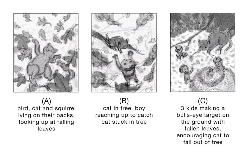
I think the third composition has a nice pattern of darks and lights. Just make sure that as you progress, the distance between the cat and everything below is clear, i.e., lots of depth perception cues. I know these are just thumbnails and that thumbnails often flatten everything out, but at the moment the cat feels not very far off the ground, and since the whole concept depends on how high up the cat is, it's important to feel the difference strongly.
As a sheer concept, I rather like the first one!
Welcome back and good luck finishing quickly!
-
Wow, they are all great! I think it depends on what you want to focus on. From the composition and story telling perspective I love C, but I think Laura is right, need to make the distance between the top and the bottom clear. I love A because it looks cute and sweet.
Good luck")
-
I would have to go with C. I like the camera angle you have on it.
-
C looks the best to my eye compositionally
-
@johanna-kim Thanks so much, @Kelly-Lane @Chip-Valecek @lenwen @LauraA @kaitlinmakes ! Looks like C is the clear winner, and yes (thanks, @LauraA) I'll make sure to have more value differentiation between foreground and background. I'll also keep sharing my progress steps, and would love your feedback as I move forward.
-
I love C. Reminds of when I was a kid and I was trying to talk my own kitten down from a tree. Of course, mine decided to break her fall with my face. Hahaha. Maybe a pile of leaves would have been better.
-
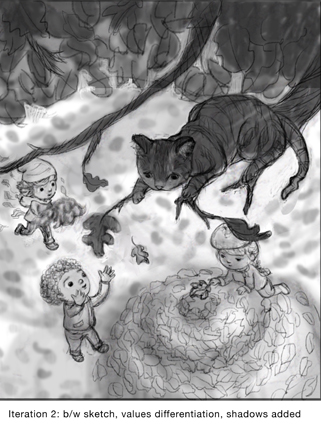
@johanna-kim Here's iteration #2 with the characters and values a bit more defined. Color study next.
-
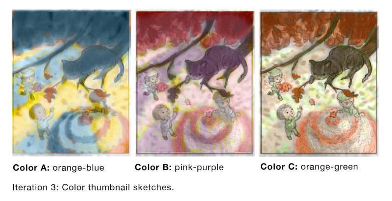
@johanna-kim Hey All, would love to know which color thumbnail resonates the best for you. Thanks in advance for your feedback.
-
@johanna-kim Revisited my b/w sketch composition and made further changes. Here's the before (left) and after (right).
The new version does the following:
-combines the two big branches above to one branch to support the cat and simplify the composition a bit.
-The cat's tail is less crooked, more soft looking to distinguish it from the branches.
-The girls are engaging with each other now.
-The central falling leaves have been replaced with leaves on the sides so that the boy is more clearly gazing at the cat and not at the falling leaves.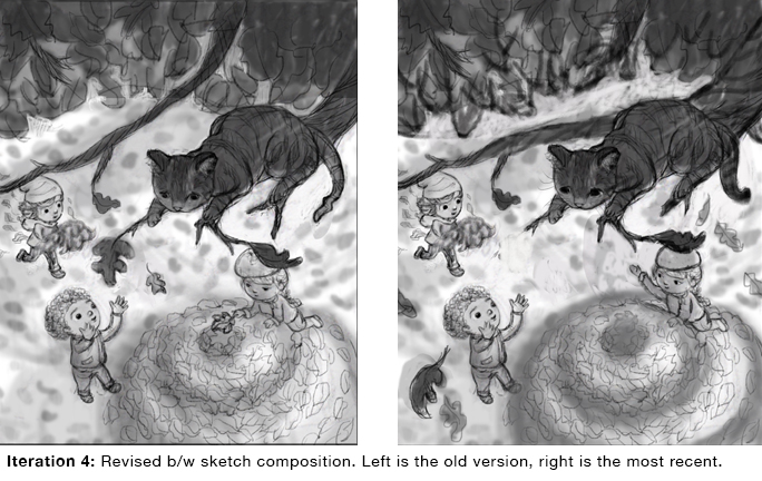
-
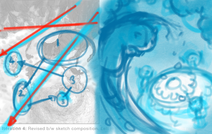
@johanna-kim Great work on this Johanna, you chose the concept I would have probably voted for if I was earlier
I know time is running out, but I think the viewpoint and composition can be improved upon. The topic of your scene is about being guided to a destination and to me it feels like you need a composition that can do that.
As I see it, the angle of the branch with the cat on is cutting the composition diagonally in quite a straight and 50/50 cut, making the viewer's eye go from the top right to bottom left. The upper half of the triangle is quite empty so everything of importance is along that diagonal or in the bottom right and they are all wanting my attention. Instead of my eyes being guided I feel like that are being pulled by each object you have in the scene (I've numbered the things that I begin to focus on) and the bullseye doesn't feel such an important part of the scene, whereas it should probably be one of the leading parts.
I hope you don't mind by I did a quick sketch over for how I would tackle this scene (i'm not saying it's the right way, but just another way to look at it. With this composition, the angle of the cat and the branch is suppose to guide us to the stack of leaves and the children and placed around it emphasis the target in the middle. My look at it is far from perfect, but I hope it can be of some help
-
For color I like A - the blue really makes the orange of fall POP! I think it'll work too if you move forward with @Gary-Wilkinson 's suggestion.
You are just zooming through this! -
@johanna-kim I like color A.
-
@johanna-kim I like color A!
-
@gary-wilkinson Thanks so much for your notes and drawover regarding composition. I always learn so much from your feedback and totally see what you mean. The reason I kept the upper half empty was because I was pretending that this would be a cover for a magazine like Cricket or Spider. However, I love the fix that you've presented and will definitely re-work it. Again, I feel a bit like I'm cheating by using your composition solution, but hopefully, I'll be able to improve my composition for the next one.
-
@johanna-kim Thanks @lenwen @Chip-Valecek @kaitlinmakes for your color votes and sticking with me through this process. This last minute submission is going to be a rush job, but I figured that I can sleep in October. (Oh wait, I'm doing Inktober! Ack.)
-
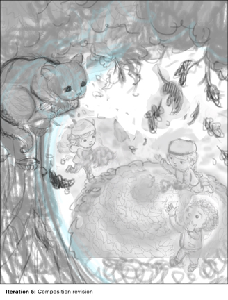
@johanna-kim Here's the latest composition fix (quite rough, but I can read it:). Running out of time, so jumping into the final drawing stage.
-
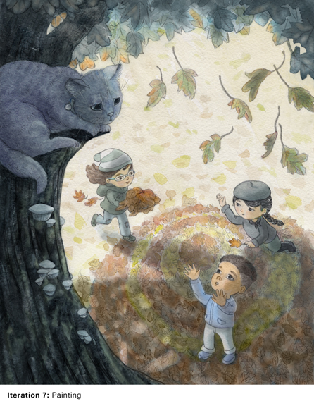
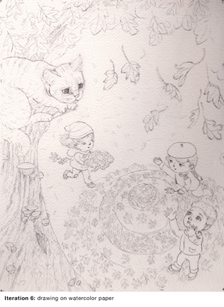
@johanna-kim Drawing on watercolor paper. Done. Feedback is welcome and appreciated at any stage of this process.
I drew a ton of leaves, and then realized that they messed with my values too much and I'd have to end up re-drawing them again, which would be painful. I know there's a way to suggest a lot of leaves, but I actually enjoy drawing each one. That said, my goal is to achieve something in the middle, and let the paint suggest most of the leaves. This is the point, the painting stage, where I make every possible excuse not to start. Like that fact that I haven't eaten lunch yet... <stomach grumbles>
-
@johanna-kim Here's the painting (watercolor/digital). I'm going to step away for a few hours and see if there are any glaring issues. As always, any feedback from fresh eyes are welcome.