WIP - Watercolor
-
Since several people agreed it's OK for me to post traditional work that's not strictly illustration....
")
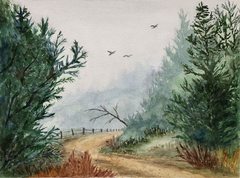
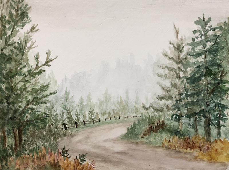
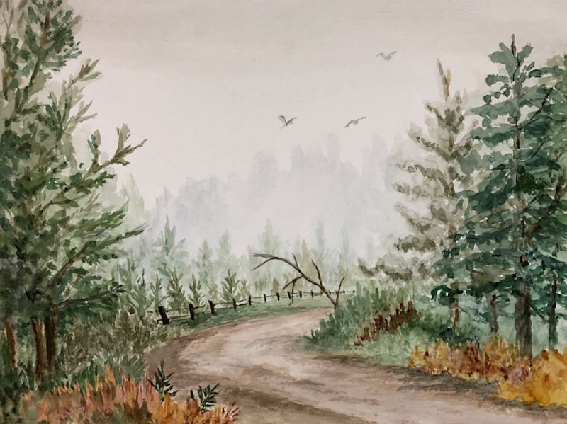
I've been working on turning a scene I did digitally into watercolor. The first painting is one I did on Arches 140 lb paper, and the second is the same scene, not finished yet, that I am doing on canvas prepared with gesso and watercolor ground (just because I wanted to try it). On the second painting, I decided to tone down the colors to be more neutral. My question is two fold:
- Do you prefer the more vivid colors of the first or the more neutral colors of the second?
- Do children's books generally use more vivid colors or does it entirely depend on the subject?
I realize it's hard to completely compare since I haven't finished the second but I wanted to ask now while I can still change the second and add more saturated color if you think that works better.
Laurie DeMott
instagram.com/demotlj -
@demotlj These are excellent! I do like the first, but I think that's mostly due to it being finished. I love the composition and the finishing touches like the birds. Once you complete the second it will be an interesting comparison. It's hard to say since they have different moods and the different saturation and colors imply different time of day/year. I think it's personal preference and whatever is right for what you are trying to say.
As far as children's books go, it depends on subject matter, demographic, and genre. Certain books do have really bright colors and lend to a very high energy, playful atmosphere, but some do have more grays and muted tones (look at Lisbeth Zwerger or Jerry Pinkney's work. They have a good balance of both imo). While I do like vibranct, I am fond of muted colors as well, since it makes things seem more moody and emotional, but I think it comes down to what you are trying to say with the piece.
More, more, more! I love your handling of the trees!
-
@teju-abiola Thanks for the encouragement. I'll definitely post the second when I finish it (which will probably have to wait until after Thanksgiving now. Darn holidays -- they get in the way of painting
) -
I really like the second one! But I think that's because I like looser watercolor, sketchier, where the spontaneity of the medium really shines
So to me, the first one looks overworked but I know that's just my personal preference! I've seen both saturated and muted colors in children's book so I don't thinks that's a problem. I have to admit though, I don't think realistic watercolors are very common in children's book nowadays, it's certainly more vintage feeling! In fact, right now I'm doing tests for a editor who's having me try to revamp one of their long-running series with my style to give it a more modern look, and their original look is in fact in watercolors.. -
I prefer the first one looks great.
-
@demotlj those are beautiful. As far as coloring, they just look like different times of day. I think they are both strong. I do prefers the second one, but that’s just a personal preference. I have no clue about what publishers are looking for. How did you like the canvas? Could you still move the watercolor? Or was it mostly dry brush? Did it pull in the paint or stay on the surface?
-
Here is the second one with the details although I only put the birds in lightly. It feels like there’s too much white in the second and I’m wondering if I should darken the back line of trees more.
I’m doing these as a gift to my son and I’ll probably end up giving him both and he can choose which one to keep.
-
@whitney-simms I used canvas because my son had gotten me some for my birthday not knowing that watercolor is done on paper so these weren't even watercolor canvases but regular linen ones. When I googled it, I discovered some people use them for watercolors so I thought I'd give it a try. It was more intimidating to work on because it took so much prep (2 coats of gesso and 3-4 coats of watercolor ground) which meant wrecking it is more significant than wrecking a single sheet of paper! On the other hand, you can immediately hang it when you are done if you want. For the most part, it felt quite similar although the paint doesn't soak in much so the edges end up being harder to soften which isn't too much of a problem with foliage. It also lifts easier which is an advantage and disadvantage.
I'd like to try one of the watercolor canvases some day to see the difference although maybe I should stick with one thing until I'm decent at it instead of constantly changing variables!
-
I can't speak for the publishing aspect but my personal preference is the first one and I think it's because there's more variety of color. Both work well, however, so I think it just comes down to personal preference.
-
These are beautiful - I'm especially in awe of your ability to get atmosphere into the image. I would love to see pictures in progress - are your very far trees done wet on wet?
I do like the first one, but I think it's because of how you painted it - the mid trees are loose and represented as a form, so those two front trees with actual detail stand out to me.
For purposes of composition - I'm not sure how I feel about that twig sticking out as the road curves - I feel as if it distracts from the flow of the piece.
These are stunning though.
I would love to see you paint plein air! -
@kaitlinmakes I did do the far trees wet on wet and in the first one, I sponged up from the bottom a little to try to get it to feel more misty. I didn't so that on the second one which was done on canvas because it lifted too easily from the canvas and essentially just wiped it off entirely.
In the first one, the light green "cloud" in the mid-ground trees and on the ground were my poor attempts to make mist look like it was settling in the woods by sponging upwards again. I didn't even attempt that on the second one because I didn't like the effect. It looked more like a chemical cloud than mist!
I see what you are saying about the twig. Part of why I put it there was to break the symmetry of left and right. That's part of why I was thinking of darkening the background trees a little more in the second one -- the middle felt too empty.