Society of Visual Storytelling

    SVSLearn Forums

    • Register
    • Login
    • Search
    • Recent
    • Tags
    • Popular
    • Users
    • Groups
    • Search

    Slowvember WIP

    Artwork
    11
    35
    2444
    Loading More Posts
    • Oldest to Newest
    • Newest to Oldest
    • Most Votes
    Reply
    • Reply as topic
    Log in to reply
    This topic has been deleted. Only users with topic management privileges can see it.
    • Kristin Wauson
      Kristin Wauson @MountainBeehive last edited by

      @mountainbeehive Thank you! I’ll have to look up that cartoon. We watch a lot of Masha and the Bear which might have influenced this piece some. 🙂

      1 Reply Last reply Reply Quote 1
      • Kristin Wauson
        Kristin Wauson last edited by

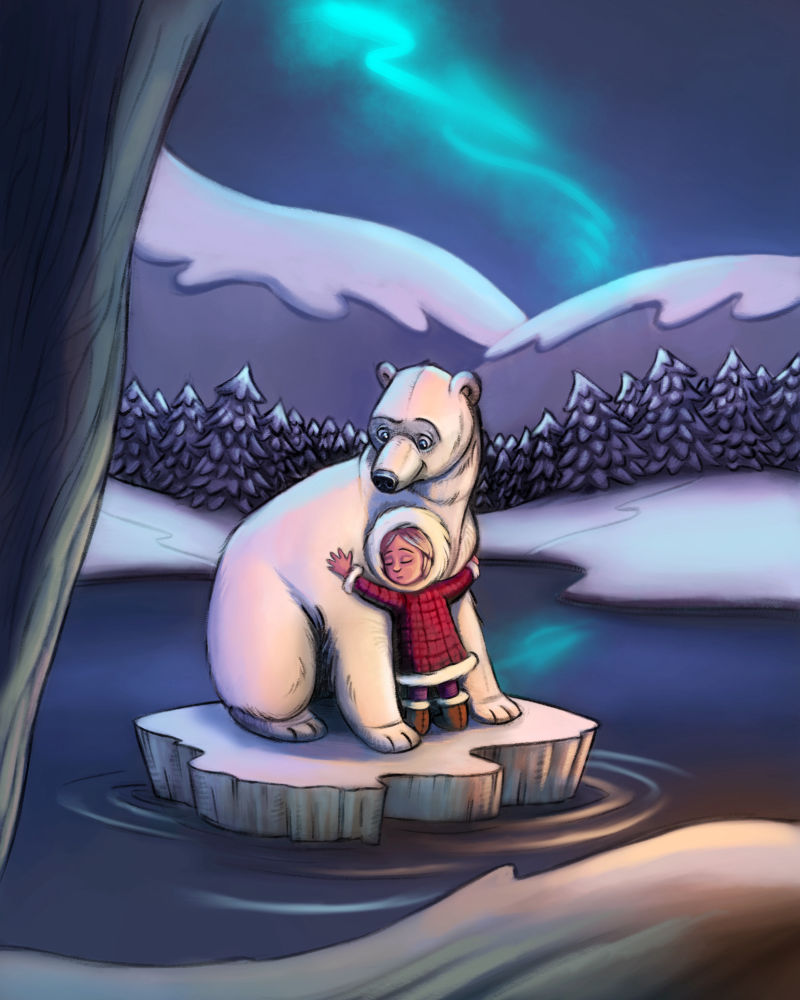
        Here’s where it stands. I’m not sure if it needs something or if I should call it done. Nothing ever looks finished to me. Critiques welcome. 🙂

        0_1542780054922_CF902E30-E900-4B82-B161-4A6E1A798D6A.jpeg

        Eli 1 Reply Last reply Reply Quote 3
        • Eli
          Eli @Kristin Wauson last edited by Eli

          @kristin-wauson I love this so much. The colors look great. There is one kind of picky thing, I guess. Her head seems like it's rotated too far on her neck--but I don't think it really is. I think her hood being pulled so far over makes it look like her head is twisted further than it should be. If you just pull her hood back, you can still expose her lovely face. You just might lose a bit of her hair. This could just be me and everyone else thinks it's fine! Anyway, it's beautiful. The expression on the bear's face is lovely and sweet. I hope this makes sense!

          Kristin Wauson 2 Replies Last reply Reply Quote 2
          • Kristin Wauson
            Kristin Wauson @Eli last edited by

            @eli I kept thinking the same thing when I was looking at it but when i checked anatomy it seemed ok. I think you’re right. The hood is twisted and giving the illusion that it’s turned too far. I will tweak it a little. Thank you so much! 🙏

            1 Reply Last reply Reply Quote 2
            • Kristin Wauson
              Kristin Wauson @Eli last edited by

              This post is deleted!
              1 Reply Last reply Reply Quote 0
              • Kristin Wauson
                Kristin Wauson last edited by

                @Eli does this look better? Do you think I moved the hood far enough?

                0_1542813381108_A81F8354-212F-4AA7-84B1-CC0047556C5F.jpeg

                Jon Anderson 1 Reply Last reply Reply Quote 4
                • Jon Anderson
                  Jon Anderson SVS OG @Kristin Wauson last edited by Jon Anderson

                  @kristin-wauson This is a nice illustration you have going here. If I may chime in, the added red of the back of the hood helps, but in my opinion the white on the left side (as we see it) also needs to be reduced or tucked behind her head. The ellipse created by the fluffy edge of the hood opening is causing us to think the head is turned more that it probably is. Tucking that side a bit might do the trick. I also like your texture. That is something I really struggle with and your's looks great in my opinion.

                  instagram.com/jonandersonillu

                  Kristin Wauson 1 Reply Last reply Reply Quote 1
                  • Kristin Wauson
                    Kristin Wauson last edited by

                    Great observation! Thank you! The texture layer on top is Will Terry’s from his Digital/Watercolor mixed media class. You can download them from the supplemental materials. 🙂

                    1 Reply Last reply Reply Quote 1
                    • Chip Valecek
                      Chip Valecek SVS Team SVS OG last edited by

                      WOW, just WOW I want to hug that bear and lil girl.


                      https://www.instagram.com/chipvalecek/
                      https://www.facebook.com/cvalecek
                      http://www.cshellmedia.com/

                      Kristin Wauson 1 Reply Last reply Reply Quote 1
                      • Kristin Wauson
                        Kristin Wauson @Jon Anderson last edited by

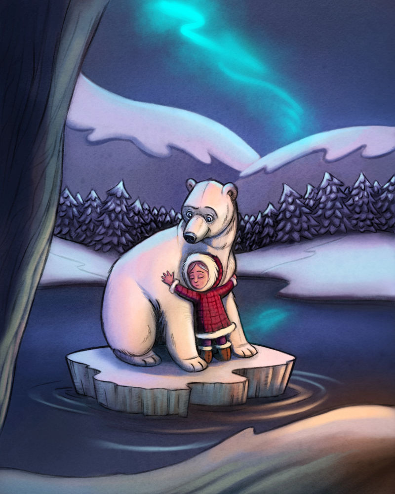
                        @jon-anderson Is this better?

                        0_1542820207080_4C4673A2-5F51-4B15-890D-317A2A5E90DC.jpeg

                        Eli Jon Anderson 2 Replies Last reply Reply Quote 3
                        • Kristin Wauson
                          Kristin Wauson @Chip Valecek last edited by

                          @chip-valecek Yay! Thank you so much for your help. 🙂

                          1 Reply Last reply Reply Quote 0
                          • Eli
                            Eli @Kristin Wauson last edited by

                            @kristin-wauson I think this is getting there! What @Jon-Anderson said about the fluffy trim was what I was TRYING to say, and he said it much better!

                            1 Reply Last reply Reply Quote 1
                            • rcartwright
                              rcartwright last edited by

                              I really like this so far but I would like to mention that when I squint at this the blue on the bear is very strong and brighter than the warmer light. I'm making this point only because I assume the warmer light is your key light? Nice work so far

                              https://www.scbwi.org/members/richard-cartwright/
                              https://www.instagram.com/richardwcartwright/
                              https://www.pinterest.ca/richcartwright3/art-of-richard-cartwright/
                              https://www.richardwcartwright.ca/

                              1 Reply Last reply Reply Quote 1
                              • Jon Anderson
                                Jon Anderson SVS OG @Kristin Wauson last edited by

                                @kristin-wauson that is better! It's amazing how small fixes can make a difference. After reading the comment @rcartwright made I noticed that the northern lights seem really hot and drew more attention. I don't know if you intended for it to be a focal point but if you didn't you might just fade that and its reflections a bit. Nice work!

                                instagram.com/jonandersonillu

                                Kristin Wauson 1 Reply Last reply Reply Quote 1
                                • Kristin Wauson
                                  Kristin Wauson @Jon Anderson last edited by

                                  @jon-anderson and @rcartwright yes, I was a little worried about that and actually darkened the values on those areas already. I work on it a bit more though. Thank you both!!

                                  1 Reply Last reply Reply Quote 1
                                  • S
                                    SketchyCaroline last edited by

                                    I love this picture. If this was an illustration in a children's book, it would definitely draw me in. I can feel the sense of rescue and care coming from the bear to the child, and that they are about to set off on a journey together. Lovely work.

                                    Kristin Wauson 1 Reply Last reply Reply Quote 1
                                    • Kristin Wauson
                                      Kristin Wauson @SketchyCaroline last edited by

                                      @sketchycaroline Thank you so much! 🙏

                                      1 Reply Last reply Reply Quote 0
                                      • First post
                                        Last post