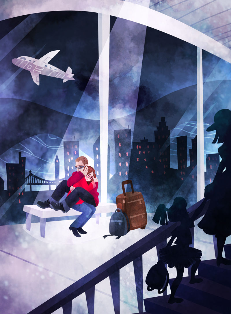
First piece for my new portfolio - would love some feedback/suggestions?
-
@kaitlinmakes Thank you so much for your wonderful feedback Kaitlin, god knows why I chose to do a night scene to start me off as I've always been so scared at tackling it - it has definitely used up all of my creative juices this week lol!
You're totally right about boosting up the moonlight and the leaves on the stairs, i've just had a play around with that and it looks a lot better just by changing those two things so thank you!
Thanks again
-
Hi @hannahmccaffery ! This is such a great piece! I really love the subject, and love your palette

If there's any feedback, it may be that I'm not sure about the staircase. I love that it's there and it frames the picture really well, but the lighting makes it so it fights for attention with the main focus of the picture, the character! And I'm not sure that's what you intended, because there's really nothing there... I wonder what could be done about it. There are many ways, for instance you could add something on the stairs to justify this prominent place in your illustration. Maybe a cat or cute monster of the stairs, hiding and peering down at the character? Or maybe you can darken the stairs a lot so it's just a dark silhouette of a staircase, framing the picture but not drawing attention to itself. I actually did something exactly like that with a staircase for one of my portfolio pieces and it worked out really well!
-
I agree with @NessIllustration about the stairs. I would darken those quite a bit. The color and detail of the leaves really detracts the focus from the mummy and his puppy.
-
@hannahmccaffery This is a really nice piece! I understand how being the person working on it, you see it in this certain light where it feels like it has all these problems, but from my perspective it's really solid.
I agree that you could do something with the stairs, but they also suggest to me where he might go next, so it's not purely a distraction. I think there is an opportunity to do something with them, toning them down, but also suggesting some kind of monster like @NessIllustration mentioned. Maybe a subtle cast shadow falling down them, something that draws you to want to find out what this kid discovers in the house. The key would be to not attract more attention to it, but at the same time enrich the story with it.
All in all though, we can always always find something to improve. As it is, I think you have a a really strong piece here, and even if you didn't touch it again, you should feel proud of it!
-
If you are going to work on the stairs I would remove the leaves or at least most of them. They are currently creating too much of a pattern and the values are a bit light. In the main drawing I like a lot of what you have done. The shadow of an object becomes much less crisp as it moves away from it's source. The doorways could have this effect applied to them. The dog is very white for night time and he seems to have the most contrast in the image.
Cheers
-
I agree with what has already been said about the stairs. I love them, but I can't stop looking at them. They definitely draw my eye away from the characters
-
Great piece, Love the compositions. I think I would darken the staircase so the focal area is centered more on the character.
-
Thank you all for your wonderful replies and advice/suggestions you've given, you're all completely right and I'm going to apply those changes to the piece this week! I've already played around with darkening the stairs and it looks so much better already, and now the focus is more on the characters
I love your idea of adding a little hint of a monster on the stairs @NessIllustration , he does meet a little creature later on in the story, so maybe this is a good opportunity to hint at that but not give too much away. So i'm going to try and do a version with and without something on the stairs and see which you all prefer ")
@robgale that's what I was intending with the stairs so I'm really glad you've said that, I wanted to show where he would go next so it moves the story along, but maybe they don't need to be as obvious like everyone else says. Thank you, I think I am quite proud of this piece, and even more so now I have some strong feedback from you guys!Thank you again @NessIllustration @jcantwellart @robgale @rcartwright @Eli @julian-beresford
-
So i've darkened the stairs, got rid of some of the leaves and toned them down and upped the moonlight and highlights... does everyone think this looks better?
Thanks everyone!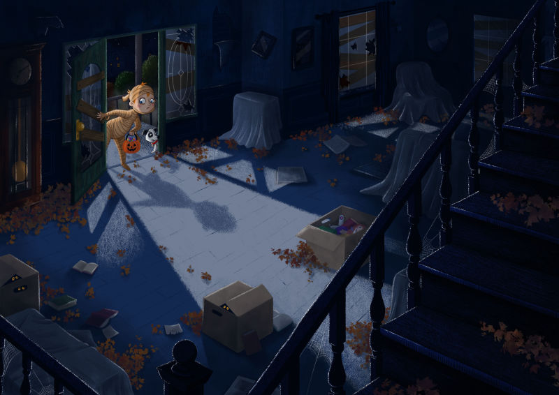
-
Hi Hannah,
Wow, it looks so much better! Really great job
I have noticed though, with darkening the stairs now the entire illustration as a whole is pretty dark! I know it's night, but I'm reminded of @Will-Terry saying that for children's books we really have to stay light... With your blue-ish color palette, we understand it's night perfectly and I think you can definitely lighten things up just to make it a bit more kid friendly and appealing!Something like this maybe:

-
Thank you @NessIllustration , you're right now that I'm looking at it again, it has darkened it all and made it look a little flat, thanks so much for pointing that out to me and for the example you sent.
I think I still want to keep the inside pretty dark but I upped the brightness and contrast like you've done, and I think it looks a little better?
I should probably do a lot of lighter, colourful work after this haha! Kids books do have to be bright like you say!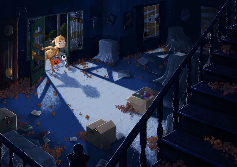
-
The advantage of the darker version (with the higher contrast) is that I noticed the glowing eyes more. I hadn’t noticed them in the original and it’s a cool detail that adds to the mystery of the picture. It’s a really nice piece.
-
I agree with @demotlj , love it! Although for a children book it's darker than most, you can't deny the illustration works!
-
@demotlj I'm glad you noticed the eyes more with this version, thank you very much
@NessIllustration Yes it is darker than most children's books, but there are a few illustrators in the UK, who are well known, who seem to be trying this sort of thing out and that's why I wanted to give it a go
but definitely on to something more bright and colourful after this haha! -
@hannahmccaffery Looking good!