Society of Visual Storytelling

    SVSLearn Forums

    • Register
    • Login
    • Search
    • Recent
    • Tags
    • Popular
    • Users
    • Groups
    • Search

    Howl's Moving Castle WIP Feedback Welcome

    Artwork
    4
    15
    1149
    Loading More Posts
    • Oldest to Newest
    • Newest to Oldest
    • Most Votes
    Reply
    • Reply as topic
    Log in to reply
    This topic has been deleted. Only users with topic management privileges can see it.
    • StudioLooong
      StudioLooong last edited by

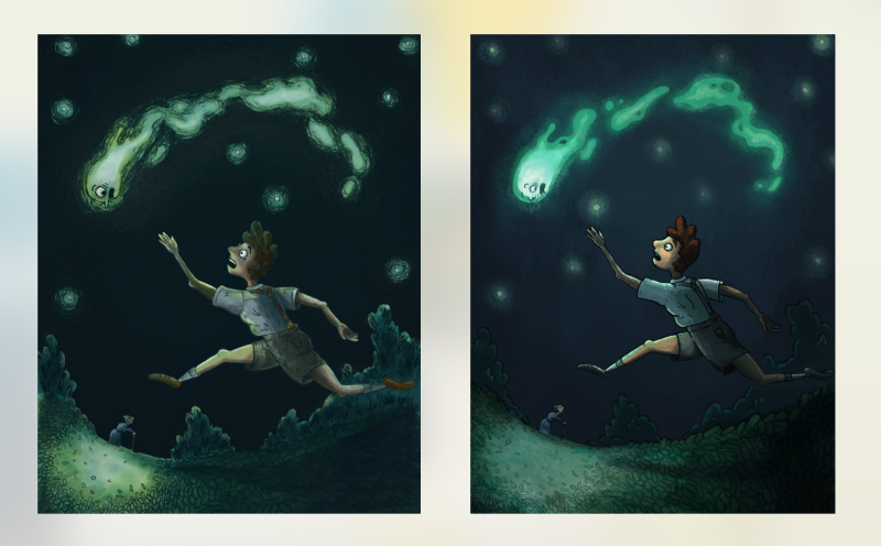
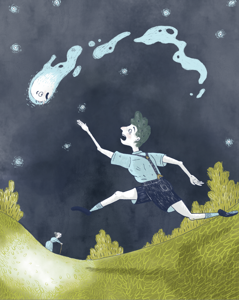
      I'm in the middle of my first paint for the Howl's Moving Castle contest (more info in Sarah LuAnn's thread: https://forum.svslearn.com/topic/6723/feedback-for-thumbnail-sketches-for-howl-s-moving-castle-contest) I'm still thumb-nailing for the other 2 comps so I'll upload those thumbnails once I have them but I couldn't help diving into this one. Heres the passage from the book:

      "Sohpie could see it, a little white descending flame shape a few yards beyond the dark movements that were Michael the bright shape was coming down slowly now and it looked as if Michael might catch it…. It dived away from Michael’s fingers. Michael plunged for it but it was too quick for him. It swooped for the nearest marsh pool and the black water leaped into a blaze of whiteness for just an instant."

      0_1543623693821_Screen Shot 2018-11-30 at 6.14.38 PM.png
      1_1543623693822_Screen Shot 2018-11-30 at 6.14.46 PM.png

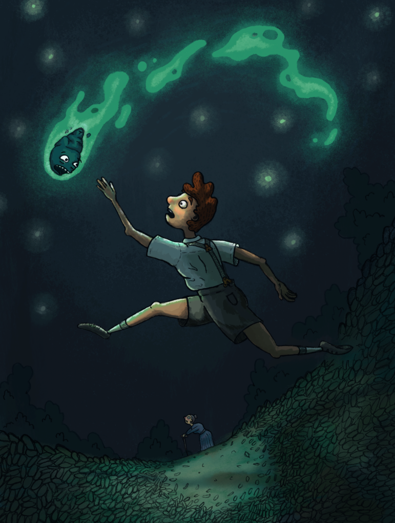
      At first I had the falling star as more of a space rock but reading the text it refers to it as a white flame so I've changed it, It still needs some work and I think I want to redo the face, it needs to look more terrified.
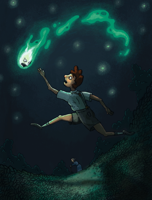
      Taylor Woolley
      (Formerly Taylor Ackerman / StudioLooong)


      Website: www.woolleystories.com
      Instagram: https://www.instagram.com/woolleystories/

      1 Reply Last reply Reply Quote 1
      • MissMarck
        MissMarck last edited by

        It looks great!
        The only thing that I'd suggest is maybe moving Sophie to the left and make her face the other way.
        For some reason, having her directly lined up with Michael makes it the composition feel stiff.
        (Actually, moving her to either side would probably work! Just something to break that "straight line" from Michael.)

        1 Reply Last reply Reply Quote 2
        • Sarah LuAnn
          Sarah LuAnn SVS OG last edited by

          What a fun image! I think the values with the white flame are really working to bring your eye to the most important thing in the image.

          My main comment is that it feels very left-heavy as it is--all the focal points are center or left of the center, and the movement is in that direction as well. You need to bring some interest/"weight" to the right side of the composition, either by cropping it differently or moving a focal point.

          sarahluann.com

          1 Reply Last reply Reply Quote 1
          • StudioLooong
            StudioLooong last edited by

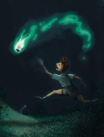
            @MissMarck @Sarah-LuAnn So maybe something a little more like this? (excuse the messy cut-apart)

            0_1543685887029_Screen Shot 2018-12-01 at 11.36.41 AM.png

            Taylor Woolley
            (Formerly Taylor Ackerman / StudioLooong)


            Website: www.woolleystories.com
            Instagram: https://www.instagram.com/woolleystories/

            1 Reply Last reply Reply Quote 1
            • Sarah LuAnn
              Sarah LuAnn SVS OG last edited by

              Yes! Much more balanced.

              sarahluann.com

              1 Reply Last reply Reply Quote 1
              • StudioLooong
                StudioLooong last edited by

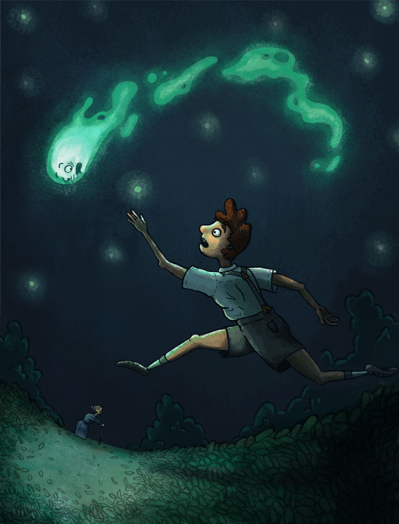
                Alright, here it is after some reworking:

                0_1543720688058_falling_star copy 2.jpg

                Taylor Woolley
                (Formerly Taylor Ackerman / StudioLooong)


                Website: www.woolleystories.com
                Instagram: https://www.instagram.com/woolleystories/

                1 Reply Last reply Reply Quote 1
                • StudioLooong
                  StudioLooong last edited by

                  Here are some rough thumbnails I've been trying for the other two compositions, I'd love to get some feedback on which you think are working and what I need to work on:

                  0_1543892185939_howls_thumbs.jpg

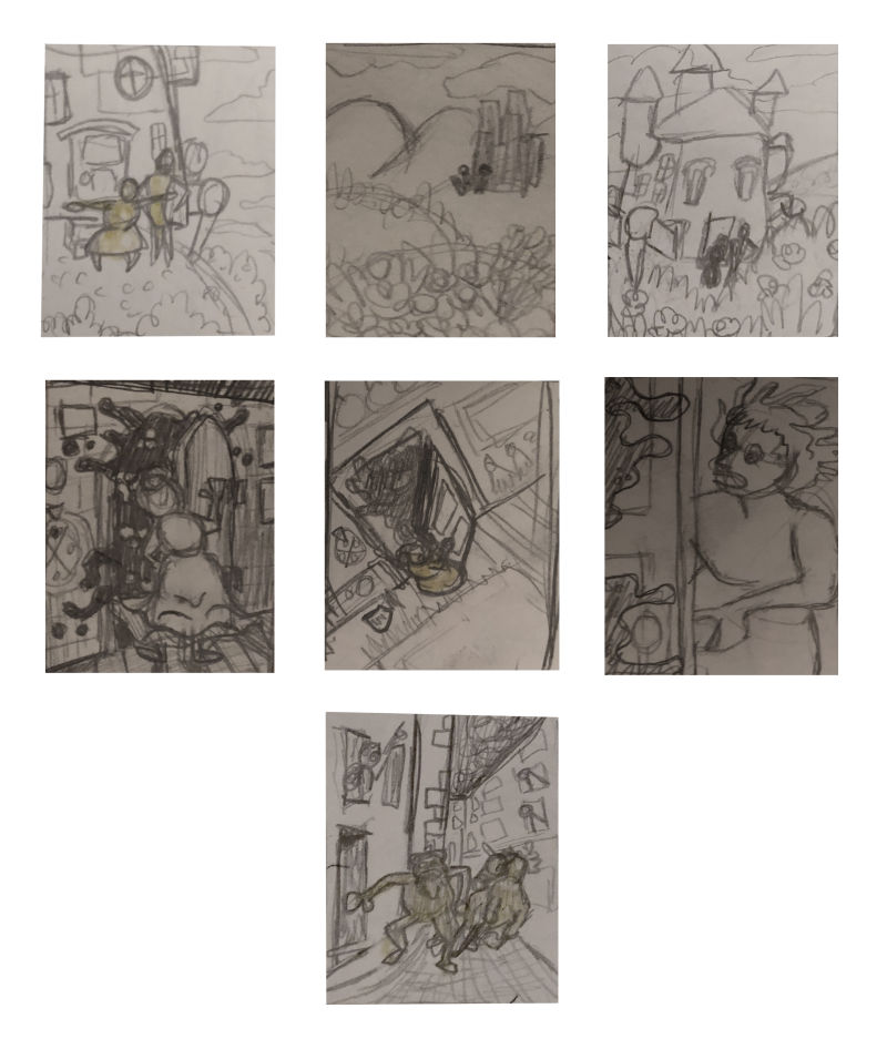
                  1st row is when howl takes Sophie out into the field of flowers
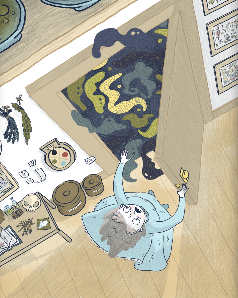
                  2nd row shows Sophie opening the door "on black"
                  The last one is Sophie (bearded man) and Michael (horse) running through the streets just before the mermaid/fight scene. I know this isn't a super important moment in the story but I like how ridiculous the two of them would look running to get a view of what's happening and I think it would be a cool way to show environment and building action through the bit of sky and other people's expressions

                  Taylor Woolley
                  (Formerly Taylor Ackerman / StudioLooong)


                  Website: www.woolleystories.com
                  Instagram: https://www.instagram.com/woolleystories/

                  1 Reply Last reply Reply Quote 0
                  • Sarah LuAnn
                    Sarah LuAnn SVS OG last edited by

                    There is nice stuff going on in all your thumbs, but in the first row I like the first image most because you get a good view of Howl being proud and Sophie getting so excited about it--I think you could fine tune their gestures a bit more but that composition is the one working best for me.

                    In the second row I LOVE the middle option. The cool perspective is awesome. The corner of the door is a bit of a tangent with the edge of the image, but that may be just how you cropped it. I would even try cropping out a bit more on the bottom/right side, since the floor isn't telling much of your story anyway.

                    I love seeing what you are doing! Keep it up 🙂

                    sarahluann.com

                    1 Reply Last reply Reply Quote 1
                    • StudioLooong
                      StudioLooong last edited by

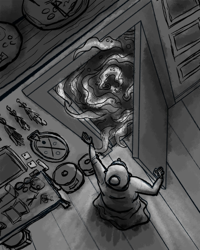
                      I'm continuing to work on "Sophie opening the door on black." Here's my rough sketch and value study. Let me know if you see anything I need to work out as I refine it:

                      0_1544136124758_sophie_door.jpg

                      Taylor Woolley
                      (Formerly Taylor Ackerman / StudioLooong)


                      Website: www.woolleystories.com
                      Instagram: https://www.instagram.com/woolleystories/

                      1 Reply Last reply Reply Quote 1
                      • Sarah LuAnn
                        Sarah LuAnn SVS OG last edited by

                        This is looking really cool! I like it a lot. It’s kind of distracting me that the top of the door appears to be exactly vertical. It also looks to me that if it were to swing closed it would be wider than the doorway. Minor nitpick, but that’s because it’s looking really interesting otherwise!

                        sarahluann.com

                        1 Reply Last reply Reply Quote 1
                        • StudioLooong
                          StudioLooong last edited by

                          I'm trying to add some more artistic/rough texture to my render, not sure if it's working.... any tips?0_1545108267336_Screen Shot 2018-12-17 at 10.42.54 PM.png

                          Taylor Woolley
                          (Formerly Taylor Ackerman / StudioLooong)


                          Website: www.woolleystories.com
                          Instagram: https://www.instagram.com/woolleystories/

                          1 Reply Last reply Reply Quote 1
                          • StudioLooong
                            StudioLooong last edited by

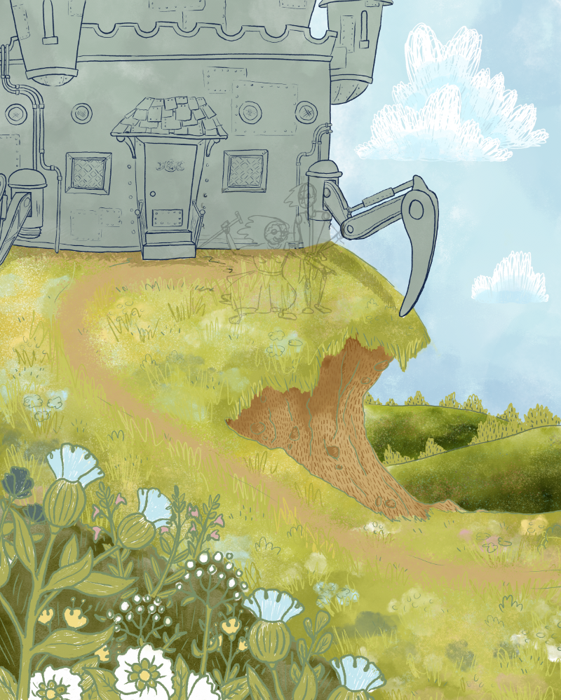
                            Update on my progress for the Howl's illustrations, the last one is still unfinished in parts.

                            0_1546752769459_Screen Shot 2019-01-05 at 11.31.04 PM.png

                            0_1546752774354_Screen Shot 2019-01-05 at 11.31.13 PM.png

                            0_1546752781790_Screen Shot 2019-01-05 at 11.31.22 PM.png

                            Taylor Woolley
                            (Formerly Taylor Ackerman / StudioLooong)


                            Website: www.woolleystories.com
                            Instagram: https://www.instagram.com/woolleystories/

                            kaitlinmakes 1 Reply Last reply Reply Quote 2
                            • kaitlinmakes
                              kaitlinmakes @StudioLooong last edited by

                              I just Love Love Love the direction this took! The colors and scenes are so crisp and have a real mature approach about them - I'm in awe. id be curious what the last image would look like if you did more of a patterned approach to the grassy knoll in the last image, similar to that of the first image. I see that you've touched on that already, but it still feels a little disjointed from the first image - it's a little busy and haphazard.
                              I absolutely can not wait to see how you handle the castle.

                              https://www.instagram.com/kaitlin.kahn.art
                              Https://www.kaitlinkahn.com

                              1 Reply Last reply Reply Quote 1
                              • StudioLooong
                                StudioLooong last edited by

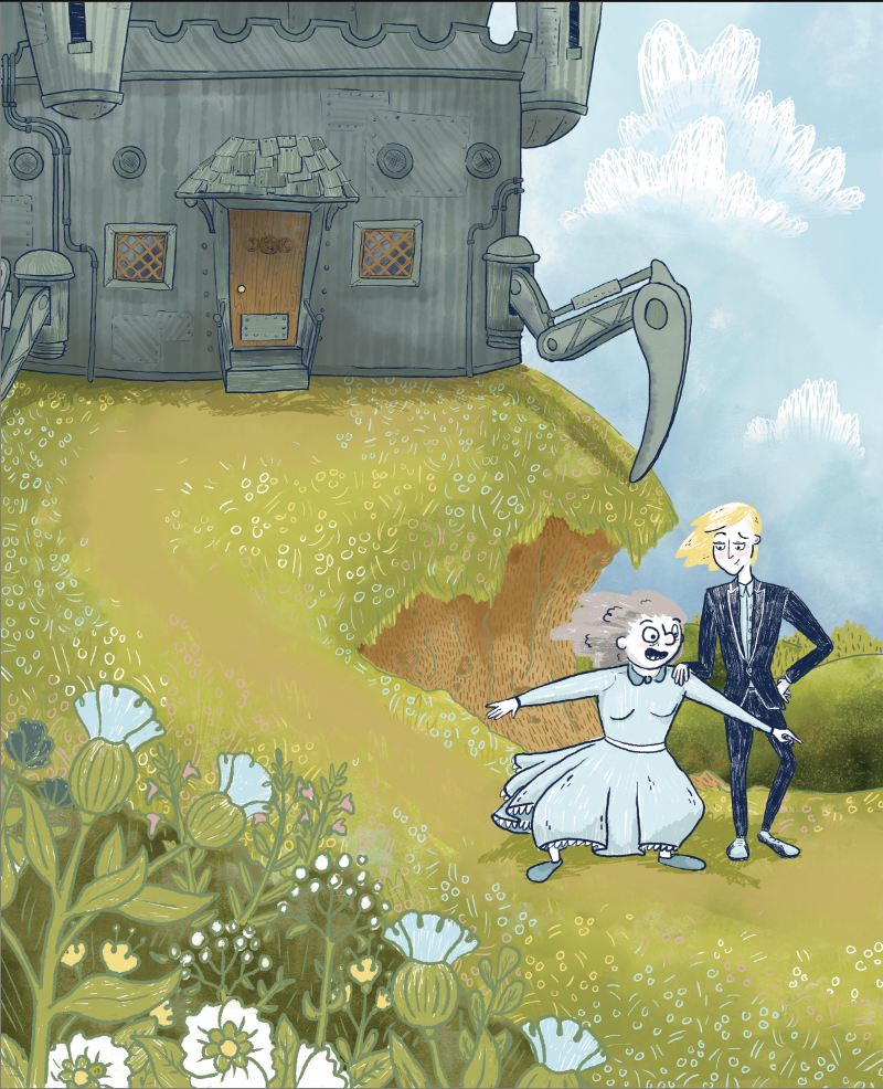
                                Thanks so much @kaitlinmakes! I tried out a more patterned look for the grass, I do think it cuts down on the chaos and I tried to change the pattern a little to make it look more like flowers than just grass.

                                0_1546832619768_Screen Shot 2019-01-06 at 9.40.51 PM.png

                                Taylor Woolley
                                (Formerly Taylor Ackerman / StudioLooong)


                                Website: www.woolleystories.com
                                Instagram: https://www.instagram.com/woolleystories/

                                kaitlinmakes 1 Reply Last reply Reply Quote 2
                                • kaitlinmakes
                                  kaitlinmakes @StudioLooong last edited by

                                  @studiolooong OMG yes! That pattern definitely sells flowers - and Sophie's and Howl's characters read so well with those poses! And the patterned steel walls of the castle!
                                  This is everything.

                                  https://www.instagram.com/kaitlin.kahn.art
                                  Https://www.kaitlinkahn.com

                                  1 Reply Last reply Reply Quote 1
                                  • First post
                                    Last post