Feedback on my illustration
-
Hey everyone, nice to meet you all as this is my second forum thread after introduction
")
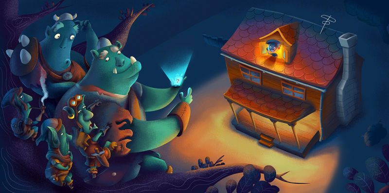
I would like to get some comments and thoughts for my illustration - Fantasy travelers. The premise is as follows: orcs and goblins meet real world and are curious to see and try stuff in our world. Any constructive comment is welcome! It's mostly finished and I'v spend quite some time drawing this and feel a bit lost in it. Maybe some of you seasoned guys can recommend courses that are suitable for me? Thanks a lot!
-
Hi Marcel!
Cool piece! Love the limited palette, textures and the "wonky" architecture. I hope you don't mind but I scribbled some notes for you. Please see the attached photo.
Basically these are my thoughts on ways you can improve this piece:
- I don't think that you need those little background elements like the fence and bush/tree behind the house. They're sort of distracting and don't add anything to the story. Just delete them.
- The branches over on the right side -- I think they could be more full and flowy and feel more like an element that frames the illustration. I don't mind the round leaves, but I think they could be placed in a more organic way.
- Why is the boy blue? I think it might be nice to have him be the warm tones of the house. The yellow light is spot on... it just appears a little "flame like" to have him be blue in the center of all that light.
- I think the tree needs a tad more structure, just so that the viewer can understand that their sitting on a branch.
- Don't feel discouraged by this because your character design is so fun! Love these orcs and goblins but I think I would try a more pronounced sitting position for some of the goblins. All the colors and shading just sort of melt into one another and it's hard to tell where their limbs are. I hope my scribbles on your drawing help you understand this comment more. I also drew the back orcs hand on the other one, just to make them feel more intertwined.
I hope this helps! Like I said before it's a really great piece!
- Cass
-
@heycasshey thank you very much for all the tips! They mean a lot! As you already pointed out, im strugling a bit with the shading of the characters and they are hard to recognize from each other. Maybe i should not use so much dark shading aswell.
-
Hi, Marcel. I think your piece is already great with perhaps a few issues but nothing too serious. I like your characters and I like your colors. The main thing that stands out to me though is the light coming from the porch. It’s of the same color and intensity as the light coming from behind the boy. Now, I assume that you want the attention to be more on the boy and not on the porch/ground. You can solve this by desaturating the light from the porch. Maybe you can use a cooler color or maybe not light the porch all together in order to focus the attention on the child. These are my thoughts. I hope you find them helpful.
-
I agree with the tips mentioned, but just wanted to add I also think it's beautiful work! I love the design of the goblins and the colors!

-
This post is deleted! -
THank you all for the feedback i appreciate it!
-
Hi Marcel, I like this piece a lot! I'm struggling with all of these things myself so I don't know if I would be the best person to give feedback. But it was nice to see some of the things I thought were mentioned by others.
The classes that have been helping me are:
The Magic of Color
Painting Color and Light
Creative Composition 1 & 2
Creative Environment design
Painting texture and detailI haven't finished all of them there's so much to watch. But the amount I have seen has definitely helped me with a lot of this.
-
I like it a lot! Great colours, nice finish to it, really professional

The thing that really stands out as not fitting in, are the eyes of all the characters. They dont seem to be in the same style as each other, and they're not conveying much. Black dots would work better, or just take another stab at them? -
You've got some nice things working in the picture but I think it needs a slight touch up in composition. The group of trolls and the house seem to be the same size and split the image right down the middle. Maybe extending some trolls along the bottom to the right can make an interesting shape and guide the viewer to the house without breaking it up right down the middle. One good thing is that you have such a good start that whatever you adjust to make your picture better probably won't involve a complete overhaul.