Finished Christmas artwork--any small changes before posting?
-
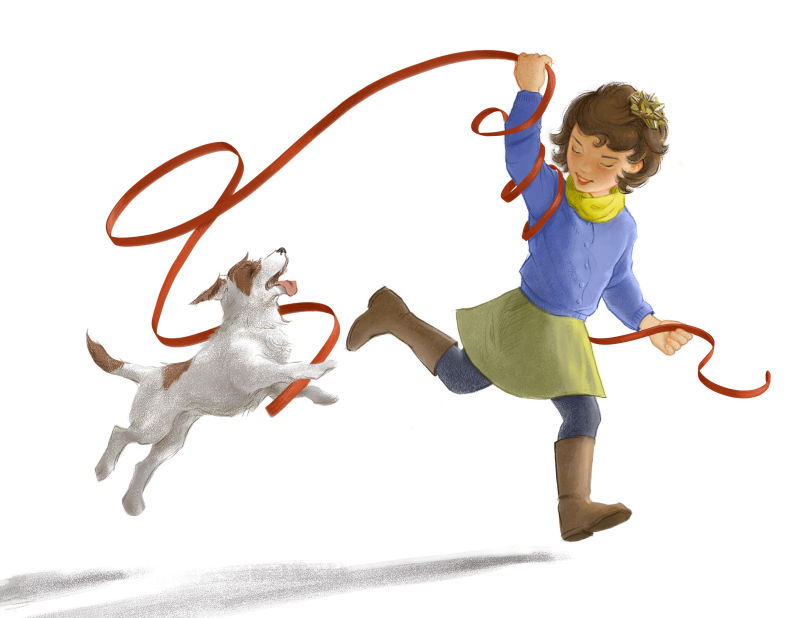
I really like the change to the ribbon and have always enjoyed the overall piece. The one thing I notice is the ribbon at the dog's mouth cuts across it in a way that flattens the dog's head a little. I think it would loop out a little farther from the dog's mouth if it were wrapping around his/her head in the back. But that's a small detail -- I think the whole picture looks great.
-
Congrats on meeting your deadline! You might could play with the bg gradient or place something to indicate that the horizon line is lower or even remove the back gradient.
The girl and dog read well though and are so cute. I think changing now might just be noodling and that it's good as is.
")
-
What a fun piece. I love the love the interaction between the dog and girl.
I would agree with @demotlj about the ribbon. It sort of has a strange tangent coming out of the mouth where it does. I think moving it a little would help significantly. The other thing I see is I don't think the ribbon is quite high enough when it leaves the girl's raised hand. Just feels funny to me, like she is not really holding it.
Otherwise loving this piece. Thanks for sharing it.
-
I love it. Reminds me a little of Rie Cramer in terms of character design and style. Lovely. I would remove the gradient though or play with it it looks sort of like she is running on a plane of white illuminated by a big tablelamp sort of. It gives it something of he feeling of product photography. i personally would get rid of it
-
Ok, here it is with the ribbon moved, no gradient (the jpeg really exaggerated it!) and in two versions, dog with collar and without. I had accidentally left the collar out in some past version and forgotten about it. I would say it's not necessary but at the moment something about it helps to keep the ribbon from cutting the dog's head off, in my "I've been looking at this way too long" opinion. If I had more time I'd completely redo the ribbon, but I don't.

Thanks so for your feedback, guys! An extra pair of eyeballs sure helps!


-
The ribbon is much better and I like the collar just because, as a dog owner, it makes me feel like someone owns the dog and he (she?) isn't a stray. I think it's a great picture.
-
@lauraa That looks fabulous!
-
Ribbon is much better, really works well. I like the collar, its color matching the leggings connects the picture better.
-
I think this is a beautiful piece. The girl especially has a beautiful face. I love the new placement of the ribbon and I like the collared dog better. It anchors him to the girl with the blue. I think if you had to do one more thing it would be just to make some of the shadows a little darker. It reads a little flat without some nice deep colors. I always have a hard time with this myself: either too light or too dark is my eternal sin! Overall, I love this!
-
Thank you so much, everyone!!! I posted it yesterday with the collar. Of course now I see all the things I want to change, but so be it. I have to get used to working faster!
@JeaneBean I really like doing the faces because I used to be a portraitist. This isn't as realistic, but I don't think I could ever draw a generic kid face! And yes, I did have a hard time deciding whether I was doing a flat or rounded piece, so perhaps it was too compromise-y.