Composition for next DND project, feedback welcome!
-
Nice thumbnail!
-
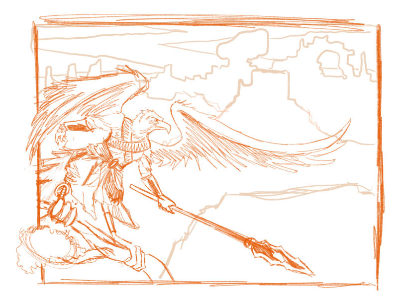
Ok whew here is a rough sketch of it. Any thoughts?
-
I'm really liking the composition and the character is really coming together. I think I see the composition work already showing progress in your pieces!
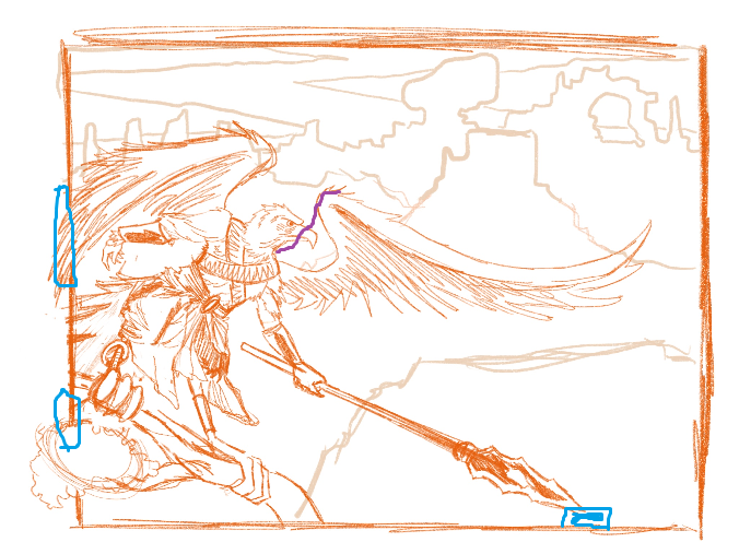
I did a ghetto trackpad paintover of the places I would keep an eye on. The wing on the right of the picture looks like you are exaggerating the curve, perhaps for good design reasons, and I did a markup in purple of where it felt like it might would go if you weren't avoiding the beak.
There are also a few places that I would watch for tangents, marked in blue. Where the wing is on the edge I think you've cropped so it won't make any weird tangents but you'll want to make sure the feathers sweep out in long lines I reckon. The foot is also near the edge of the page ; again working right now but I like to keep an eye on things like that. Same for the spear.
As usual, ymmv. I've been doing more "Atelier style" oil and gouache painting for the last year and so have gotten used to designing things to stick well out of the page or stay well within. Framing makes you need to watch for different tangencies and I'm not used to digital yet to feel like I can correct anything later or add some canvas space.
I'm really enjoying seeing how your pieces are coming together and learning a bit vicariously. I may get brave enough to post some myself soon. XD Maybe I'll even straight up copy your inspiration and illustrate an old character.
-
@thiskatecreates I’d love to see it! Thank you this realllyy helps. Im gonna change a few things but i want to make the left most wing and leafy branch to pop out of the image frame intentionally is there a way that would work?
instagram and twitter: @artofaleksey
alekseyillustration.com -
@swordofodin Personally, I like compositions where things go past the edge. It looks more alive to me. Or are you going to have a border drawn and intentionally push out beyond it? Both sound good to me.
The rule I've heard for edges of an image is objects should boldly extend beyond them or stay well inside them, but not sit on them unless there is a very good reason. As soon as something sits on / is tangent to the edge the picture ceases to look like a window to a scene. I feel like that came from a Charles Sovek book/ lesson, but I can't find it just now.

-
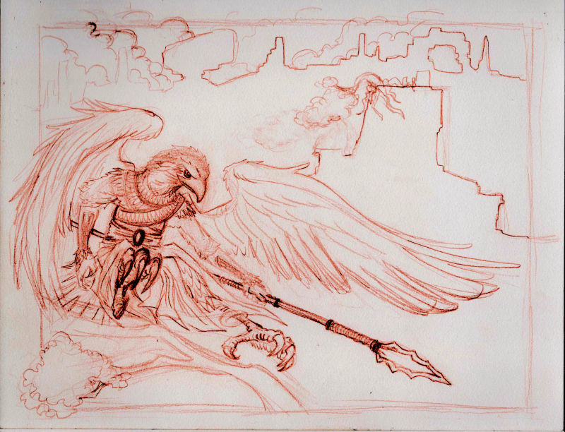
@thiskatecreates ohhh very good point.. I think in that case.. what I want to do is make the background/frame smaller and make the character and branch popout on the left while having the background on the right as kind of a comic panel? What do you think of that idea? Here is the paper pencil version, would love your opinions on it
 (i drew it before I read your comment. I think if i do that it would look less squished)
instagram and twitter: @artofaleksey
alekseyillustration.com -
@swordofodin I think that looks really good!
-
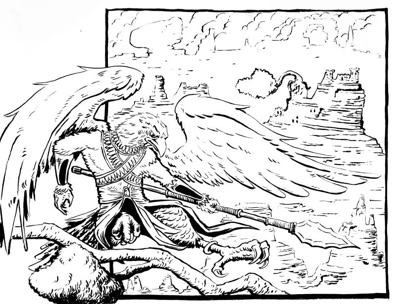
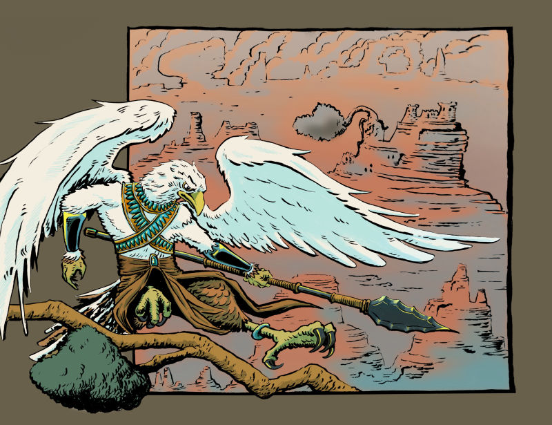
So i changed some stuff around, I see little parts here and there that i'm not happy with, tangents in some areas and stuff, I messed up the image left foot, but overall I think this came out better than I expected it to. I'm going to a fix a couple of things on my ipad when I'm coloring it hopefully it'll come together well. What are your thoughts?
-
Ok fully colored version. I dont think the background is working as much, I might make it lighter. I think that tree on the cliff should be gotten rid of too. What do you guys think?
instagram and twitter: @artofaleksey
alekseyillustration.com -
@swordofodin Nice! I think you could do more contrast with background but not sure you need too. In the final pose something feels off with how his torso and legs attach. The legs are leaning forward but the torso looks straight up and down.

Like the color scheme and the dynamism (is that a real word) and the rimlight on the spear to pull it forward.