Critiques welcome
-
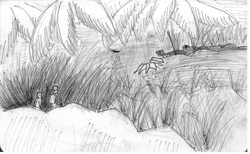
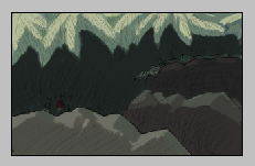
I'm struggling with my learning digital paint. I'm going through the digital painting class on a sketch I already worked in pen:
Learning digital and working composition first is going slow.... I did thumbnails but this is already a huge post so skipping them.Normally I just watercolor a pen sketch and maybe color correct:
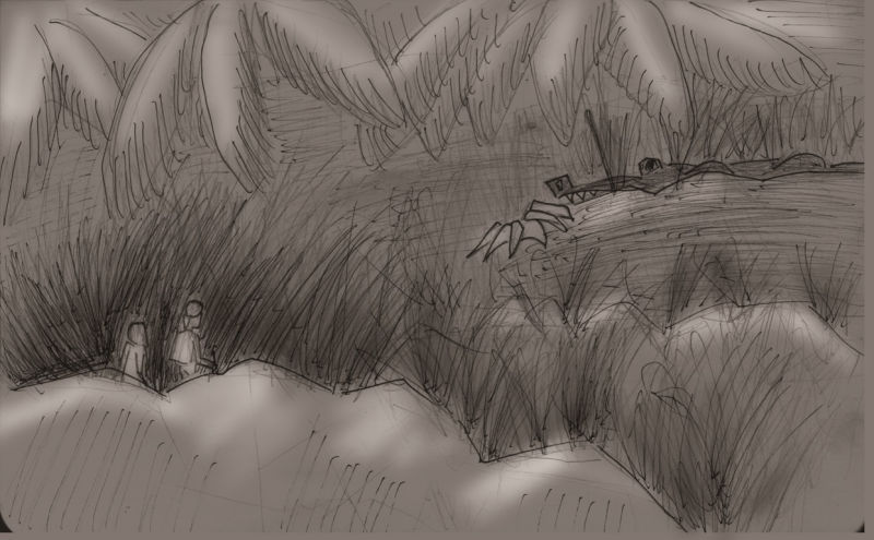
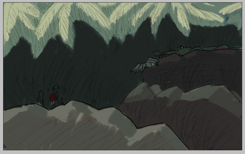
Here is the tone layer:
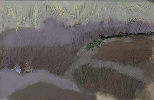
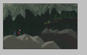
I had played with color before trying this technique and got a pallete I kind of like here:
And here are some color studies:
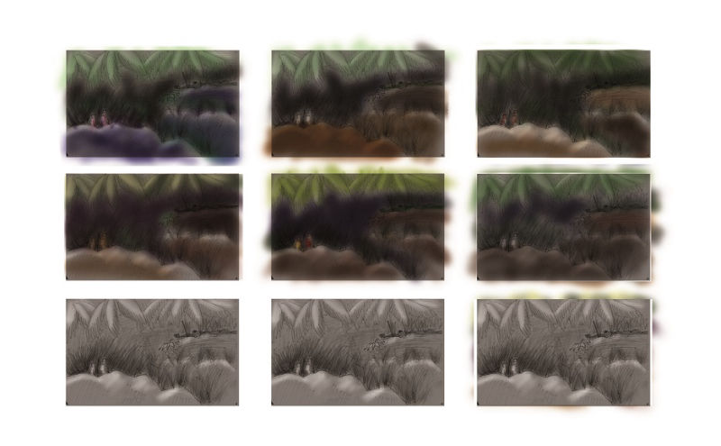
Any suggestions? Do any of those color palettes look ok?
When I work with oil I use limited palettes and with watercolor I would typically just add some splashes, possibly similar to a darken only layer if I removed all the pencil sketch. Trying to find a workflow in digital is tricky. XD This was supposed to be for a weekly drawing challenge that ends today but I really want to get a workflow more than my weekly post out. We'll see how today goes.
-
I notice in all the colored pieces the leaves at the top is what draws and keeps my eye for a bit. I think it’s the green and that they are all nice big shapes. Is that where you want the focus?
instagram and twitter: @artofaleksey
alekseyillustration.com -
@swordofodin I'm really struggling with that actually. The crocodile is supposed to be hidden but palms probably need pushing down in focus.
 Maybe if I state the grass more strongly and darken the top leave values I can get it.
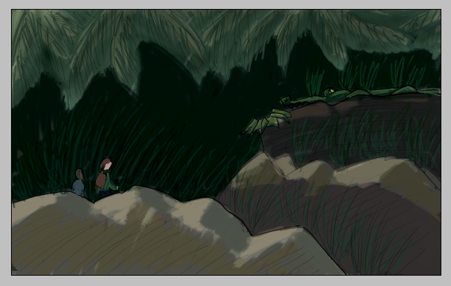
Current progress in tiny:
I'm going to paint in little dudes and then adjust those leaves, cause yeah, they are dominating....
Here is my block in so far (after I don't want to thing how many errors and redos of parts)
-
@ThisKateCreates I think you can have the crocodile physically hidden, but in terms of the illustration, adding a little bit of color that picks up the viewers eye would probably be a better decision because you want the viewer to see it other wise why is it there? If you want the bigger focus on the 2 figures, make them more noticeable than the croc, and mute the big leaves a big more? Before watching the digital painting class I recommend the painting color and light class. They spend sooo much time on color and composition and I’m still not done with it. Also the creative composition plus the magic of color classes have helped me with these kind of issues more. I’m definitely still struggling but I’ve gotten better at stepping away and analyzing the colors themselves. Ty Carter in the color and light class gave so many good tips.
instagram and twitter: @artofaleksey
alekseyillustration.com -
@swordofodin Yeah. I think you hit the nail on the head. I'm about to add the figures and hopefully that and fixing the textures in the grass will make them the primary focus but probably another repaint coming on both leaves and crocodile. I've completely lost some of my value structure and maybe croc needs more saturation. At least a bright yellow creepy eye. But even in my value sketches the big leaves were distracting. Should have fixed it early. LOL
I'll look at the color class next.
-
@thiskatecreates
More work...
-
Oh that’s better! A slight tiny highlight on the crocs snout would be enough I think to make the croc stand out. Overall I’m not sure what else could help. I’m sorry I’m not the best at color.
instagram and twitter: @artofaleksey
alekseyillustration.com -
@swordofodin Thanks. You did confirm kind of what I'm thinking. Just slowly trying to get it...
Really struggling to get more finished. But thinking I want to let this one go and start with an improved composition. The one I chose is so-so and I think the biggest thing on this was that when I saw the composition issues I shouldn't have tried to make a painting out of it.
Sometimes rushing just slows me down. -
Yeah i find jake, will and ty do a good job of explaining their process when it comes to approaching a piece. And they mention there’s nothing wrong with start Something over.