Tangents or overlapping? Critiques wanted
-
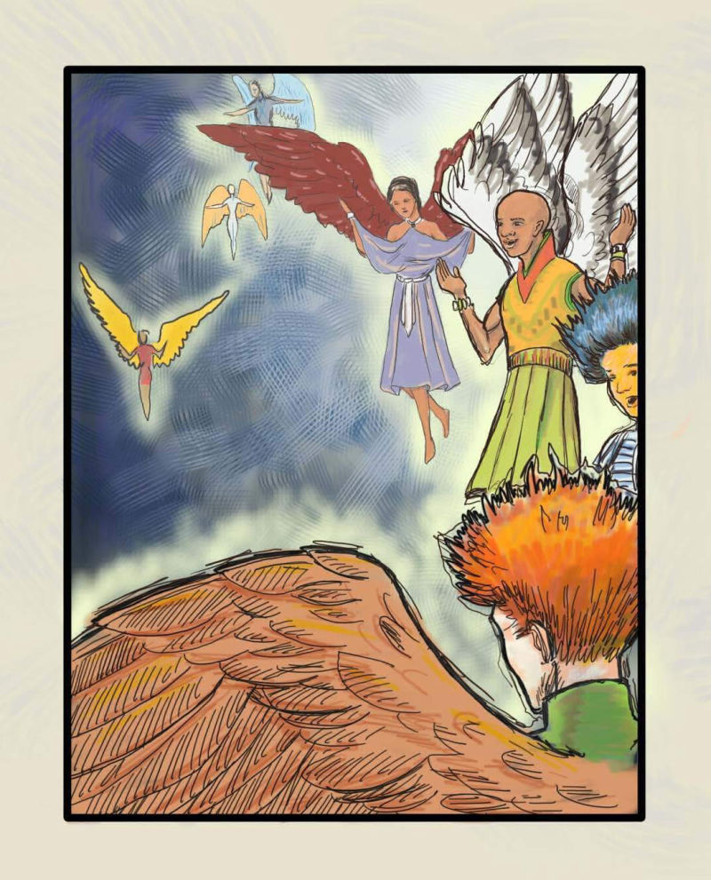
I think I created some tangents here but I was also working on creating some visual implied lines. I also experimented working huge to tiny. Overall does this composition work? Is it successful in showing a multitude of angels singing? What would you do differently?(Been working through creative compositions 2.0 with @Lee-White )
-
@chrisaakins Looks great I would just move the girl angel in the lillac dress over a few inches to the left so the mans hand is not tickling her armpit .Also make her more of a focal point and to fill out the left side of the painting which looks a bit empty at the minute.I like the man angel at the bottom making a frame with his wing really nice. Hope this helps!
-
Hey Chris! Great concept! I'm liking the layout for sure. Good color choices, and I'm digging the scraped paint background you've got going on.
the only place that I'm seeing potential tangents is with the hair on the red-headed angel going into the bald headed angels skirt, and the wings on the lilac angel and the bald headed angels wings. I think some minor adjustments there would fix that pretty easily. For example, if you had the red-headed angel's hair going back a bit instead of so upward I think that'd be prefect so that the lines don't match direction quite as well, and if you adjusted the lilac angel's angle just a bit, to get contrasting feather direction, just something like that to indicate a break in subject would help a lot.
Other than that, I'd almost say move the yellow and red angel outline higher up in the corner and shrink it to be furthest out. I think that'd give a good balance to the peace. You've got a lot of weight on the right side of the painting, a bit more dead space on the left could help the overall composition. Just a thought
")
Overall, I really like the piece and I'm looking forward to seeing the final version!
-Aaron
-
@aaron-pierce thanks for the advice. Funny thing is, I have no clue yet how to move things around yet, so it may be awhile. Haha!
-
@chrisaakins hahah! Like they say, live and learn! If you're using Photoshop, the marquee tool and the polygonal lasso are your friends
