Dragon Characters -- Feedback/Critique Welcome!
-
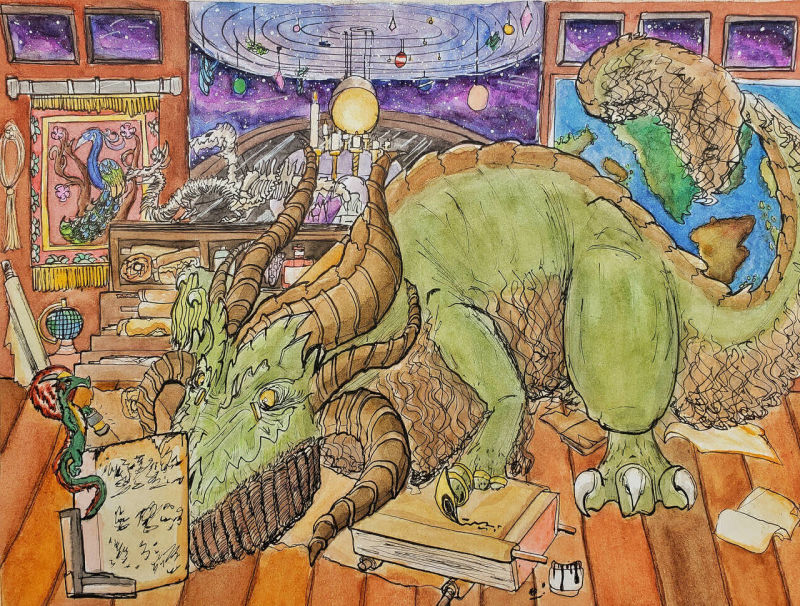
Traditionally done watercolor art done of two dragon characters! This is the first piece I tried to work on backgrounds that said something about a character on this piece. Looking at it now, this doesn't have the best art fundamentals in place, but Id like to hear what other people could see that maybe Im not.
The scene is in the workshop of the larger dragon Ghiacoco, who is an old jack-of-all-trade scholar. He's an eccentric scholar, and it seems like those kinds of people have random items from different places in the world and maps and globes, so I tried to emulate that here. The smaller dragon is Kiruin, a young snarky trouble maker. Ghiacoco is just basically giving Kiruin boring tasks to prevent Kiruin from getting himself killed.
This originally was to have a short story, but the effort needed to make the story hindered me from posting this online, so I went without it.
Fun fact! Ghiacoco is actually me because I use dip pens and also have bad posture.
-
@rinovarka I love the characters you have going on here. And the work to add the interesting background. Very fun.
I think that one thing that is holding the picture back is that you have no value difference between the characters and the background. It makes everything just blend together. Here is a greyscale version.
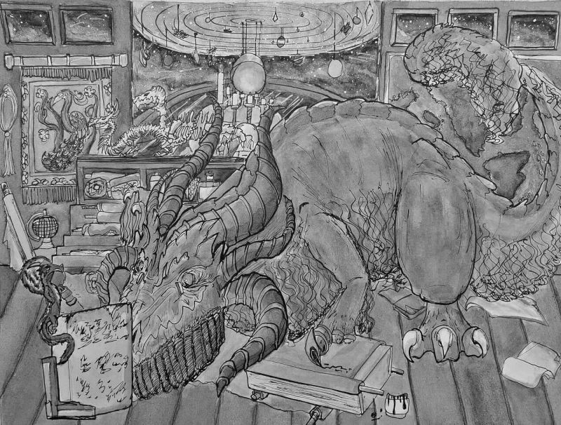
The picture would read much better if you created emphasis between the important things (the characters) and the rest (the background). I did a quick hack in GIMP with the air brush, but even with that I think you can see the difference.
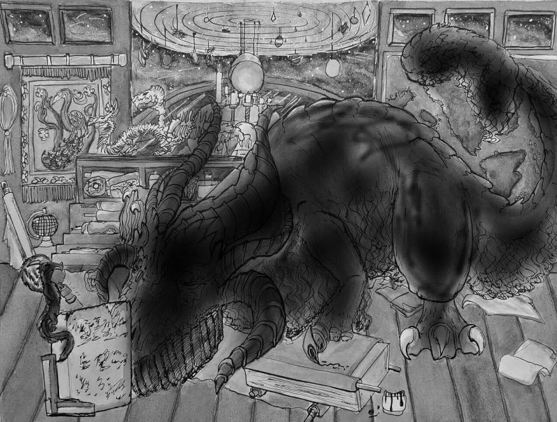
Note that without value differences you will not be able to see the image from 30 feet like @Will-Terry discusses in creative composition.
I am not great with watercolors but I know some people do this by using a wash in the areas that are going to be deemphasized. Maybe someone else can weigh in on how to do this with watercolors.
-The Prairie Fox
https://www.instagram.com/theprairiefox
https://www.theprairiefox.com -
@theprairiefox Thanks for the feedback! I understand what your saying, and I looked up the class, it sounds like something I definitely need. Im going to watch it now!
-
I like the shape & details on your dragon. The horns and the toe shapes can be hard to figure out. I agree that adding some variety in your values would help greatly. That was the very first thing I noticed. Also, I’m not sure what’s going on when you reach the tip of his tail. Maybe that could be tidied up a bit.
But I love the idea & it’s a great drawing! -
Love the toe pen.
")