I need a lot of critique...
-
Hey everyone, I'm Nicole, and I'm new to SVS and have been doing art for a few years, self-taught. I'm super excited to be on SVS to improve and learn all those important concepts I never learned from professionals before.
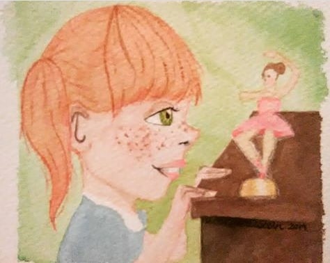
Anyway, I just wanted this watercolor illustration torn apart (ha!). Seriously, though, I want to improve and eventually do book illustration, so I figured I might as well start putting myself out there for critique!
Thank you so much, I'm so glad to be here!
-
Nice work so far!
A good way of getting constructive critique is to ask for specific feedback. Is there a certain aspect of this picture you feel isn't working?
-
@Braden-Hallett I think I could really add a lot of storytelling, and overall the color is kind of flat. I also have a hard time creating definition in watercolor. Also, how could I improve the perspective?
-
@nkdrawings Looking pretty good so far!
Here's an option if you don't feel like putting too much time into the watercolor part. Sometimes I like to actually outline the lines in my watercolor paintings with ink pen, which if you happen to like a cartoony style it works great and it's an easy way to make the lines clear and defined.There is beauty in life!
-
@avfarrar Thanks for that tip! I might try that, but I think I want to take Jake Parker's How to Ink class first (I haven't gotten to it yet).
I feel like I've got some weird perspective and proportions...anyone have advice for that?
-
@nkdrawings The base of the ballerina and the way the girl's fingers overlap are looking a little flat to me. The desk's perspective is believe-able so building off of that, the bottom edge of that dancer statue would be more curved. For the ballerina part, you probably wouldn't see that darker part of the inside of her skirt, you'd be looking down at the top a little more. You would also see more of the tops of the girls fingers and her head would be in less of a strict profile.
-
@nkdrawings I think the 'how to draw anything (everything?)' class will really help you out. You'll learn how to break down basic shapes and put them in perspective.
-
I think it's pretty cute. If you want to make it more realistic/believable I would consider the following:
- The proportions of the girl are pretty extreme. If that's what you were aiming at then it's ok but her head is very big compared to her body and arms.
- I would study and use reference for the hands - even if they are going to be stylized.
- Try and make sure you have more clear/clean lines to define her arms as they look a little like a single shape.
- Consider where she is looking more carefully - at the moment she is looking towards the doll but I think it would be more successful if she was looking up higher towards the dolls head.
- The dark line at the corner of her mouth is a little weird- I would either use pink or leave it out.
I hope this helps! Remember to use reference for EVERYTHING! ( I don't do it enough either but it helps so much!)
PS: The perspective might get helped on the desk if you made the side facing us very straight so it's lining up with the girl.
-
I actually like the colors going on here! (I'm a fan of complimentary colors, especially orange/blue) and a proponant of the "less is more approach" when it comes to anything having to do with color. (Just my personal preference) But if you just started SVS, Mastering perspective and how to draw everything are good ways to start! My two cents: Keep practicing shapes and how they sit in space/overlap each other. It's tough, but after a while, things will definitely start looking more and more cohesive.