Seeking critique for Creative Comp assignment
-
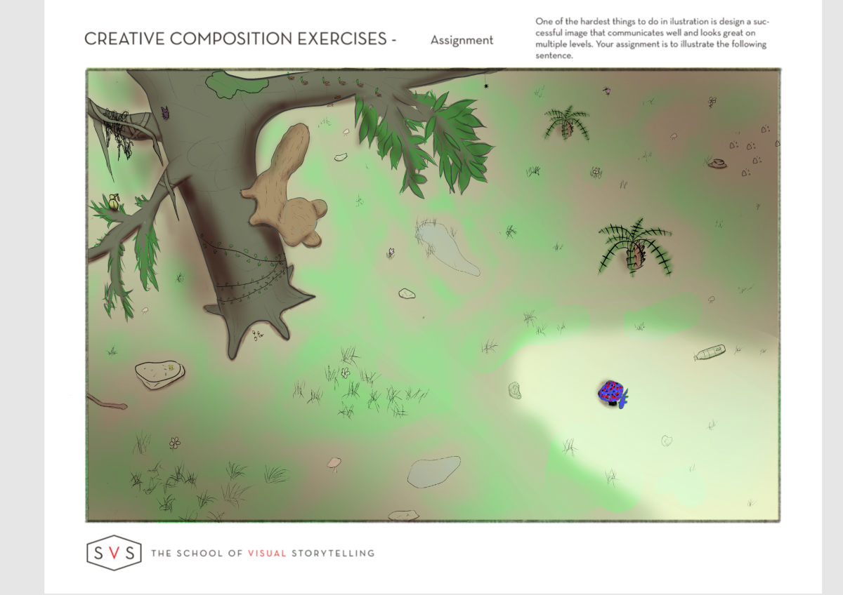
Hello! Doing assignments for the Creative Composition class and wanted some feedback on the page 29 assignment. The sentence the drawing is based on is: "Quickly the little salamander scampered down to the forest floor and hid from the squirrel!"
The goal was to use a simple value pattern for focal points while including 25 items. Any tips or advice on how it could be better would be appreciated.
-
Hey @SketchyArtish , I really like the detail you've put into the tree, all the vines hanging off it and the insects are a nice touch. Here are a few thoughts:
- The subject of the sentence is the salamander which is very small and partially blocked by the mushroom. You may want to consider changing your point of view to make the salamander larger and more of a focal point.
- The composition is feeling a little unbalanced with the big dark tree in the upper left and nothing with the visual weight to counteract it. Many of your 25 things are very small, consider varying the size of the objects and balance that tree with some larger things in the lower right - maybe some more larger trees to give off more of a forest vibe, right now I read it as more of a field.
- It may also help to engage viewers better if you could see the face of the squirrel and the salamander - people are naturally drawn toward faces and hands (even animal ones).
-
Thanks for the feedback @StudioLooong.
I considered putting the salamander up close initially in thumbnails, but was trying to push the "creative" part of the composition and took a different path. Focused on the actions of "scampering down and hiding" more than the character itself. (Like a cowboy riding off into the distant sunset thing.)
Was hoping the high contrast and highly saturated color would create enough weight to make the salamander pop despite the size, but it might not have been enough. Changing the size throws off the perspective to much. Hmm...
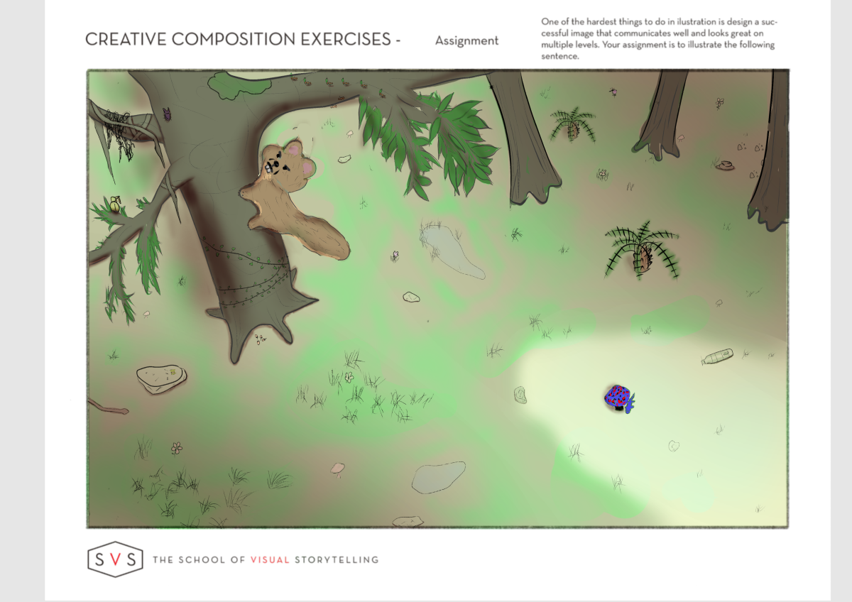
Made a few changes based on that feedback. Thanks again!
-
Hello!
") I like the salamander and colorful mushroom, and I find the perspective from above, as you're using it here, one that grabs my attention. One tool that I find useful is to look at whatever I'm working on at a super small scale; for instance, the width of my phone screen. It seems to really help me see what my eye is drawn to first and how it moves around the image. For your illustration, I notice something in the light area in the lower right immediately because if its high contrast, but at a small scale it just looks like a dark dot and I wonder what it is. Maybe the point of view doesn't have to be from quite as high up in the trees so that some of your more detailed elements could really shine? Thanks so much for sharing your process... looking forward to seeing more!
I like the salamander and colorful mushroom, and I find the perspective from above, as you're using it here, one that grabs my attention. One tool that I find useful is to look at whatever I'm working on at a super small scale; for instance, the width of my phone screen. It seems to really help me see what my eye is drawn to first and how it moves around the image. For your illustration, I notice something in the light area in the lower right immediately because if its high contrast, but at a small scale it just looks like a dark dot and I wonder what it is. Maybe the point of view doesn't have to be from quite as high up in the trees so that some of your more detailed elements could really shine? Thanks so much for sharing your process... looking forward to seeing more! -
@KathrynAdebayo said in Seeking critique for Creative Comp assignment:
For your illustration, I notice something in the light area in the lower right immediately because if its high contrast, but at a small scale it just looks like a dark dot and I wonder what it is.
That's basically what I was going for.
Wanted the viewer to have to "find" the little guy hiding down there. I was assuming a book sized page, but started with thumbnails and worked up. -
@SketchyArtish I'd say that the composition looks a bit sparse at the moment, and maybe you could try bringing the tree and salamander closer.
You could achieve this by making the angle of the viewer see through the tree, between branches, downward at squirrel, to the salamander.If you like the position of both characters as is, just add foliage, and then I'd say the biggest thing issue is the tree. Since we are looking downward at it, the left and right lines that make up the trunk should appear to come closer and converge, the more lower the trunk is.
Minorly, the characters could have more body language. For example, if the salamander is scampering, he could be stretching his hands(?) with his back legs bent inward, to show movement. If he is hiding, he could be surrounded by foliage, with tail curled in to hide. The squirrel could have shoulders hunched in anticipation, tail up, head to left or right, ears perked to listen. Personally, I dont think faces need to be added if the body language can be used in this case.