Does this read well?
-
@NessIllustration @LauraA Thank you both so much for responding! Hearing your impressions of what's happening in the picture is really helpful. And Laura, I'm so grateful that you mentioned the legs... I just kind of slopped some paint on the paper in the name of being loose, but didn't analyze how the forms suggested by the colors really aren't working. And yes, it seems some shadows are in order. Thanks again!
Do you think the piece overall is too dark? Too gloomy?
-
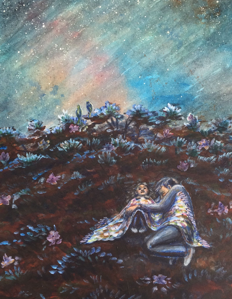
@LauraA And yes, I was going for some kind of family member with the small girl. In my mind it was her Dad. Maybe he's tired after a long day but still came outside to be with her. I was hoping that the piece conveyed calm and love.
-
@KathrynAdebayo Beautiful colors! I love the family vibe and the girl's face. I feel like there needs to be more of a contrast between the two main characters and the background. I think they kind of get lost in it all. Maybe more of a silhouette created by value or some contrasting color? Or perhaps the flowers could be toned down just a little so that their brighter values don't get lost? Their forms almost read as a pattern in a quilt. Also the glasses on the dad's head are not reading well. At least I assume they are glasses. They would need to be bigger or they are looking like tiny grandpa glasses.
I can't wait to see what the final product looks like.
-
@kathrynadebayo These fresh opinions on the forums really help me too! That's why I try to respond to others when I have a distinct impression.
I will say that the painting gives me an impression that something is not as it should be, but there are also positive elements. In fact, if I had to assign a keyword, I'd choose hope, and hope implies a situation that isn't easy but can be transformed. My first thought was that maybe the little girl was sick, even though she looks quite genuinely happy. Those two things can go together, especially in a child!
When I ask myself why I have this impression, aside from the expression of the father, which I mentioned earlier, I would say it is the choice of brown for the ground, which then influences the skin color of the figures and makes them look less rosy. I very much appreciate the importance of neutrals and don't think a color scheme has to be all saturated by any means, but it might not hurt to try some adjustment layers on this and see how they change the mood. I do like the way the colors are working in the blanket.
It looks like it might be a traditional piece (oil?), but since you have a digital image, you could still use digital tools to explore other possibilities before changing anything in the original.
And take what I say with a grain of salt! It's just my impression and I offer it simply as a fresh set of eyes.
-
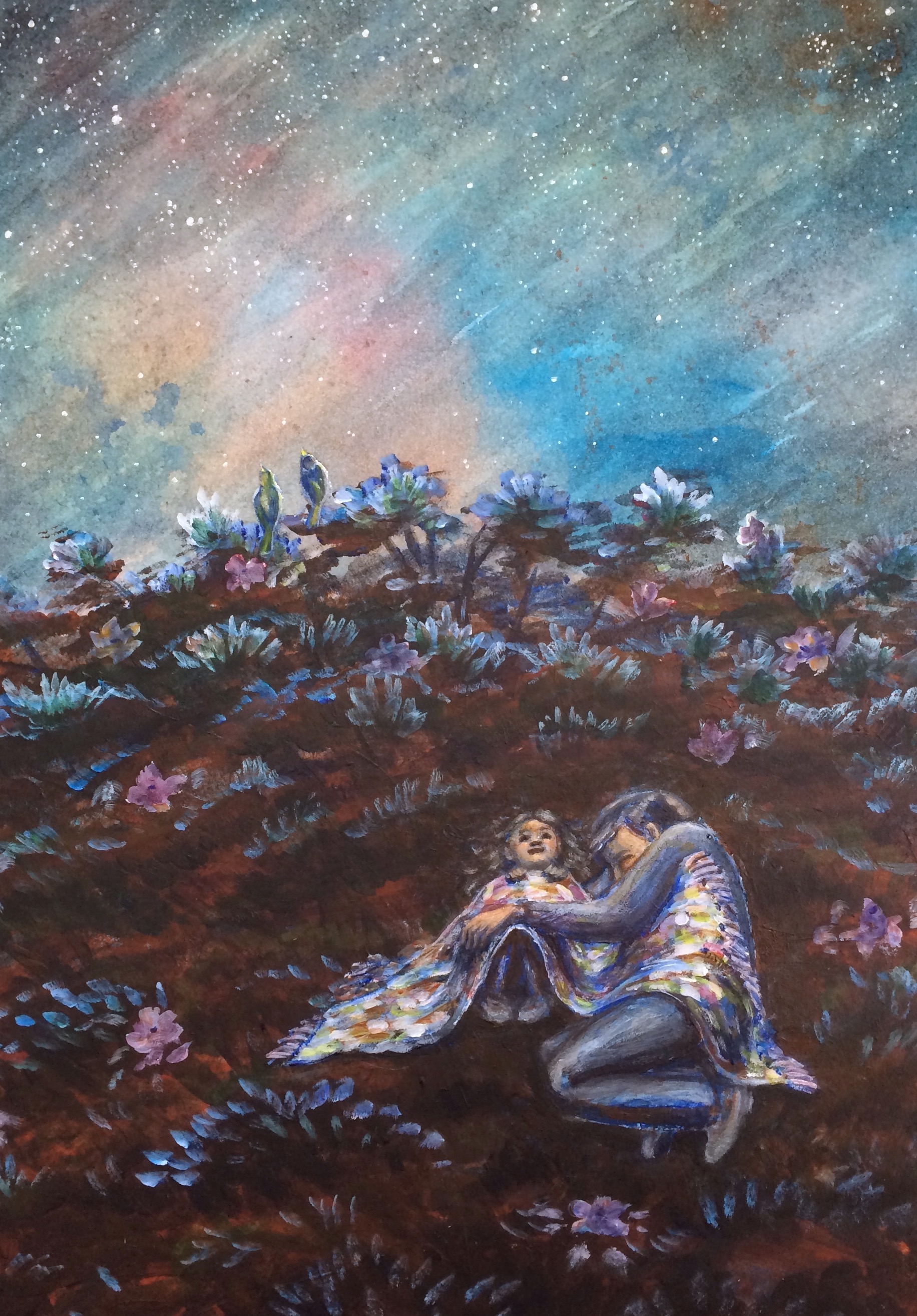
@chrisaakins Thank you so much for your feedback! Your insights are so helpful. I've toned down the flowers and I think that helped a bunch. Originally this was a painting of a flowering tree top, so the flowers were there before the people... I don't know that I would have included them if it was originally conceived of as a hill, so it looks much better to me now that they're pushed back. Also, thanks for the comment about the glasses! I was going for a closed eye look with no glasses, but now that you say something, I see how the cheek looks like a lens. I think if I flip the arch of the eye so it goes down like a bowl rather than up like a rainbow, it'll probably read better. It'll have a different emotional feeling too, I think. That'll be interesting...
@LauraA oooh... interesting observation about the brown color. That is so helpful to think about. I will play around!
Here's where we're at now...
-
@KathrynAdebayo I love this piece of art! Couldn't read through the thread but you really nailed the warm and cozy mood with the mesmerizing colors. Is this the final?
-
I really love all the colors you’ve added to the piece. It enhances the serene, warm, and dreamy feel to it.
-
What beautiful work
 the sky is gorgeous and I love the look on the little girls face, to me it definitely reads of a father and daughter!
 -
@nasvikdraws Thanks so much for taking a look and chiming in! I tried to clean up a few more details after this version, but I think the way it is now may be how it stays?
")
@nyrrylcadiz Thanks for the input, Nyrryl. I'm glad that's the vibe you're getting from the piece. I think I tend to make things too dark, so your input helps me see how brighter colors can be valuable. By the way, I love your cat and thumbelina piece.
@hannahmccaffery Thank you so much for your input, Hannah! I'm glad to know it reads as father daughter to you.I've made a few more tweaks, and I think it's about done unless anyone else sees something to change! It has been a good learning experience to try to paint an evening scene.
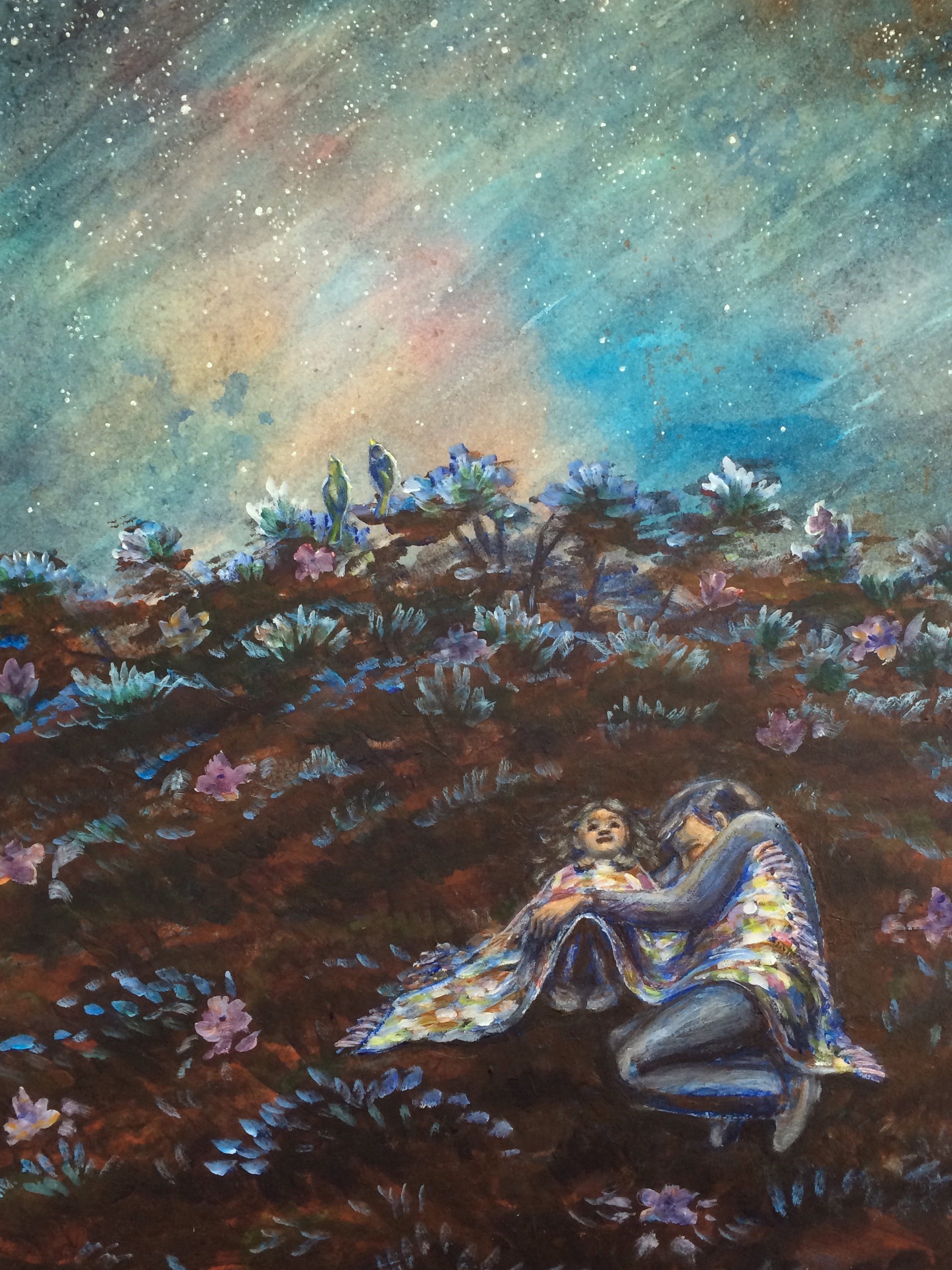
By the way, I've cropped it like this, and I think I like it better, but I'm not quite sure. Any input is welcome!
edit: Actually, I think I like the original crop better.
-
@KathrynAdebayo i’m very happy to help.
