WIP Critique Please! Pig and Bunny Roasting Marshmallows
-
Such a cute concept! I love the kinship you created between the bunny and the pig.
(1) Color: is everything working well together or not? If not, which color is not working? Do you think the characters are too dark and should be brighter?!
-
Would it be possible to cool down the color of the fire and do something a bit cooler? I couldn't find a perfect example but something like this?
-
I think making the fire a bit cooler would bring out the red in the scarf a bit more...
(2) Am I communicating that the scarf as the focal point? It is the object that threads through the story.
- As mentioned before, perhaps cooling down the color in the fire would help emphasize the scarf? If you keep the other colors cooler, maybe it would make the scarf pop a bit more?
(3) Do you feel whether anything is distracting and should be removed or replaced or resized?
There are a lot of marshmallows in the fire. Perhaps you could have the animals sharing a single marshmallow and that could also help to emphasize the scarf?
(4) Anything that looks odd or out of place? Or out of proportion? (Besides the window; I will fix that)
The house adjacent to the fire seems a bit askew from the fire/animals. Perhaps it could be brought into the background a bit more and the perspective changed a bit so it doesn't seem at quite an angle. It may be possible that the house in the foreground is not needed with the one in the background?
(5) Composition: Any suggestions for improvement?
Overall, a nice piece! I hope my comments are helpful. I'm a newbie so please take with a grain of salt.
-
-
@jennymwine @Ben-Migliore @KathrynAdebayo @theprairiefox @Jessica-Jolicoeur @djly Thank you all so much for stopping by to post your suggestions for improvement. I will take everything to heart and work hard at all the weaknesses that you pointed out. I really appreciate your time and help!
-
@lisanganart Hi! You have great concept going on here. Your characters are cute. However, I think we can still improve the piece more. Here are the issues i’m seeing.
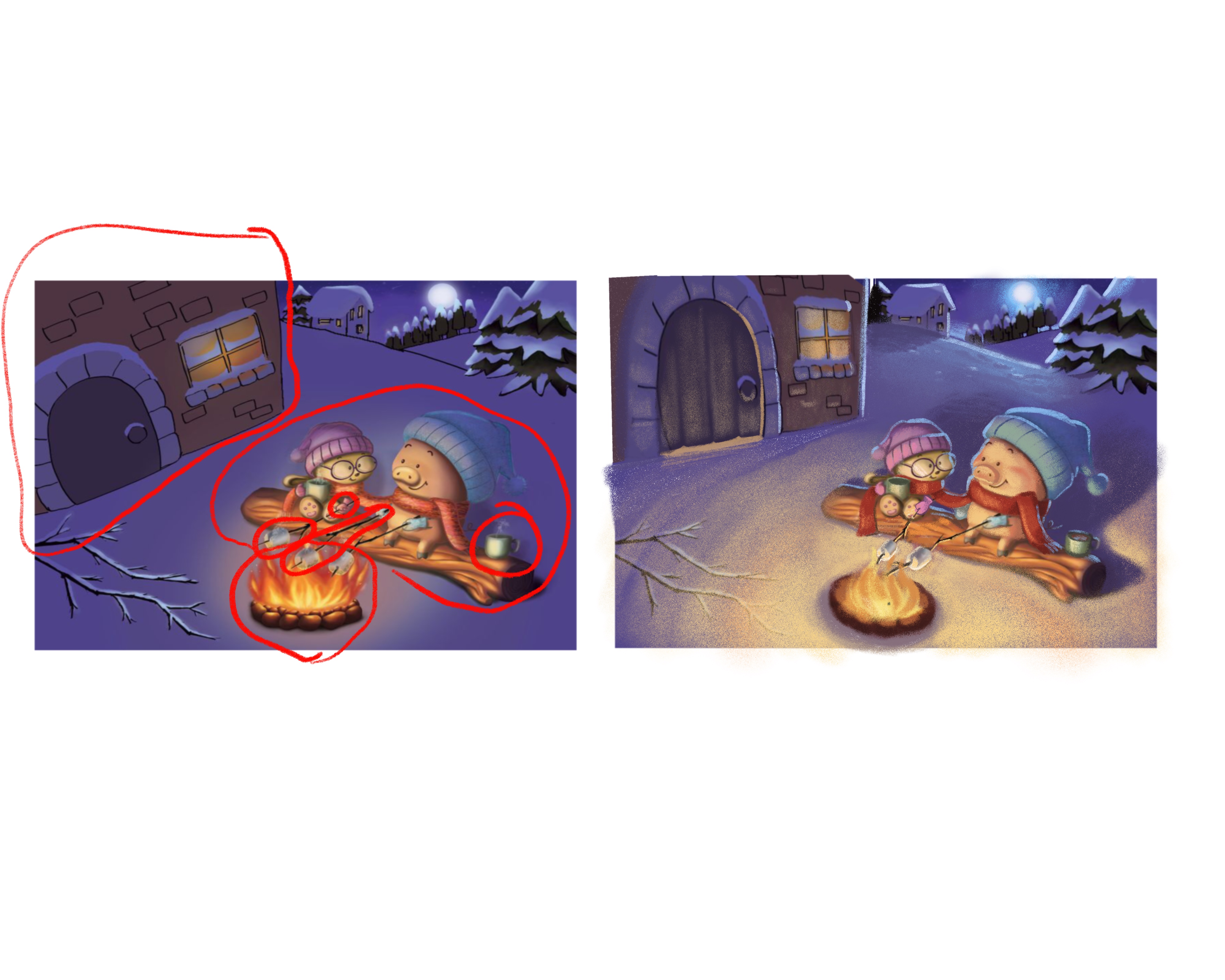
- Lighting. Your piece is too dark. Despite having a huge bonfire, your piece is very dimly lit. Your light is bouncing nicely on your characters but seems to be very faint on your snow and the building. Snow easily bounces off light. If you have a fire as big as the one you have, the whole environment should be lit brightly. Added to that, There is also not that much of a value diffrence between the background and your characters. Notice how they almost seem to blend in with the surroundings in the image below. I suggest, painting the snow a warm bright color especially the area near the bonfire and also increasing the brightness of your characters. You should also have long dark shadows behind the characters given tha the source of light is very strong and is located below them. You could also added a strong cool ream light behind the characters coming from the moon.
-
The bonfire. I personally think that your bonfire is too huge for roasting marshmallows. I’d reckon it would burn your smores in a few seconds. Also, your fire is too red. I’m not an expert on fire but flames made by coal/wood/fuel most of the time look more orangy/yellowish than red. I’d suggest toning it down and making it more orange/yellow. I also undrstand that you want to focuse the attention more on the scarf warped around our characters but since both the scarf and the flame are both red, they’re kinda fighting for the attention. And since the flames are more saturated that the scarf, they’re kinda winning and your scarf get thrown in the backdrop. I honestly did not notice the scarf thing until you mentioned it.
-
The pig’s marshmallows. I really think that your pig having 2 marshmallows is just too excessive. I understand that it might be a part of your story like if the pig had this really big appetite but it just makes the area between the pig and cat(?) too busy. Your piece would really benefit if you get rid of that extra marshmallow and make it more simple.
-
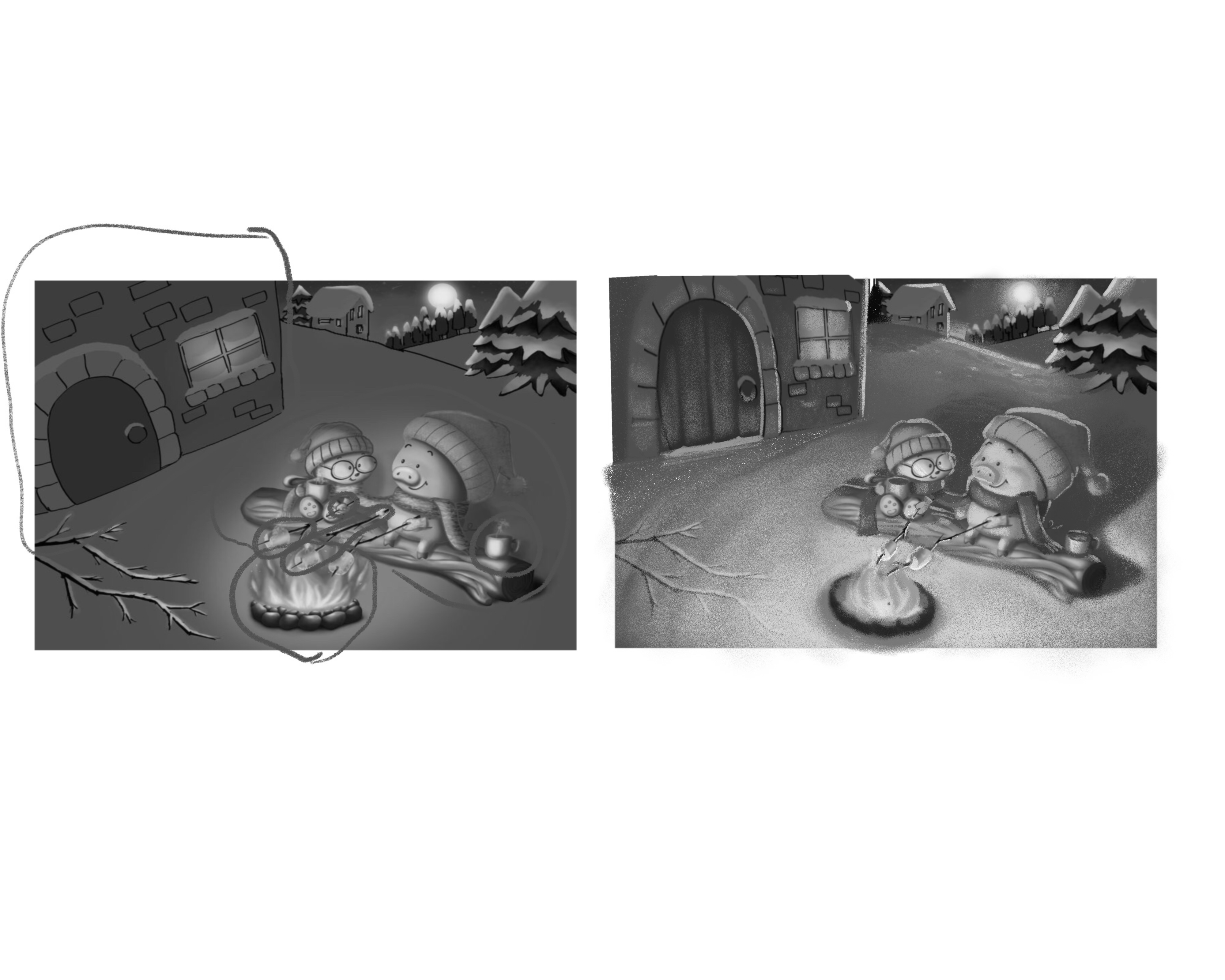
The Perspective. Now this is a huge glaring issue for me. Your characters and the background seem to have a unified perspective but the house and your bonfire seem to be doing their own thing. Let’s first talk about the bonfire. Your camera angle is set at a higher angle that means we should be getting more of a top view and seeing the circumference of the stones around the flames but you’ve painted the fire pit as if we’re directly viewing it from the side. We need to fix this. Now let’s go to the bigger issue, the house. You’re house seems like we’re viewing it from a bird’s eye view. It’s so foreshortened. It really contradicts the whole piece.
Below is my paint over of your piece. We need to fix a few things but your piece has big potential. I hope this helps.
-
Wow, nice paintover, Nyrryl! @nyrrylcadiz As a word of encouragement to @lisanganart , I don't think Nyrryl could have done that without such a good foundation to work on. Thanks for sharing your art for everyone to learn from!
-
@KathrynAdebayo the piece definitely had great bones. Great concept. Good composition.

Portfolio: nyrrylcadiz.com
Instagram: https://www.instagram.com/nyrryl_cadiz/
YouTube: https://www.youtube.com/channel/UCbJCF1Im8ZO7hpGWTKOJMuA -
@nyrrylcadiz Thank you so much for taking the time to explain everything to me and also to do a paint over. It looks so much better! @KathrynAdebayo thank you for your encouragement! Thank you everyone for stopping by. I learned so much from all of you and I appreciate the honesty and eagerness to help. You are an amazing group!
-
@lisanganart you’re doing amazing work! Keep on practicing and making art and yuo’ll surely improve.

-
@lisanganart Very cute concept.
@nyrrylcadiz Wow. the paint over is great. Love the lighting in your paint over. -
Your paint over was also helpful to me as well, thanks @nyrrylcadiz
-
Great paint over, @nyrrylcadiz!
That is exactly what I was thinking and suggesting in my comment.
It looks great.