WIP Love is a Battlefield
-
Nice concept...look forward to seeing the next iterations.
-
Thanks for the encouragement! I got some basic "pencil" sketching done and worked out the details a bit more today.
-
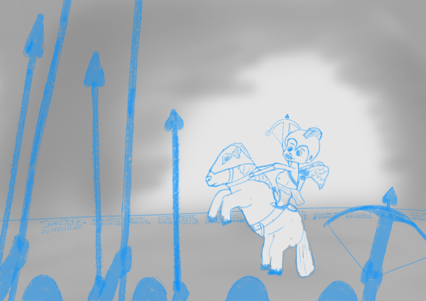
Seemed a bit hard to see at that size. Here's one with the foreground tones layer off.
-
This feels very flat. I think some of that has to do with how the horse and figure riding it feels close to the apparent size of the foreground characters. Also the foreground characters feel abruptly cut-off and their spears are drawing a lot lof attention. I think the background and ground feels a bit lazy. I recommend doing smaller and faster executed experiments to make a better composition and sense of value. You don't have to do it digitally either. in fact you may feel a lot more freedom drawing in a sketchbook, just make sure it's readable
-
Thanks so much for sharing your process. The idea is great
")
-
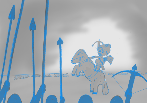
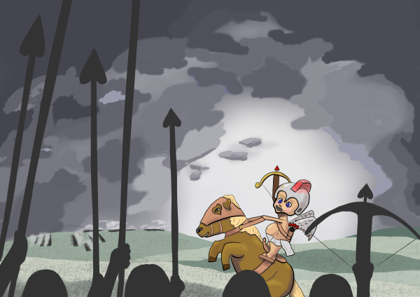
Seemed like Cupid was floating a bit so I brought him down. Got a little bit of line work done too. I would really like to have a battle raging in the distant background, with this group ready to dish out some love, instead of them facing an army head on. Not sure if that's gonna work out, but if you can't experiment while making a 300 themed battle scene starring Cupid - when is the right time?

-
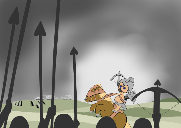
This month is too short! Hopefully I can get this thing done on time. Made some progress on the battlefield, ground and sky. Just needs a bit of coloring and lots of refinement. That distant battle was giving me fits. If anyone had ideas of how to convey that better let me know (quickly
)
-
Even as a silhouette that work is cool.
-
@peteolczyk Thanks!
-
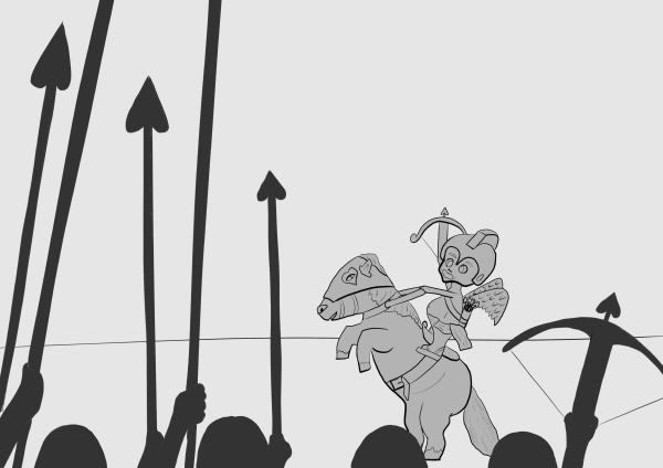
Starting to come together. Nothing like an incoming deadline to force some progress.
-
@SketchyArtish looks good! The darker clouds really brings out the character. The outline around the face looks a little wider than other outlines, not sure if that was intentional? I really like the foreground weapons and overall composition.
-
@yeungtina Thanks! That thickness was intentional to get more "pop." I just did the How to Ink class and am experimenting with the line weights.