My first value study
-
Hi SVS friends! following the advice I got in my last post ( here https://forum.svslearn.com/topic/7157/critique-on-composition )
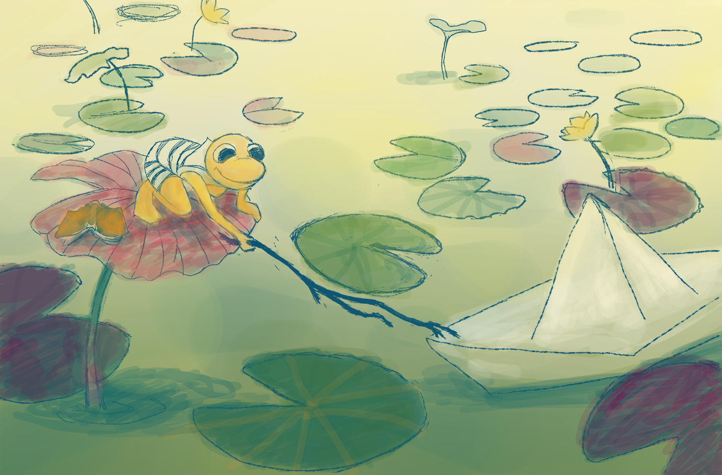
I went ahead with my first value study. This piece will be done with acrylics but here I worked in photoshop.. then I tried adding some colours from the palette I had in mind... how could I improve it ? I am using this piece for my portfolio, but also to learn a process which I didn't have yet.. Thanks for your advice!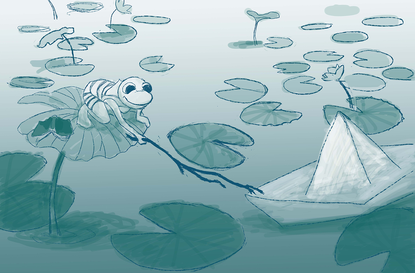
-
@Lucelfo Nice work! Doing a greyscale and adding colour with photoshop (well, painter) is how I work, too
")
The biggest couple of things to wrap my head around when designing in value are still things I'm kinda struggling with, but I think they may help you.
1.) When laying out thumbs and comps in value, you need to have either a light object on a dark background, or a dark object on a light background. Then you need to KEEP that relationship when you paint the final image. our froggy friend starts off as a lighter object on a darker background, but in the painted version, he's closer to a darker object on a lighter background. But the values are still pretty close. Squint at the painting. If things start to blend together, the values are gettin' too close together.
2.) If you want something to be a fully saturated colour in the final painting, it's going to be a neutral grey in the greyscale image. Keep that in mind when designing your lights on darks and darks on lights
Awesome work! I like the composition
-
@Braden-Hallett thank you so much for these advices and the effort to explain them, i know it's not easy to put in words this stuff! very useful and I am going to think about them ..
-
@Lucelfo Awesome work! I actually liked the value study better than the color, not sure why...maybe the contrast? The origami boat is super cute!