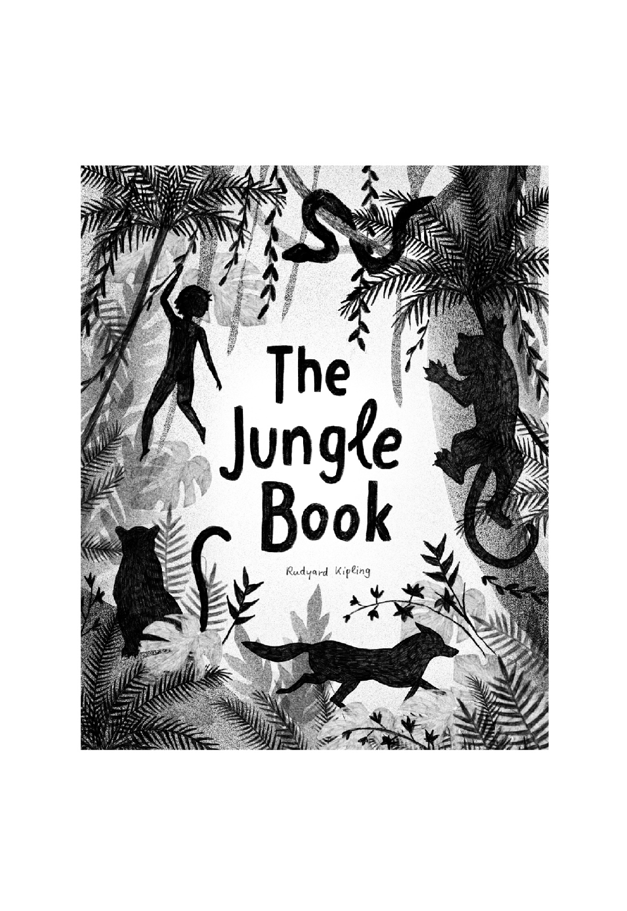
WIP Book Cover „The Jungle Book“
-
Yeah your silhouettes are very clear. The values are really good. Even if you left it black and white it would be effective. Which i think means if you decided to color it and kept the values in the same ballpark it could look even more amazing.
I dont know if you need additional elements like balloo and fire. There are definitely ways to add them if you wanted to build on it. But so far the concept is very clear and communicates well.
-
Actually, I quite like how the animals and boy are deliberately framing the title. But that's a personal choice I think. I think this is gorgeous. x
-
@andersoncarman first, thank you for your detailed critique!

I’m thinking about replacing Bagheera with Baloo... since Baloo is a character people have immediately in mind when thinking about the jungle book, ...and you are right about his flat bottom, I actually tried to hide it with some leaves haha
I tried first to show Kaa’s full body but liked it more when a part was hidden, I think that’s sneakier, and he is sneaky isn’t he?
I keep the fire idea in mind...I’m also really unsure how to include it and if I do I will do it in a very subtle way.
Maybe it’s also good to say that the book is actually very different from the Disney movie which picks just it’s favourite parts from the book and puts them together in a new way. The book itself is separated in a lot of different tales and some of them are not even connected to Mowgli. That’s also a point that makes me a little bit unsure about the fire idea.
@Sas thank you for sharing your thoughts Saskia I will work on the details you mentioned! About the space above I liked that it gets a little bit airy, like the holes you have in trees when you look up a forest? But I will give it a try and see how it comes out
 ")
@Aleksey thank you! I will try to keep the values, even though I’m still a little bit scared that I will ruin it with colour. But I just take it as a challenge!
@CobaB Thank you! I’m glad you like it! -
@saciia_ I really love your cover, the layout is beautiful! Such a great job laying the values out like that before you start.
You already received some great feedback, and the only thing I would add is the top right of the image feels a bit crowded to me: the dark value plant and dark animal are pretty close to each other (and to the snake). To create more breathing space and overall balance for the piece I would suggest to move the plant a little upwards, or lighten the value a bit (maybe even turn the plant upside down and have it lean in from the right upper corner like the corners down below). I hope that makes sense, it’s sometimes hard to express art terms in English.
I’m really looking forward to seeing your finished piece, it looks amazing!
-
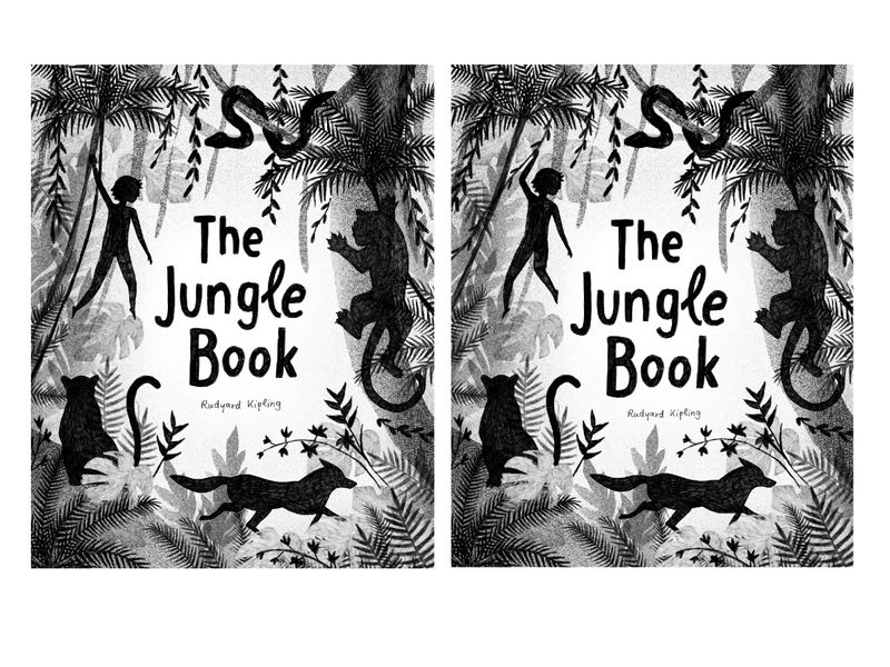
Okay, I made a couple of small changes. One of the best tips you gave me was definitely changing the boy a bit. I think I got now some more natural casually hanging in the jungle - pose
I decided to leave Bagheera - first I just love how his tale comes into the light space and also I like his presence - I feel watched and Bagheera is the one who always keeps the eyes open, isn’t he? Since there are so many animals in the book I just decide to leave something out in the hope that less is more.
Thank you all for the critique until now! It really helped me to see and think about points I haven’t seen before! If there is still something bothering you in the cover feel free to complain!
Next step is a scary one: Colouring! I have no idea what will happen
-
Before and after:
Instagram: saciia_
-
@saciia_ I love the values on this cover. I think the silhouette design is very strong. One thing I don't know if you have considered--every silhouette is equal in importance--You might be fixing to change this with the addition of color, but if you want to create visual heirachy---maybe all the silhouettes are pointing to the boy...? , then something might need to give. If you are striving for harmony, you nailed it.
-
I really like this. The bold silhouettes contrast nicely with the background/foreground. I appreciate the balanced composition to this piece as well. Great work!
-
Hi @saciia_ Laura said, that all animals are pointing to the boy, what about changing the direction of the wolf, so that it also goes in this direction.
About the hanging, love the new position of the liana and boys lower body, I would make his right hand little bit more straight hanging. I an happy that You didn't changed Bagheera, I liked his pose also. Try to make the authors name bit bigger. -
This is a beautiful composition, I like all the details in it. Second one is a subtle improvement on the first.
-
@saciia_ Yeaah this is the stuff! To see what a huge difference one small change can make. Love it!
-
This looks great @saciia_ ! I wonder if making the boy smaller might add a bit more interest. If you want to try that I would suggest thickening the tree beside him to keep the visual balance. It looks great as is though. This style really suits the book. Good work!