Boy licking a shop window WIP
-
@lauraa Yes that's matched up
")
-
@hannahmccaffery Ok, thanks! Vote taken down.

-
I like 4 but I also like the hat in 9.
-
@inkandspatter I'm not sure whether it goes with a specific course, but it goes with the general idea of what the courses teach, and I've seen it elsewhere as well. SVS gas two color courses, though: Painting Color and Light and Choosing Colors for Storytelling.
Also see the link above to the other thread about color resources. People posted some great stuff! I found some of these colors while playing around with Coolers, linked in that thread.
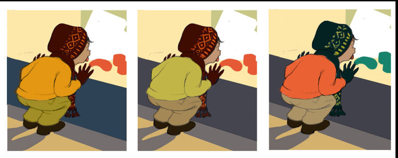
What I did here was to create a value study with a mask for each object (makes selection easy), put them in a folder, and then on top of that I created a folder for each scheme with most of the layers set to color mode. Color mode just adds color to the values, and that keeps the values consistent. The obvious exception is number 8, in which I made the cap bright red. I had made the cap dark to draw attention to the boy's head against the glass, but I always have this thing about vibrating color, especially red. It just works its way into everything!
I tend to like 2 the best, but would be hard pressed to say why. I could make the cap pattern brighter, of course. And I like 8. It doesn't have the value effect I wanted, but maybe the intensity of the color makes up for it? But I really like getting all your opinions, because it reminds me that we all see things differently. And if enough people like one particular color scheme, it may mean that one has something universally appealing about it.
-
I like number 1 the best!
-
Submitting final (tweaked and cropped) color comps for critique. I like all of these, but I think I'm going to go for the red version.
I'm going to refine what's going on in the window, though. The tough part is going to be to render the idea of something good to eat, but still have a lot of teal green.
I have a long way to do on this, especially since I'll likely be trying out different stylistic ideas. The point with the last couple of pieces I've posted here has been to start a 100 kids streak and develop a style in the process. As usual, your opinions are more than welcome!
-
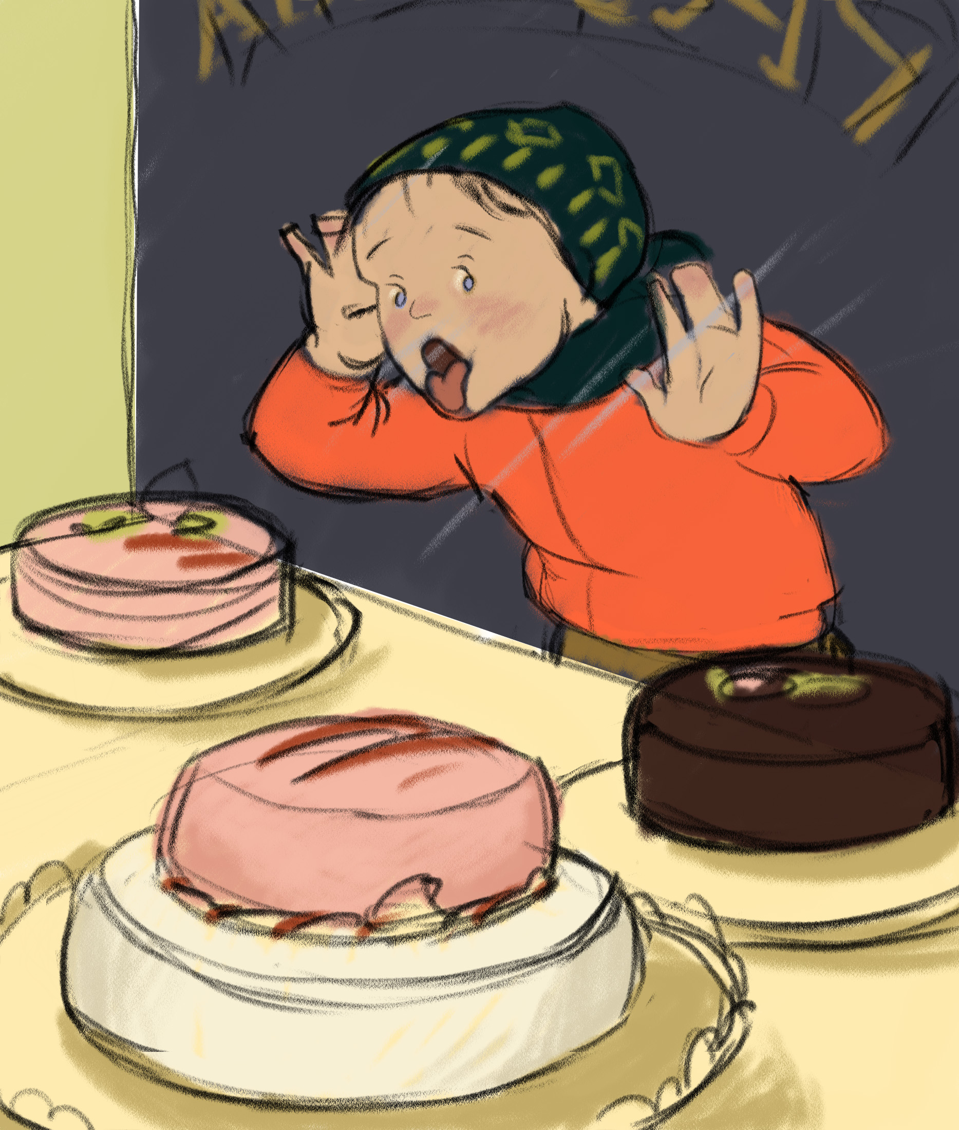
Today I rethought this whole composition, came up with a color sketch, and I think I like it better! Maybe he needs his gloves on, but I even sort of like the cold hands. They'd leave such nice smears on the window! The gloves could go around his neck...
Any thoughts? Thank you!
-
I like this version because you can see his face. And it makes me hungry
-
Oh yeah! That looks way better. I think if you exaggerate it more by squishing the face and hands up against the glass more and add that weird breath fog on the glass it would look even better. Cause kids are gross sometimes kinda like this:
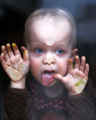 https://i.pinimg.com/originals/d6/64/1e/d6641e5ede6fb007872fddc5e287b754.jpg
 -
@LauraA This reminds me of my silk screening days in college -so many colour combinations and your edge crispness too. I like #4 the best but not purple (in the window).
-
@LauraA This is a more dramatic and dynamic angle. I can feel his love of cake. Although, I think you could build this into a comic strip about the mission to get some cake! Also a cold smear of saliva and a bit of mist on the window would add to that barrier between the boy and the cake.
-
@sigross and @Aleksey I love your comments about the window and especially your reference photo, Aleksey! That was going to be worked into my next step. It's going to be hard to get that squished face and pane of glass figured out just right, but I'm going to try. I spent a lot of time with my face and hands pressed up against the mirror yesterday.

@Heather-Boyd I am really attracted to flat print color, but also to light and drawing form. It's so hard to choose! The only thing I know to do is just keep producing work and hope the style question works itself out. And now that I have a dark background to make the red stand out properly, I've pretty much decided on color scheme 3, adding some pink on the cakes. The red/yellow green/purple combo decidedly appealed to me when I returned to the color comps.
In retrospect, this angle was the obvious choice, but it took a while to figure that out because I thought it was plenty funny in real life seeing it from the other side. And since I had liked the way his chartreuse hat looked in real life, I kept trying to get that in the composition too. But story-telling/composition factors have to come first.
I am working especially hard at the moment on being honest with myself and letting others be honest with me, because it's how we grow. So thanks guys, for letting my know what you think!
-
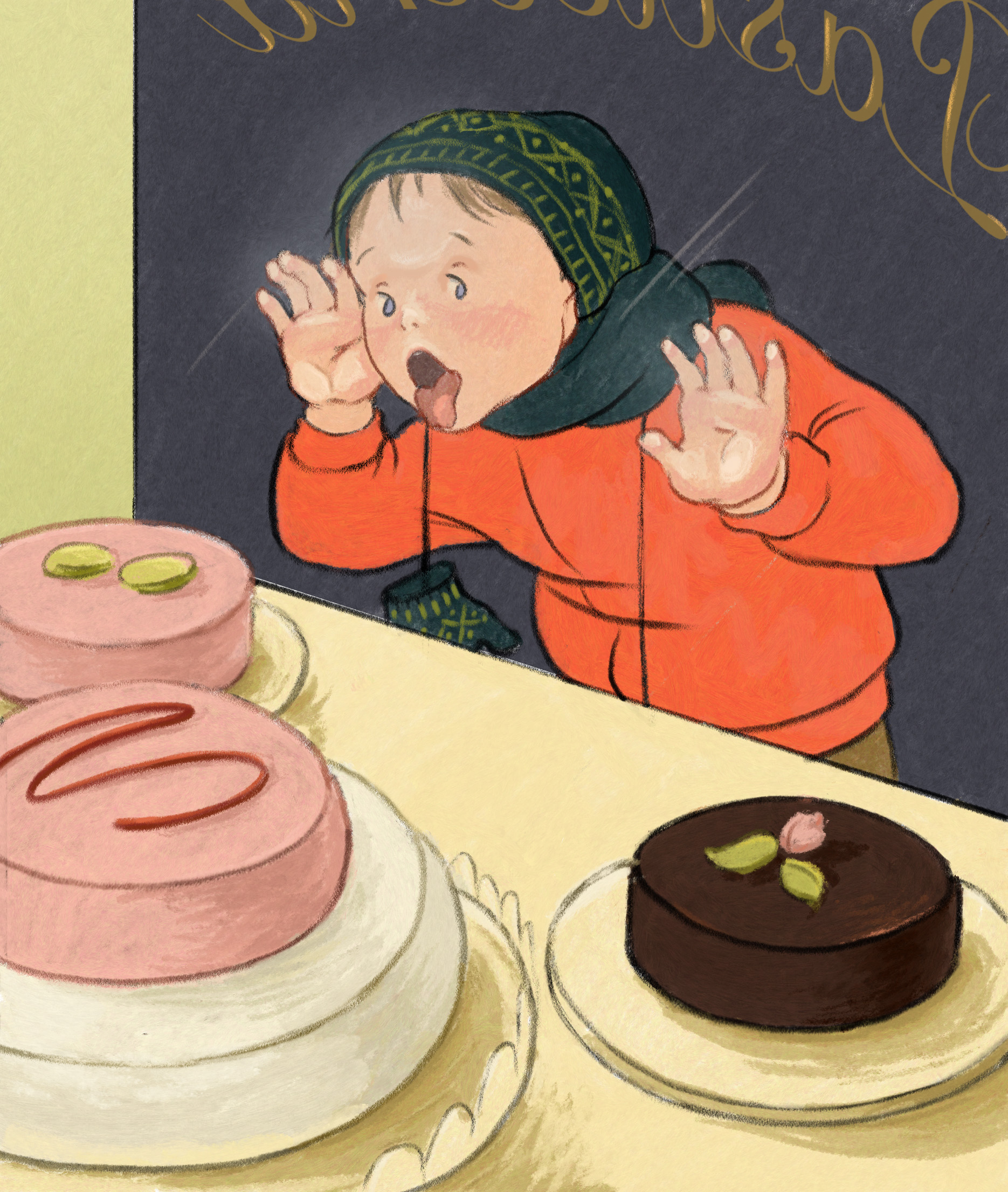
Here's an update on the window-licking piece. Still working, especially on making those cakes look appetizing, but I'm wondering, is it starting to lose its freshness? Also, any tips on the face-pressed-on-glass aspect would be especially welcome. Aleksey, I did use your photo reference--thank you!
And now that I see it enlarged, I'm not too happy with that signage and will probably draw over it or modify it in some way. It's just too obviously font type.
Thank you for your input!
-
It looks beautiful
-
The cakes are very appetizing! I think the flesh pressed against the window is working and the signage looks ok to me. My only critique is that his eyes aren't directly looking at the cakes but more above them which makes me wonder if there is something even more delicious that we can't see!
-
@demotlj Good point!
-
Looks great, I'd be tempted to make the head bigger to make the kid look younger... Depending on the age your going for..

-
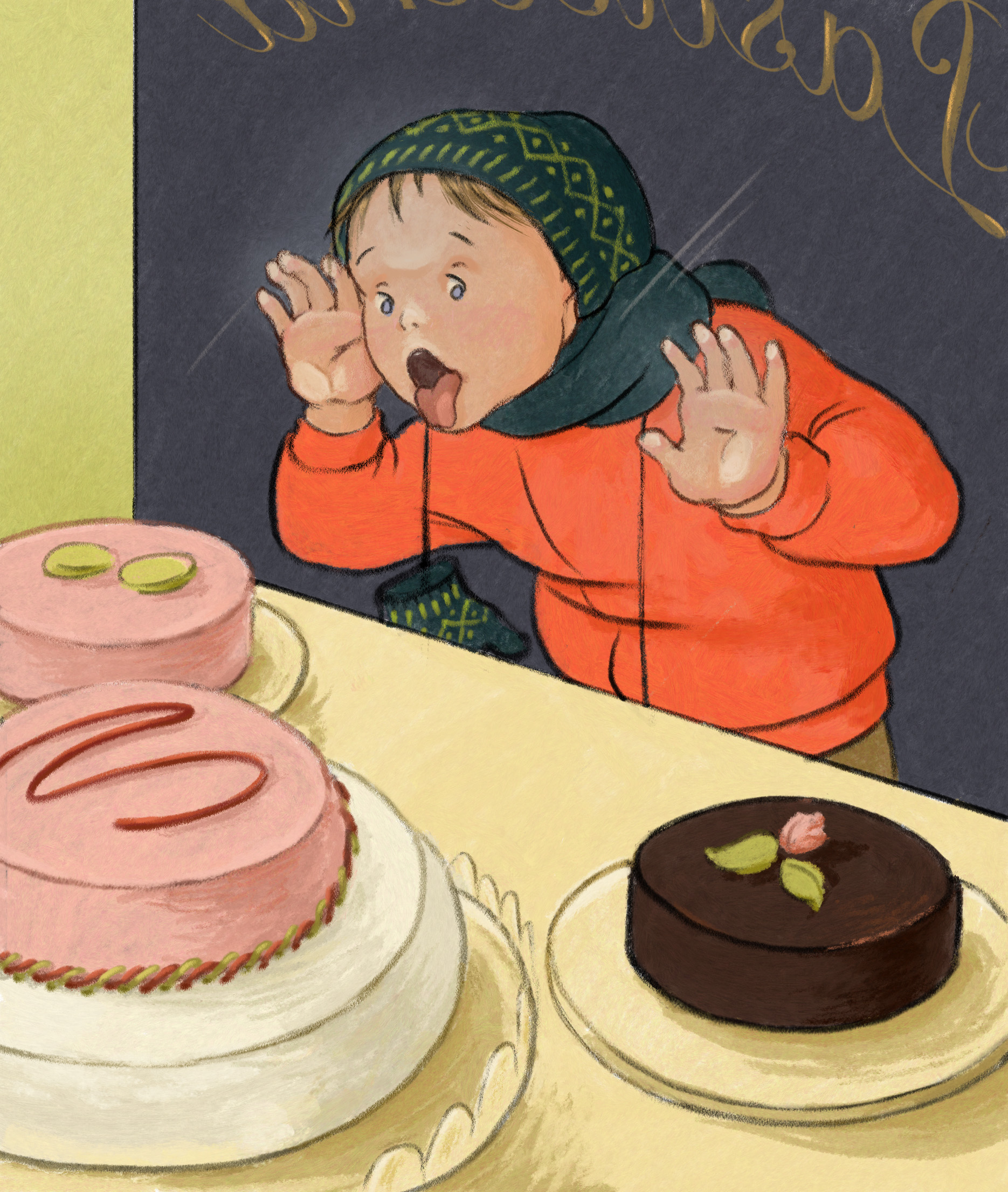
Here's a version that's more or less final. I moved the eyes so that it's clear what he's looking at, added more cake details, tweaked colors, finished the cap design, enlarged the mitten, added some shadows, and roughed up the signage a bit. I didn't enlarge the head size any more, because it's more or less right for a boy who is four or five.
After leaving it to sit for a while, I may do another version closer to the original with the boy facing away from us, because I want to include the mom. But the idea for now was to finish something so I can work on style.
Comments still welcome, of course Just trying to call something done within the next day or two Thanks for all your help!
-
@LauraA I think it looks great. Loved seeing it come together.
-
Hey @LauraA
I REALLY like the change to the second composition. I think it puts emphasis on the more interesting parts of your idea (for me at least) and gives more of a reason to stop and look at the image.Cakes more appetizing.
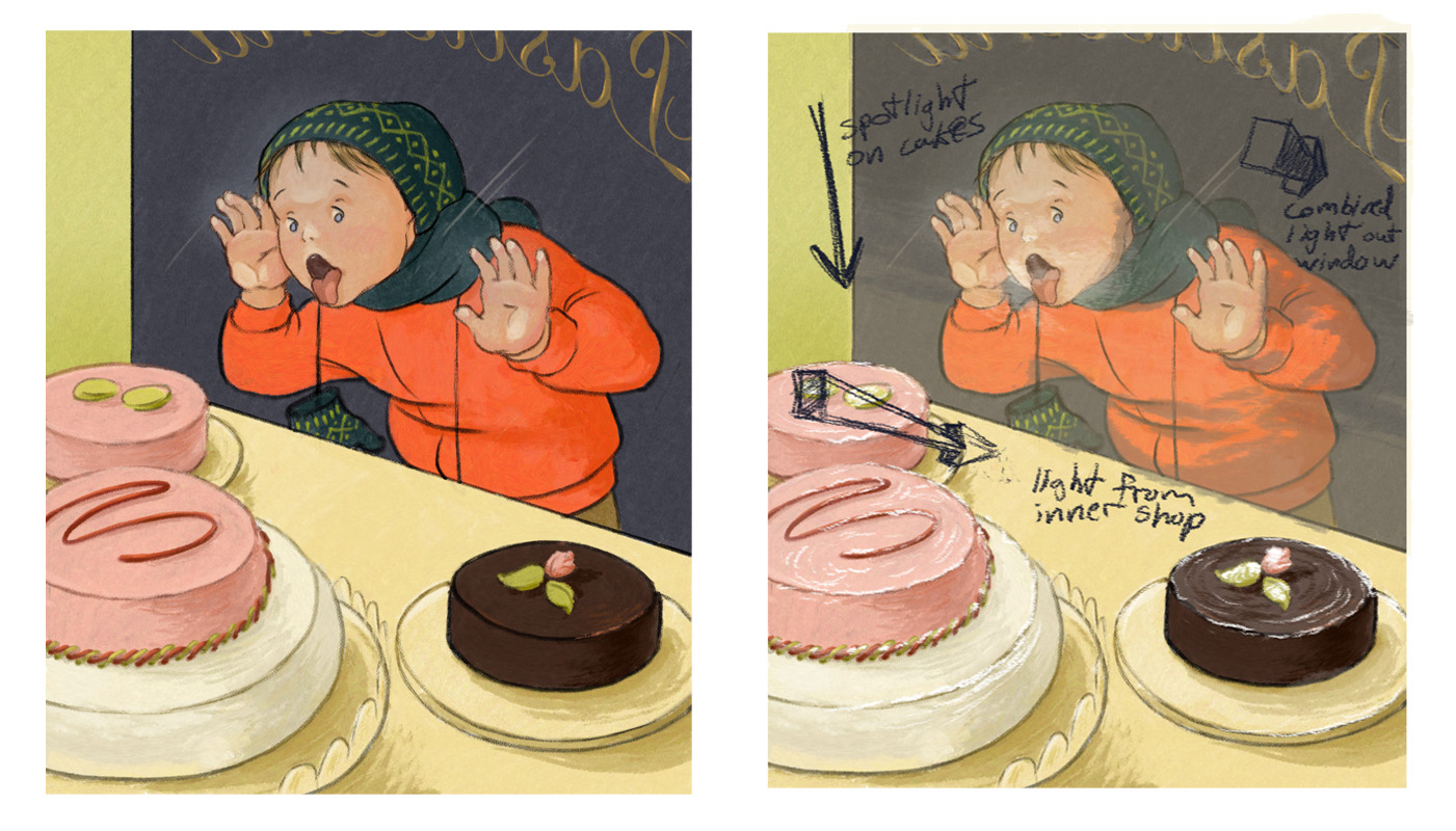
For food commercials, agencies spend a lot of time trying to make the food look extremely appealing. There's more emphasis put on how the consumer wants the food to feel than on how the food actually is. So you get commercials about fruit and veggies with moisture and juice splashing everywhere showing how fresh and juicy everything is. And burger commercials showing moisture rolling from the lettuce to the sauce to the meat. I think the same idea can be applied here as well. Usually stores have window items in spot lights. One approach is to focus on an 'off-screen' spotlight's effect on the food. If the frosting top layer on the cakes is of the traditional creamy variety (not sugar dusted or chocolate shell), the cakes will probably give off a reflective shine. The shine will give you a look at the texture of the cake and a look at how the frosting was spread on the cake. All of this helps present an idea of what the cake will taste like and less an idea of how it actually tastes.Something that sticks out to me is how the glass is represented. The black outline around the boy contrasts and takes away from the outlines of the cakes. The bright colors also take away from the colors of the cake. These present the image as if there's no glass at all. We know that glass likes to act as a mirror. So one way to show that there's glass between the cake and boy is add a layer of the color closest to us - the yellow. This will downplay the colors and black lines on the boy and give the idea that the glass is acting as a mirror.
There's also the boy himself. He's outside in the dark next to a lit window. I think to further convince the viewer that the boy's outside (besides the reflective glass), it can help to play up the light/shadow from the shop on his clothing. The outside color can be used for the shadow to present him as part of the environment outside the shop.
This is all just how I would approach the situation. Really like the designs of the characters (the kid and the cakes
 ). And, as said before, I LOVE the new composition.
Good luck!(sketch over to illustrate points)