Lord of the Flies WIP
-
Looking good Chip! I love your style. When I scroll instagram, I always recognize your art for your unique style.
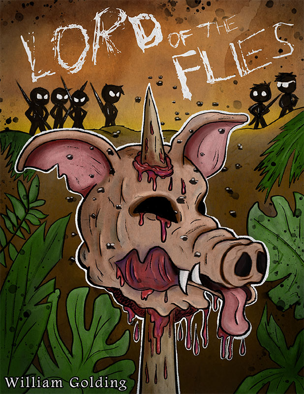
I agree with the others on the color choice of your font. And also the right eye (the one closest to us) of the pig makes it look off with his snout. I can't tell if its the placing of the nostrils or the eye that's a tad crocked.
Love how you worked the white lines around his head. It gives it a nice 3D effect and makes it pop right off my screen. Also great placing of the authors name! Not overruling your piece but not really hidden away either.
-
Thank You so much for all the great feedback. I took everyone's suggestions and tweaked it. Here is the updated cover. Again please let me know if anything needs changing or suggestions. I plan to add the final detail later this week. Thanks!
-
@Chip-Valecek Hi! I haven't read the Lord of the Flies. I must say your bookcover is striking! I would definitely stop and check the book out if I saw this bookcover on a shelf. Well done!
-
Wow Chip - I love this.
I am way into the grunge of it.
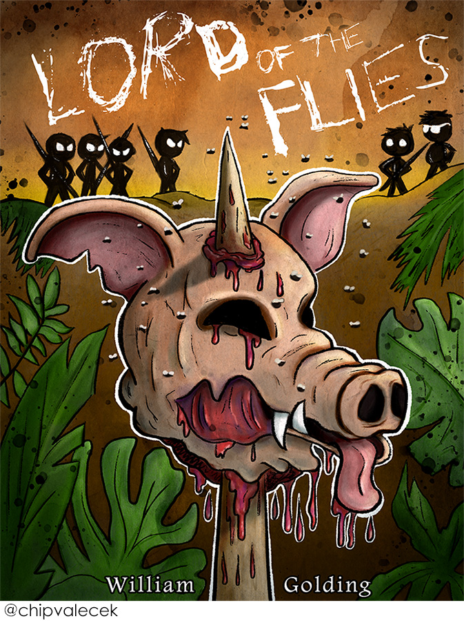
Like super into it.For the William Golding what would it be like if you put the William on the left side of the spike, and Golding on the right - a little larger? Did you try that already? I'm just curious.
I image when you say Final Detail you may mean tightening up the flies a bit more - I think that would be really delicious.Also, total side note, but I would LOVE to see your work on some vintage "Weird Tales" magazine covers.
Oh man - I'm just so excited about this piece!!!
-
@kaitlinmakes thanks for all the positive feedback. That is a good idea with the name of the author, I will try that out. And yes final touches will be cleaning up the flies, some more shadows/hightlights on the pig as well as some extra light source to create a rim light.
-
@Chip-Valecek the right ear on the pig needs to be pushed back, the mass of the head just needs putting in front of it
 it's looking great
-
Looks great. I like the changes to the scale of the kids. I miss the plane, but I totally get that it’s hard to tell the entire story on the cover. The changes to the font look great too. The I and the e at the bottom of flies touches and it is kinda hard to see. Maybe disconnect them and make the I longer? Leaving it the same is fine too. It is much clearer than the wording with the black. The text in general is awesome! Totally reflects the mod of the book.
I was hoping you would do “scary things to tell in the dark.” But lord of the flies is good too. I kinda want to nanny cam my house when the 12 year old is in charge when I’m gone!
-
@Whitney-Simms with the movie coming out soon for scary stories to tell in the dark, I am sure to do fan art of those characters
")
-
@burvantill I agree. There need to be more space between "I" and "E" or it reads "FLES"
-
@Chip-Valecek sweet, I think. We are all even scared of goosebumps in this house. And Harry Potter is even a stretch and the kids haven’t seen all of them. My 12 year old mad the sleepover turn off “the sixth sense”. So, we will just relive the book through your work.
-
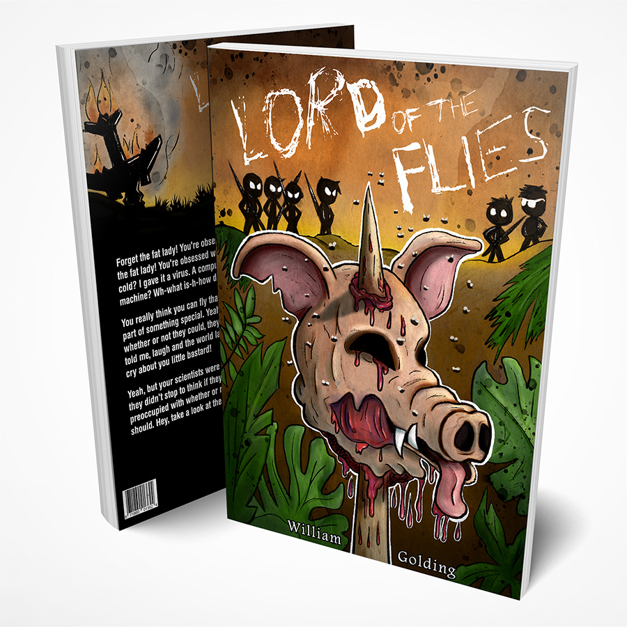
Here is the final cover and mockup.
-
@Chip-Valecek awesome
-
@Chip-Valecek looks awesome! Great job!