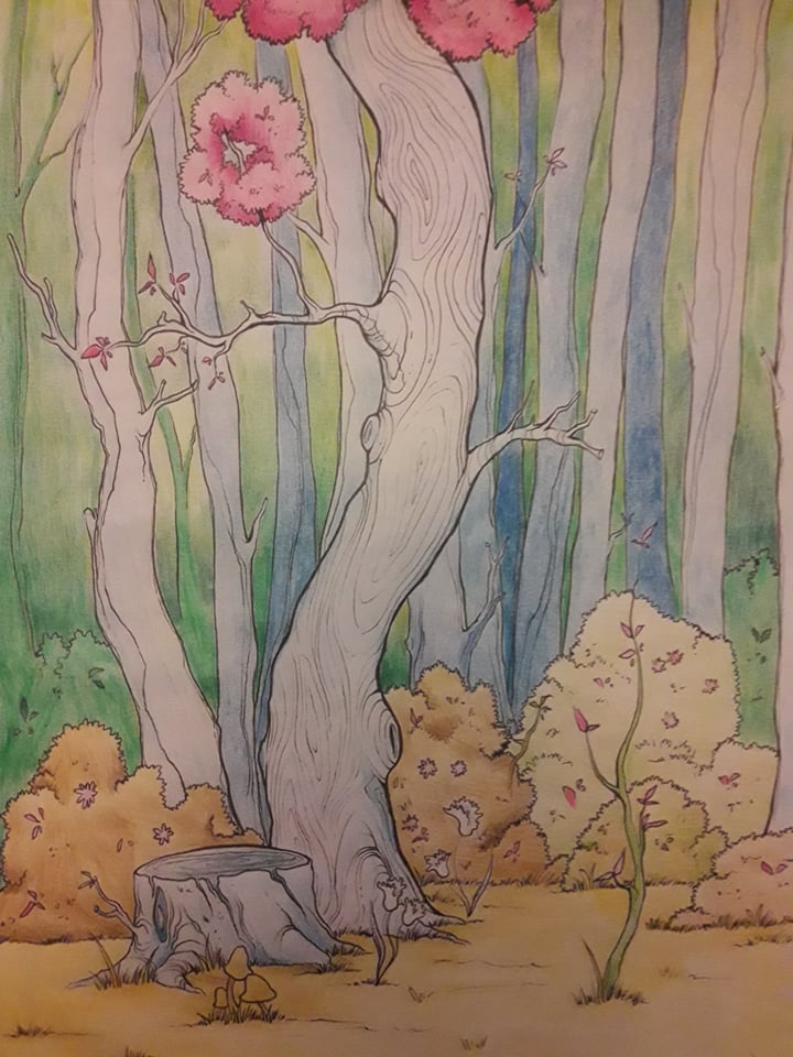
Sense of depth problem in this painting
-
This insight about the values is really helpful. I'll try to learn and incorporate that trick.
I thought the only issue was that green-yellow background behind the trees. Is there anything that can be done about that? It's really throwing me off and I don't know why.
-
Tweaked it a bit. Thanks immensely guys, this looks so much better!!!
 I'll keep working.
 -
Hi there, your line work and composition is really good. I like this a lot but I agree with the others, the values are what's throwing you off. It would be worthwhile to do some quick value studies and as Chip said, the closer the object, the darker it should be. The trees in the background are fighting for attention because they are so dark. I struggle with value all the time... somehow it seems counter-intuitive to me.
-
@TianLian Really nice drawing! - I think the main things for me pulling the background forward hard edges and a tangent. The thinner tree in the center of the two main trees in the left foreground seems to want to belong to the background at the top and the foreground at the bottom - the tree could be curving back but I think it is helping to bring the rest of the trees on the right that are painted the same value and similar edge treatment forward - the bottom of that tree has harder edges and slightly thicker lines which brings it forward and as we near the top the lines fade a bit which help it go into the background - the bottom of that tree creates a tangent on the left too which is a way to bring an object forward that belongs in the background - there is nearly a tangent on its bottom right too. The hard edges on the outlines of the bushes has a flattening effect which also makes them seem to exist in the foreground - another way to bring the background forward is with saturation - your background colors are more saturated than the foreground colors which bring them foreword to our eye - making the foreground much darker will help bring it forward - this looks like it is not digital? could you make a few copies and mess around with value a bit on them? The tree in the foreground should be quite dark in places even if it were a white tree I'm thinking - anyways.. feel free to ignore - I really like your drawing!
-
@Kevin-Longueil wow, so much information in your comment. Thank you.
That's not digital. It's traditional, colored pencils. There's not much else I can do to it. Paper's already all wrinkled, which I hate.
I didn't know about all these mistakes until you pointed them out to me. It makes sense that things that are in the background cannot be darker than things in the foreground. But it's done now. -
@TianLian I work in traditional media mostly too. For edits I have found a light table to be an awesome device. You can duplicate your piece very easily/quickly so you are not stuck with not being able to make changes. It is difficult if you get along too far but in general you can do edits and not loose all of the layout and work you have done up to this point.
They are not too expensive anymore with LED tables available now. You can find some examples here:
https://www.thearchitectsguide.com/blog/light-table
I have a Artograph which has served me well. It also helps with going from thumbnails, to roughs and to finals. You can use the computer to blowup the thumbnail or rough and then make sure you are keeping your proportions and such.
-
@Kevin-Longueil I don't think there are mistakes - the things i mentioned could be helping to flatten the image but it really is an Excellent drawing even if it does not have the sense of depth you are wanting - and if you check out my work you’ll see that i am certainly no expert at this
")
-
I thought about doing some small thumbnails, just the basic shapes and do some value studies. Recreate my drawing with whatever value problems there are and then create a couple of others and see what happens.
-
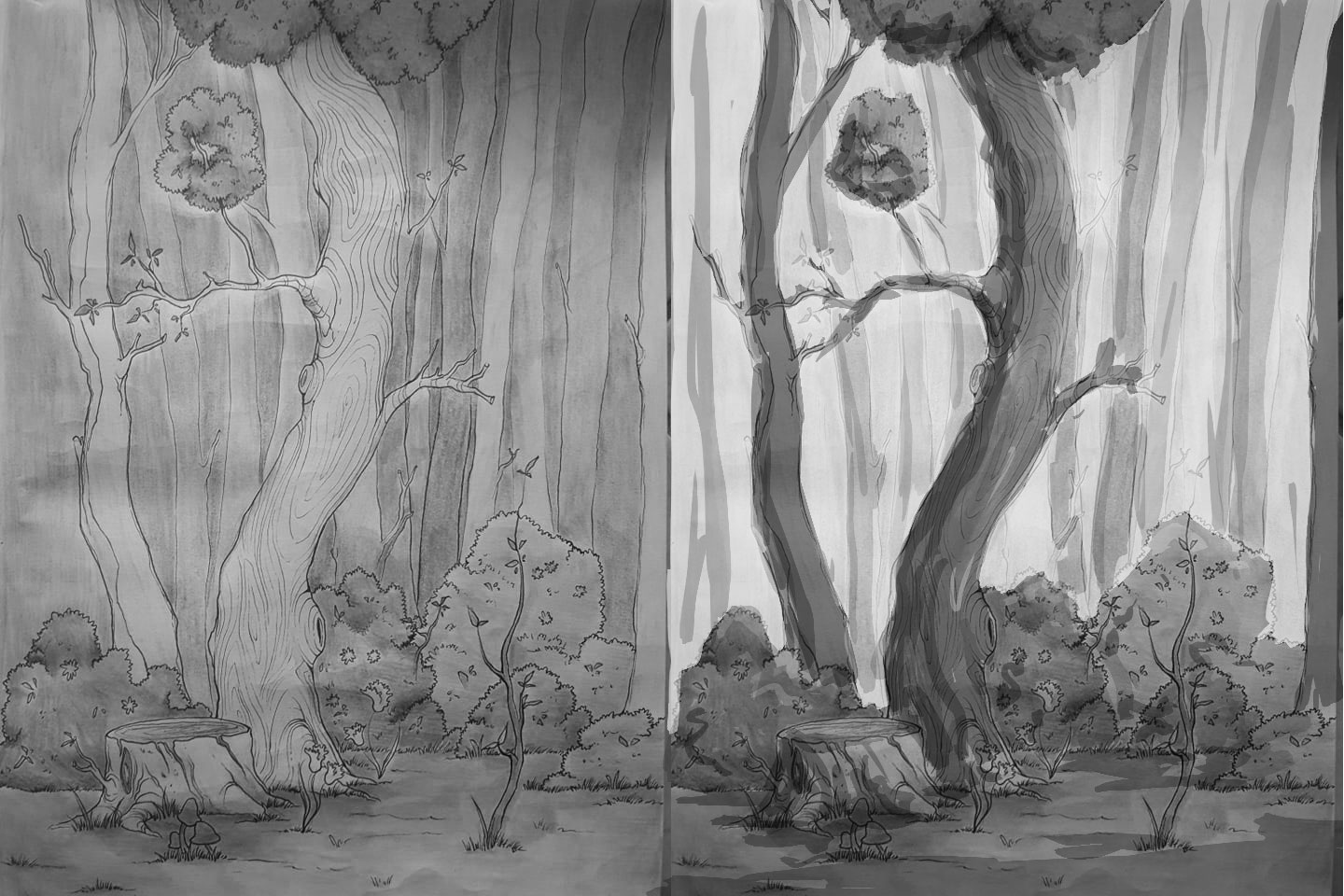
I find it's a lot easier to see values in black and white.
I did a quick paintover hope that helps.
I just created more contrast between the foreground and background to create more depth.Love your main tree btw
-
@Sliproot Woooah dude, thanks!! This looks awesome. It's really amazing how much different a painting can get with some tweaking in its value scale. I've no idea how to work digitally though :p. I'll create some traditional value studies of my painting and post them. Your example really helped.
-
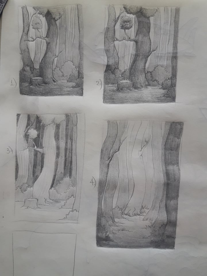
Here's what I did. These look so much better in person, than in my crappy phone camera -_-Whatevs.
Images 1 and 2 are done with what you all said in mind. Image 3 is the image I made with the values grouped a little better. Image 4 is a new concept where the tree that is the focal point is actually in the background. Now I don't know if you agree but image 3 works right? Even though the darker values are further back? -
I like number 4 out of them all, if you add some leaves at the top of the illustration then it would work great!
-
@TianLian I would agree with @hannahmccaffery that #4 is coming out the best. I think it is maybe because the framing using the trees. In 1 & 2 you run it having the tree on the left just touching the edge... that is really distracting. It should either be on and not touching or framing like the tree on the right.
I think that both 3 and 4 work but you might want to think about the feel you want. #3 feels to me that we are standing on the edge of the forest looking in. #4 feels like we are in the forest and found a cool tree. It is amazing how value can change the feeling isn't it! Good job with the value studies.
-
Excuse the delay, I didn't have internet for a few days.
@theprairiefox so you mean that in pics 1 and 2 the central tree and the tree on the left are fighting for the attention of the viewer?
Thanks for the insight. It's really fascinating that there aren't really any rules when it comes to that stuff. You just experiment, think about the feel and the atmosphere you want out of the image and see how it goes. Nevertheless I got some useful pointers out of all you guys. Thank you very much!