Moment Before Dragon Egg WIP
-
Hi guys.
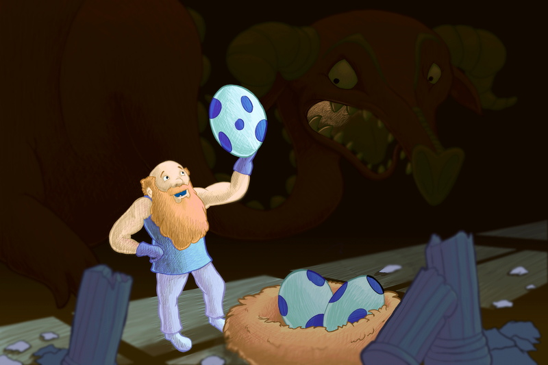
For this month's competition I went for the moment before things get very toasty for this wandering dwarf. I was trying to push the separation of the foreground and background characters. Using cool lighter colours and lighting for the foreground and darker warmer colours for the background. I wanted to try and push the dragon back as far into the shadow as possible so that it would almost be a second read with the inner mouth glow signalling that something lay in the gloom.
The things I'm not currently sure about are whether the dwarf pops out too much that he doesn't like he's in the same room as the dragon. The more I look at it the more i feel he should have stronger shadows.
Thanks,
Daniel -
@skillydan This is a great piece! I am thinking darker values in the foreground would be good as you mention - i started messing with "curves" in procreate and it was only then that i could see how cool your dragon really is - so maybe lighten the background a tiny bit?(maybe not) and darken the foreground a lot? The only other thing is maybe the pose of the dwarf - i am thinking the egg feels almost weightless by the way he is holding it - i did a quick draw over of a pose that might help imply weight - one last thought is that the image seemed to flow really well when i flipped it horizontally to check my drawing so i left it that way to see what you might think - feel free to ignore - just my thoughts
") - really nice image you have going here!
- really nice image you have going here!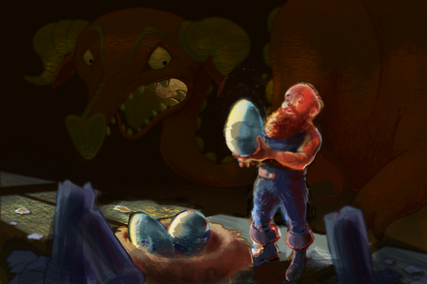
-
Thanks for taking the time to reply and critique @Kevin-Longueil. Really appreciate your feed back.
I know what you mean about the background. I've since viewed the image on my phone and can see it's much darker compared to my computer screen.
That's a good point about the dwarf's pose. In my initial sketches I'd had him finding gold and holding it up to the light. The eggs read better than the gold but I kept the pose. Your pose does work much better.
Thank you for doing the paint over. It has really helped me to visualise your points.
-
Nice idea! I love the dragon in the background and the fact that you keep it subtle, so as to be more of a lurking presence rather than detracting from the focal point, but honestly I didn't even notice it at first. The silhouette of the body may need just a slight bit more contrast to draw the eye there at all?