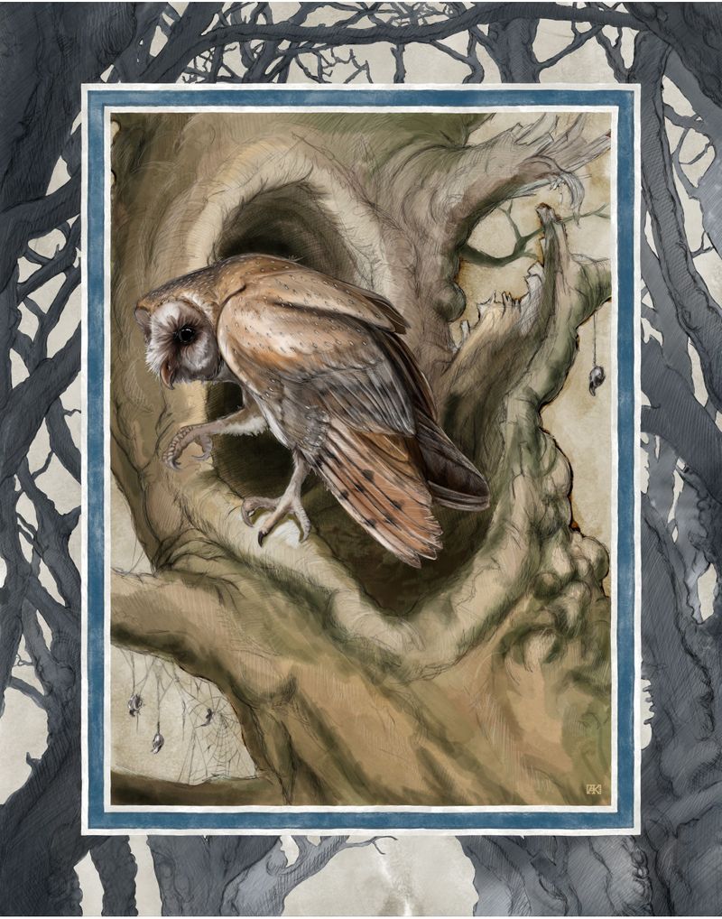
Border alternatives/ Critiques welcome.
-
@Adrian-K Try googling "frame clipart" in Google image for inspiration
")
-
@Adrian-K I love your style of breaking borders but in this case the double border makes it look like the mouse is looking at a framed painting of the owl. Maybe some part of the owl or tree could also break the frame?
Are you doing a story with the owl and mouse? I loved your painting for the April contest and these characters are so appealing.
Laurie DeMott
instagram.com/demotlj -
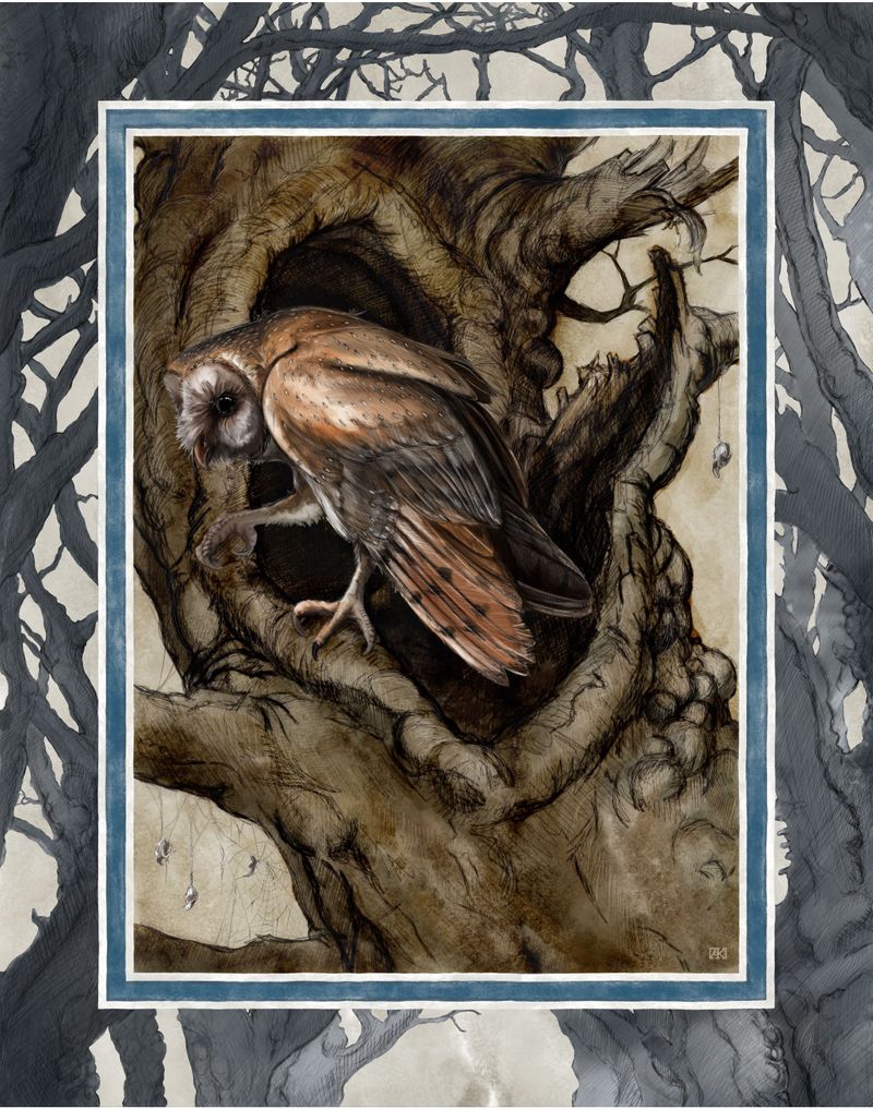
@demotlj thank you very much. I’m currently doing a series of these. As for a story, just visual for right now though that may change. I do agree with your statement of the mouse looking in. Currently I’m not happy with that mouse, I’ll be making him younger as well as him having a friend going to meet the owl, thus bringing the action from the outside into the picture. At least that was the plan.
-
@Adrian-K This is a really nice drawing! For feedback i would say you could really minimize the line weight of the interior frame - maybe even just render up to that outline without having a line at all? The mouse will still break the plane but the frame itself will not grab the eye so strongly - could be wrong though - either way ..great image
-
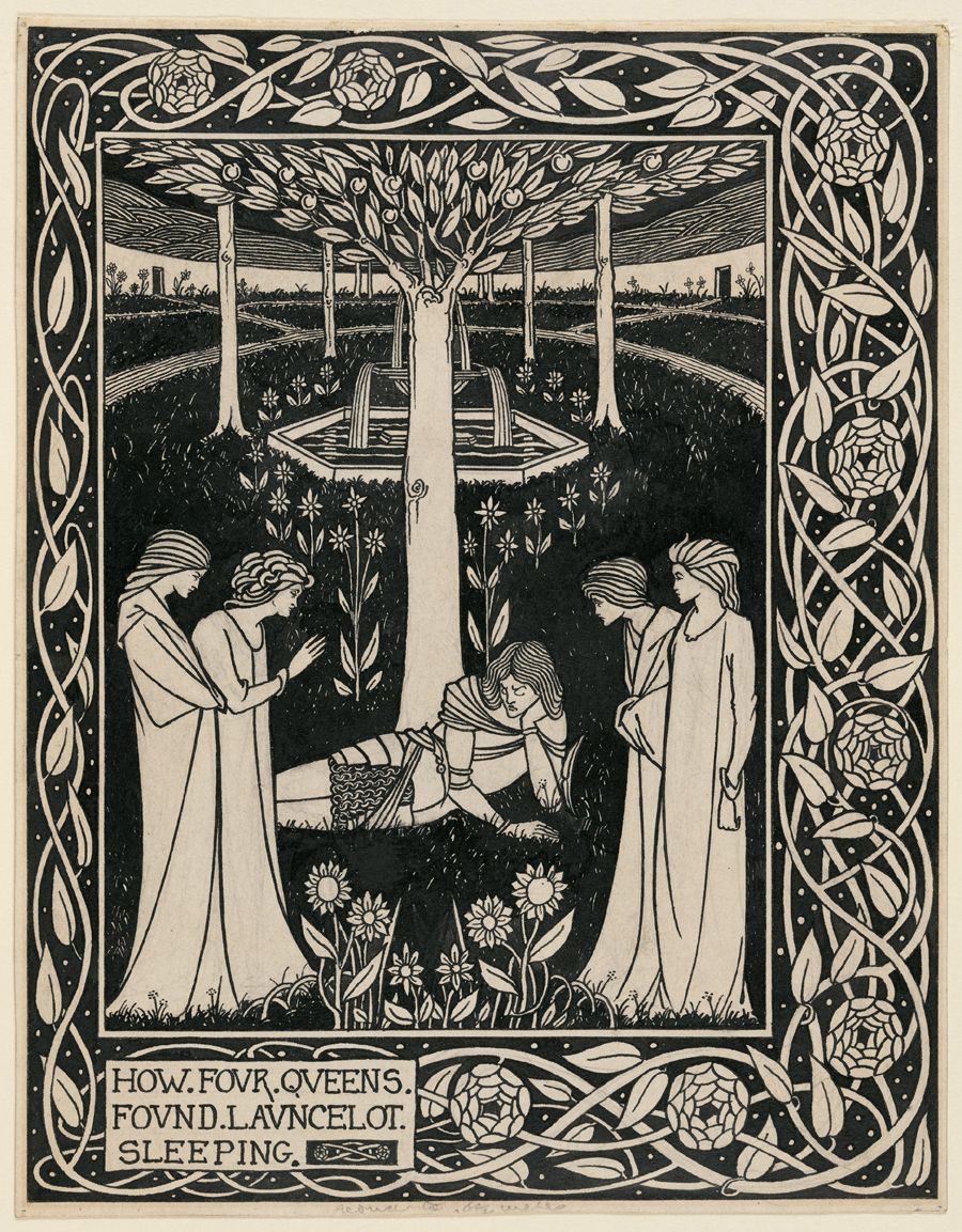
I agree with @Kevin- eliminate the interior frame and just imply it. When thinking of an illustrator who successfully uses borders and frames in illustrations I can think of no better example than Jan Brett. Her borders are usually very decorative but she is worth taking a look at. Jan Thornhill has a similar approach.
An illustrator who I think successfully breaks the plane of the page - AND does it with a mouse - is Monique Felix.
-
So here’s an update with the direction I’m going. I still have a bit more on this one in adding colors/characters, and playing with warm and cool tones.
@Kevin-Longueil thanks for the suggestion, it actually reminded me of one of my favorite artists Alan Lee, I had forgotten he does a lot of framing in his images. @Amber-Lynn-Benton thanks for the direction in Illustrators for me to follow, it’s helped.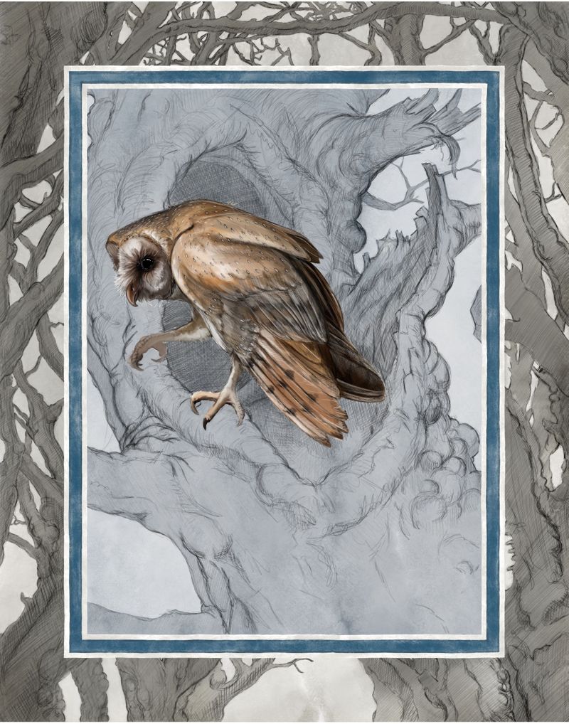
-
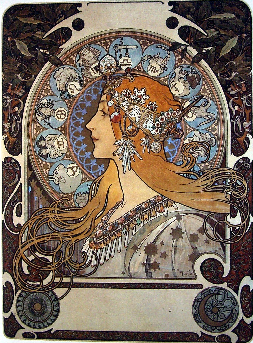
@Adrian-K Have you looked at Alfons Mucha's Art Nouveau work? His framing is electric!
Also look at the eccentric Aubrey Beardsley - the magic of the framing takes you into the world the illustrations are set.
-
@Adrian-K I like where this is going much much better than before!
-
@sigross yess love these 2
the golden age of illustration had so many artists that used similar framing techniques
My favorite is ivan bilibin
-
There’s also the etheringtonbrothers account I follow on instagram they give good art tutorials. Heres one they did on framing with cities:
https://www.instagram.com/p/BxbkDZHl0Vd/?utm_source=ig_share_sheet&igshid=qojopkipv5v8 -
I think I may have concluded this (design/color wise), a little more blending to do. I decided to go for a coffee or tea stained look, while dark, I kinda like for the mood. Also decided not to include any secondary characters as they all seemed to feel a bit shoehorned. All thoughts, opinions, critiques welcome.
Edit - lighter version
-
Wow. This is beautiful. Just...so cool. I love your textures and style. When you first posted this I thought the frame looked artificial because the line style was too clean but when you made it looked like a hand-drawn line it totally works. I think the mouse would work in this context too. I too love breaking the frame. I did quite a bit of animal art during Inktober and used breaking the frame as a stylistic choice and I was really pleased by the effect. I would love to watch a video of your process digitally or better yet sit down and watch you work. I love your style and feel like your realism style is more what I need to develop if I pursue illustration. I can make this style traditionally but alas, when I put my hands to the computer I struggle with recreating what I can do with a brush, pen, or a color pencil.
-
Thank you very much @chrisaakins , I appreciate your thoughts on this piece. One of the reasons I avoided digital until about a year ago now was because all I saw was so obviously digital, that there was literally no appeal in it for me. I love the look of traditional media, and trying to enjoy the benefits of digital while retaining a traditional look has been one of my main goals/struggles. All in all, my approach to working has been one of simplicity or a traditional mind set. There are a lot of cool tricks that can be used for digital, but for me, I have to limit those features. When I deviate from that I run into issues like you mentioned with the original border being too clean - (fake).
I may come back to this later to add the secondary character to break the border, but for now it needs to breathe.