logo design
-
Hi @BichonBistro, I am wondering if this task could be simplified a little bit by breaking it down like this:
Deliverable #1: A simple line drawing that would translate well on a coat/other pieces of cloth.
Deliverable #2: The same line drawing with a little more detail and colour to feature on the business card.Keeping this in mind, the line drawings of the bichons in #1 could be very minimalistic and sleek:
Examples (not of bichons):

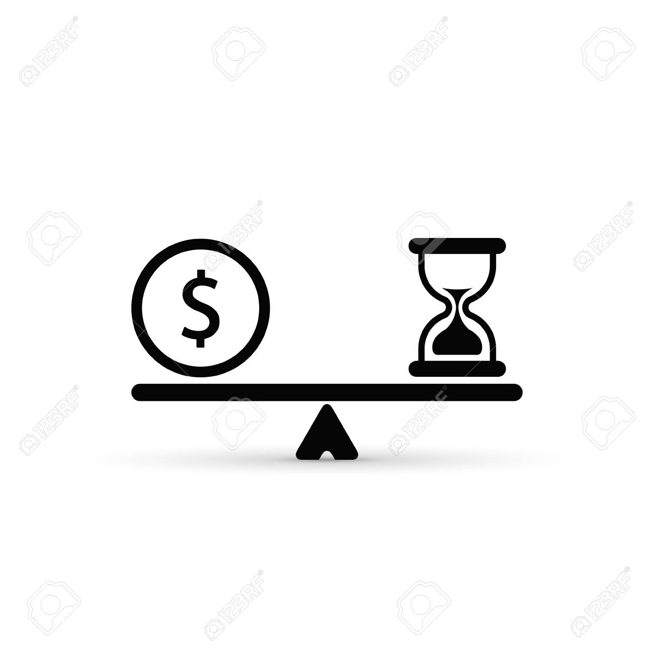
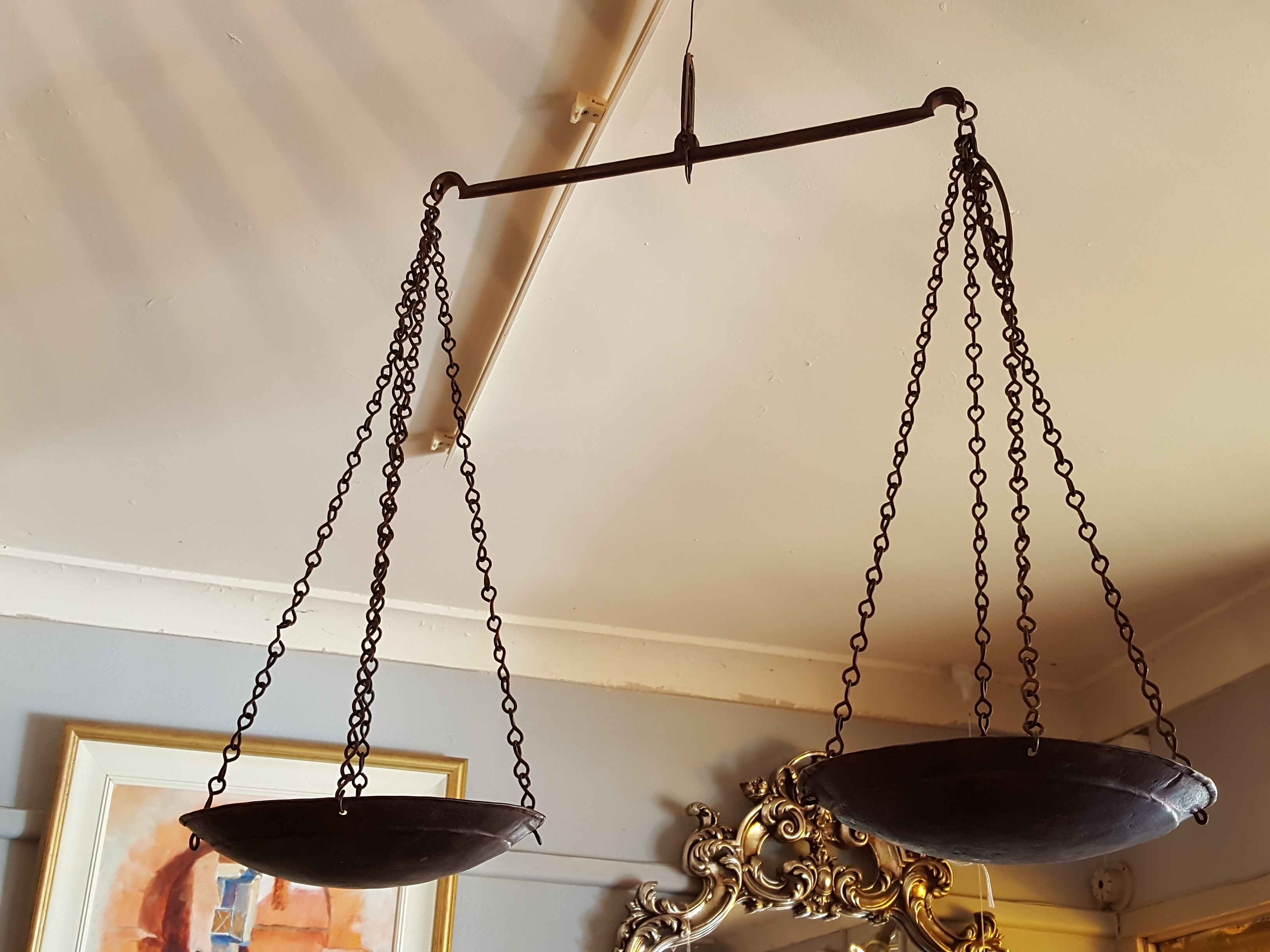
Examples (scale):
As for #2, you could try and bring back a little bit of your style, by giving it a little bit of a watercolour treatment. If you are going that route, is it a possibility for you to have the illustration of the bichons on a scale and the "JustUs"on the front of the business card, and other accompanying text on the back? That way it could look really sleek as well, without the text clashing with the illustration.
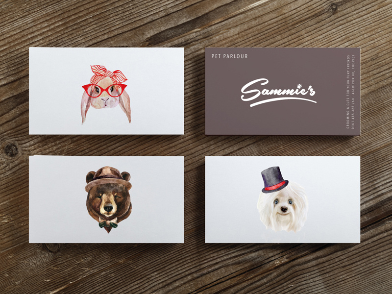
Examples (business card format):
Maybe leave out the ribbon for now till these parts are sorted out?
Hope this helps some! Let us know how it's going.
https://www.instagram.com/sooryajart/
The Beatles: "Roll up, roll up for the Mystery Tour!"
-
@animatosoor thank you so much for the feedback. It sounds like graphic/iconic is the way to go. I have no idea how I am going to achieve the kind of precision these will require beyond the sketch stage, but your reply got me thinking in a different direction.
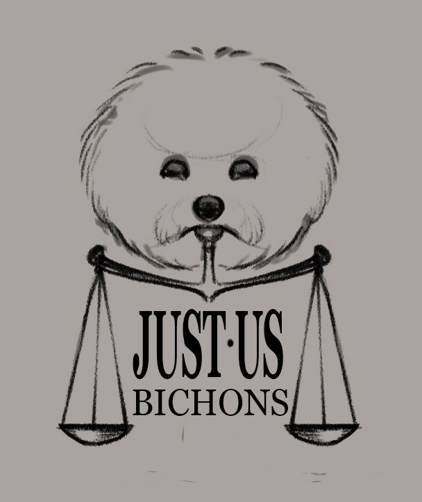
There is another legal icon, the pillar of justice. And the lawyer-turned-breeder is a solo operation (“Just Us’, i.e., “me & the dogs”), so I wondered if I could represent her as the scale keeping everything in balance.
Questions:
- Does the concept work
- Is it better to keep the “person” icon angular or more feminine curved shape?
- Her last name starts with a “W’ so I wondered if making a collar into a W might work, but to my eye, it’s a distraction.
- The biggest challenge for me will be to simplify the bichons into iconic images, so I am not attempting that until I know I am on a decent track for the overall design/layout
- She has no problem with 2-sided cards, so it will definitely work to put contact info on the back
R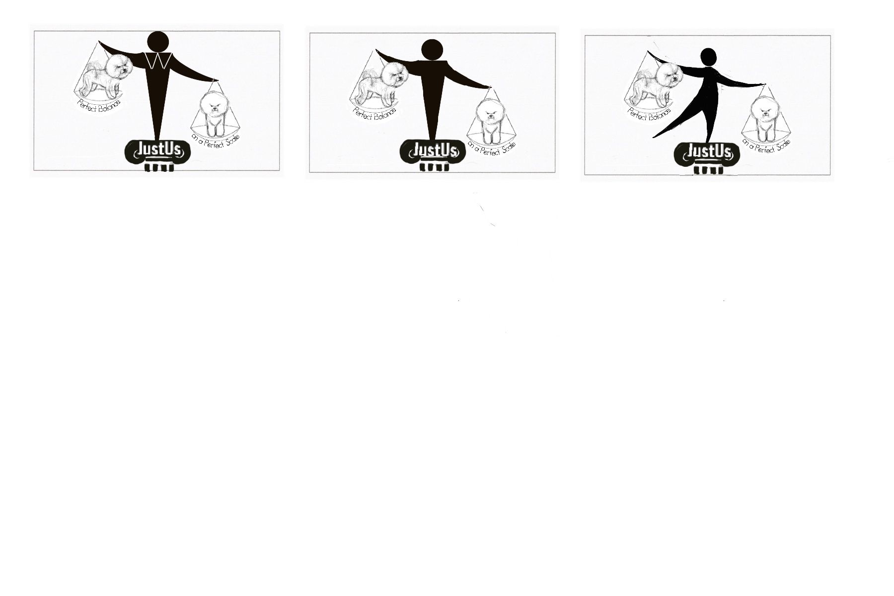
Thanks again for your help, I really appreciate it!
-
@BichonBistro You're welcome! I really like your latest mock-ups - I think there's been a marked improvement!
As for your questions:
- The concept works, in my opinion. If someone else has a varying point of view, that would be good to hear, too. Most importantly, though, is the client happy with where the concept currently stands?
- I personally think the third version - the feminine one - is very unique.
- Maybe a smaller, more curvy "w", resembling a peter pan collar? This is a detail you could add on a separate layer and show her. If she doesn't want it there, it wouldn't be a lot of trouble for you to simply remove it and move on.
- Perhaps a good way to go about translating the bichon drawings into minimalistic line drawings, would be to create a new layer above what you already have, and see if you can do a simple freehand drawing using only a black hard round brush. Pen tool would be good too, but it might be harder for this purpose (depending on your comfort level).
- If she's agreeable, that's great. Just from your latest mock-ups it's quite apparent that the image would work well on its own on the front of the card, without all the contact details.
Just an extra note on this:
@BichonBistro said in HELP! I committed to a logo design and I am in a cold sweat:
I have no idea how I am going to achieve the kind of precision these will require beyond the sketch stage,
For the final, try and do it in vector (Adobe Illustrator would be best), so as to not worry about precision and the danger of it pixelating when enlarged. That wouldn't happen in vector format.
https://www.instagram.com/sooryajart/
The Beatles: "Roll up, roll up for the Mystery Tour!"
-
@animatosoor Thanks again for your help! I am getting ready to try a line-drawing draw-over of the bichons and changing the w to a smaller, curvy one (I had hoped it would read as a "collar"/W).
I have always heard that logos require vector art, but I never got beyond the only thing I really needed from Illustrator prior to later versions of Photoshop: creating text on a curved path...

It looks like there is a function in Adobe Illustrator CS5 (my current version) called "live trace" that may allow me to trace over the drawing I import from Procreate. I am hoping Illustrator drawing in CS5 is not what I remember from my 2000 version (some wacky curving bars with dots on the end that needed to be manipulated)! I only bought it because it was part of the suite with indesign, which I needed to convert from quark.
First things first--get a simpler line drawing of the bichons, keep the panic level down by thinking about Illustrator/vector draw-over tomorrow:face_with_open_mouth_cold_sweat:
Thanks so much!
-
This post is deleted! -
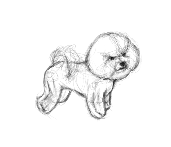
@BichonBistro I think you have a lot of workable ideas here, they just need to be simplified. I hope you don't mind I did a quick draw over. I traced your business card as well as your logo concepts, and just moved some things around. If you can draw something simple in Procreate, Illustrator's live paint could probably redraw it in vector just fine. If not, there is also the pen and pencil tool. As long as you can get them something vector, I think you got this.
I had no fonts to work with in Procreate, so I just did a rough draw. The dogs don't look so great identical, but I think you just need some small changes between them, like a paw hanging lower or something.
-
@Erin-Cortese wow, Erin! I wish I were as quick with Draw-overs! My initial reaction was ‘that’s a pretty cute Bichon for such quick turn-around”
 relieved to read that you traced my business card
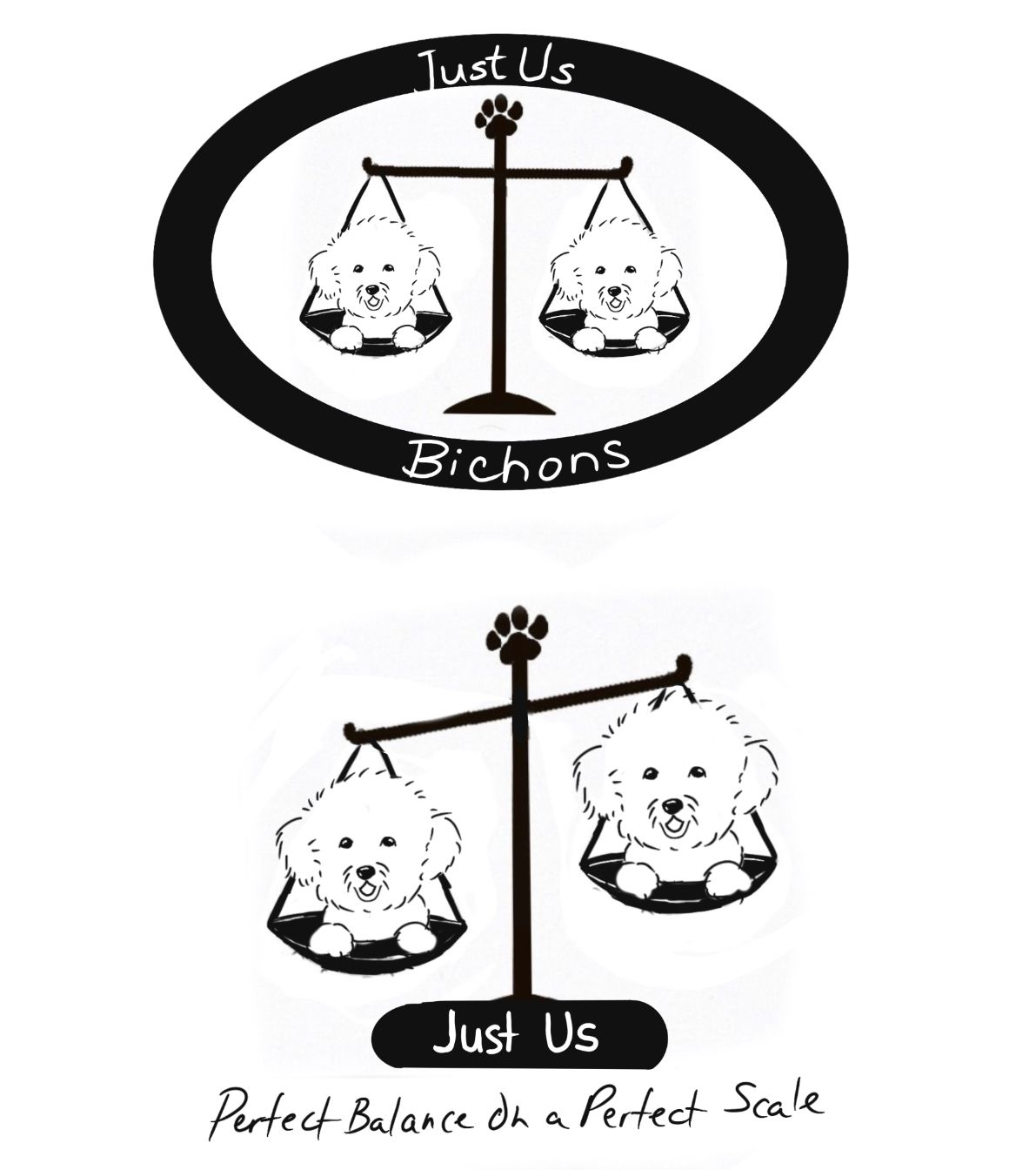
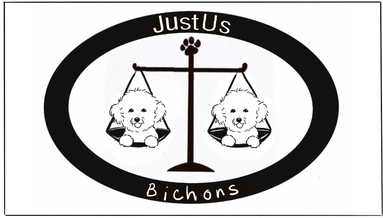
Can you educate me here? I know simple is better. So translating that to the Oval, we have 3 visual elements aside from type, right? The Oval, the bichons, the scale?
In the 2nd one, it is reduced to the scale and the bichons, correct?
In the one above with the breeder as the scale standing on the pillar of justice, we have 3 elements, correct?
So is there a general rule that 2 wins over 3 or is it impossible to generalize like that?
I really like the way the Bichon is emphasized here by basically a head shot.
I see what you are saying about varying one in some way.Questions:
- Because the Bichon body profile is a big thing in terms of illustrating balance & proportion, is it possible to combine this standing Bichon with the head shot? My gut tells me that will look odd—what do you think?
- I put the paw on the top of the scale as a way to differentiate that we ARE talking dogs here, not law, but do you think it’s too cliché? If not, is the size ok?
- Please tell me the illustrator pen tool in cs5 is not the one I remember from 2000...I basically put Illustrator in the same category as perspective: neither are friends with my brain

Even if I can’t get something in vector format, I will feel better at least being able to tell my breeder that I got a few preliminary sketches for her friend to take to a graphic designer.
Thanks so much for this help, I really appreciate it.
- Because the Bichon body profile is a big thing in terms of illustrating balance & proportion, is it possible to combine this standing Bichon with the head shot? My gut tells me that will look odd—what do you think?
-
As far as a general rule with number of elements, I think it would be to difficult to break it down in that way, but if I did it would be less is more. For balance, if things are too symmetrical they often will not communicate as well. That’s why the symmetrical Bichons I did do not look very good. If there were slight differences between them, it would communicate the idea of the Bichons clearer and quicker. The logos with the breeder as the scale are visual overload, it is just too much for the eye to process. Also, the Bichon you draw looks really good and could very easily be broken down to basic line work for a logo.
For your other questions:
-
I do not think the standing Bichon would work in the current designs you have, but if the body is important, it may be worth trying out a different design with only the one Bichon and the scales used differently?
-
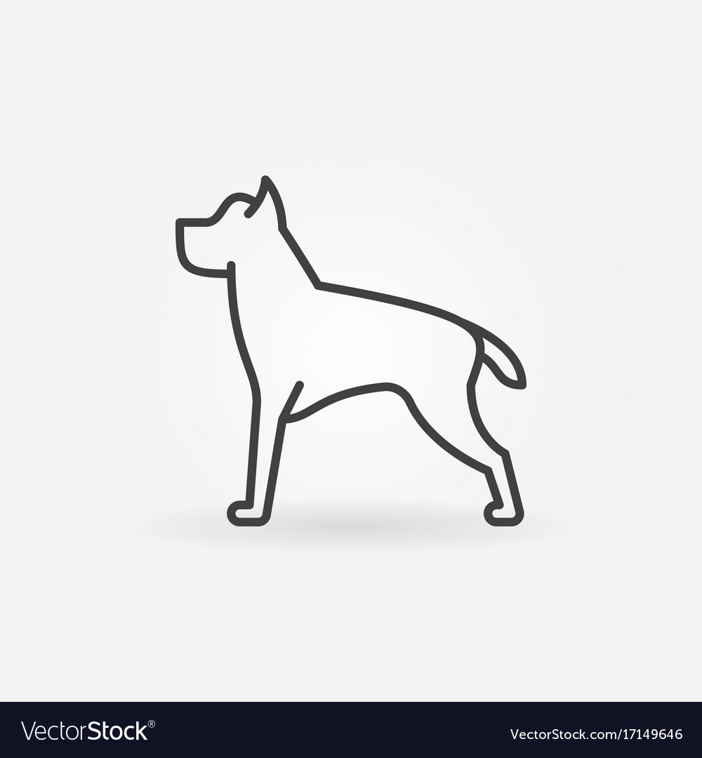
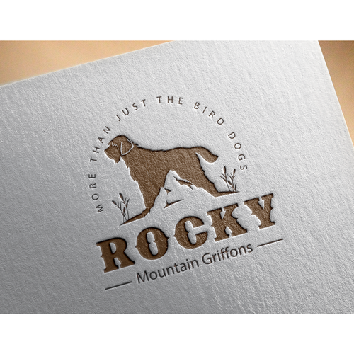
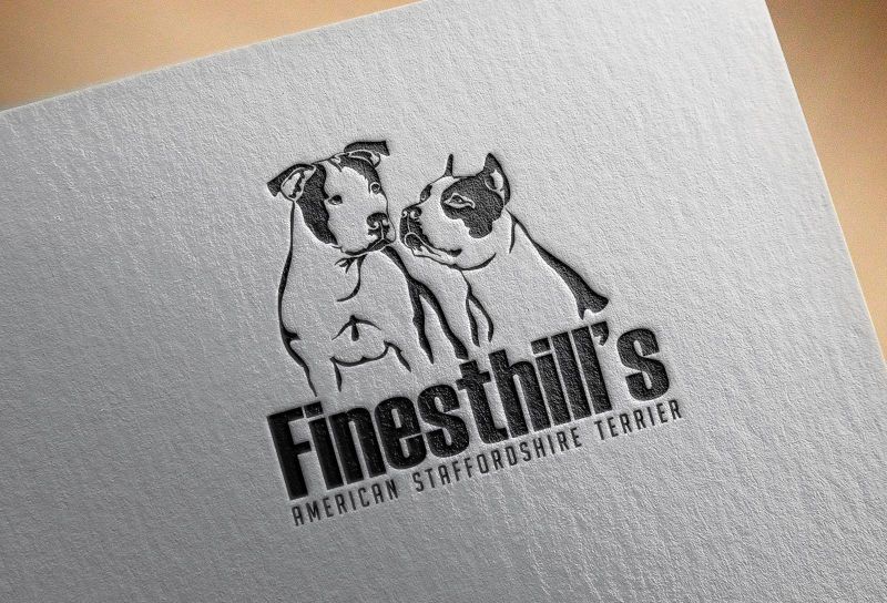
This one is tough to answer because it really depends on the audience. If you are unsure and it is not an option to speak directly to the client, it might be good to do a few options that go in different directions. Just rough, not polished. If you haven’t already, Google “dog breeder logos” and you will get a bunch of results that will hopefully inspire some ideas. Maybe the Bichon is the main part of the logo, and the scales are worked in more subtly? Or vice versa. Here are a couple I took from google..
Maybe you could put scales in place of the mountain?
Maybe you could have the dog on the left looking at the scales on the right?
- Lol! Nope. The pen tool has come a very long way. Still, the live paint or pencil may be easier options. I have never used my Apple Pencil in Illustrator, but I imagine it would be a lot like Procreate.
-
-
My rough idea for simplifying, but showing balance.
The blind lady of justice holds the scales, so would that work with the pup? Makes it balanced and leaves a nice spot for text.
I think the sub text isn't so much needed if the scales show balance already, and if the scales aren't balanced then the sub text seems false.
Could make the scales prettier to add some flair.
Just an idea, I hope this isn't rude.
All my links: https://APHOTICMOTH.carrd.co/
-
@Erin-Cortese Thanks so much for the education Erin. I have turned down logo design in the past because I knew I didn’t have the skills, but I was unwilling to say no to a friend this time. Oh what a lesson this has been! “Just Say No to Logos”
-
Those logos are REALLY good—I will try to come up with a sketch that features the standing Bichon, which might work better on the ‘pillar of justice’ icon, but she is so wedded to the scale, I will have to come up with something that features that.
-
I can easily show the scale with & without paw, as I drew that as a separate layer. Bichon fanciers tend to favor “cute”, so I could see this going either way.
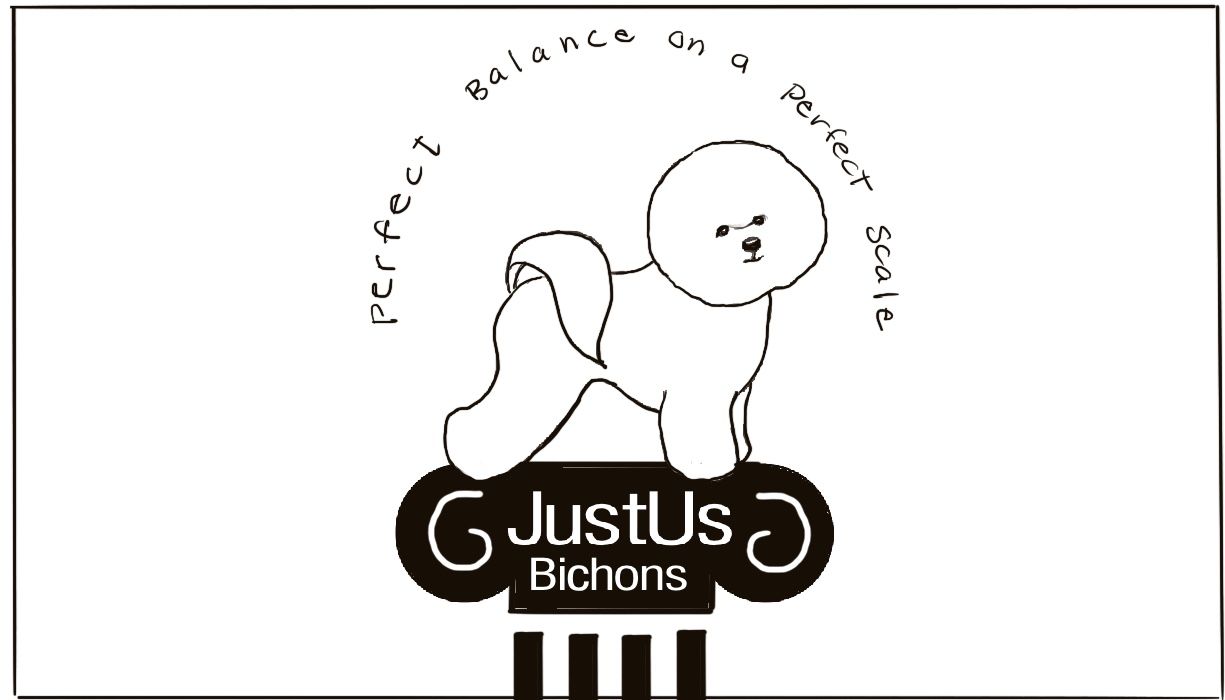
I wish I could think of a way to Illustrate just the bottom of the scale, with front feet on one side of scale, rear on other side, without losing the iconic nature of scales of justice. The dog as the focus in the Rocky Mountain logo is very appealing and the tag lines “perfect Balance on a Perfect scale’ could work as the semicircle above the standing Bichon. I am mulling this one and looking for scale of justice icons that might work better than what I have.
- I don’t have AI on my iPad, just cs5 on Mac. I will check out the illustrator app if it doesn’t require a subscription. I will have to bite the AI bullet or refer her to someone else to refine/implement the logo of her choice.
Thanks again for all your help!
-
-
@CLCanadyArts Hi Cassandra, thanks for another idea—you are not rude at all to offer suggestions! The “blind” option would probably not appeal because one of the most important features of the breed is expressive eyes, but a blindfold might be acceptable, as it doesn’t suggest what breeders call a “fault” (any unhealthy trait like cataracts).
I tend to agree with you on the unbalanced scale not really reinforcing the “balance” concept illustrated in the Bichon and subtext “perfect Balance”, but the client (the friend of my friend who I am really doing this for) was very attached to the idea of the tipped scale depicted in her “Caffe o Law” logo in our initial discussions. Perhaps she will change her mind when she sees alternatives.
This is a concept that did not occur to me, so thank you!
-
@BichonBistro You're welcome.
I didn't mean the dog would be blind, it's just the name of the statues. She holds the scales rather than it being on a base. Would have probably been better just to say, hanging scales. Sorry.
Can't wait to see what you come up with!
All my links: https://APHOTICMOTH.carrd.co/
-
@CLCanadyArts Hmm had another thought. Shes a breeder, so maybe a small young puppy in each side? Might be overkill.
-
This post is deleted! -
@Erin-Cortese @animatosoor @CLCanadyArts thanks for all your input on this task. This is so tedious and it’s just at the sketch stage

So I didn’t have time to sketch the head holding scales of justice yet @CLCanadyArts but if you think it’s best to have another design concept, I am going to do that next Sunday (company this week).
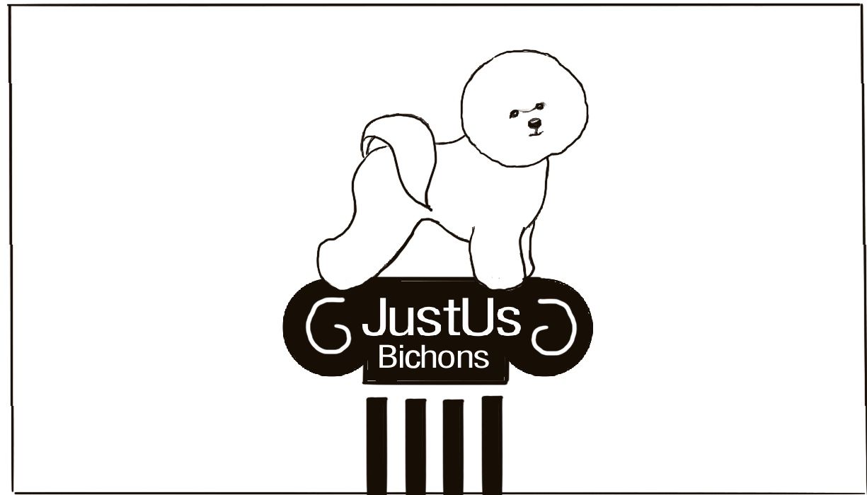
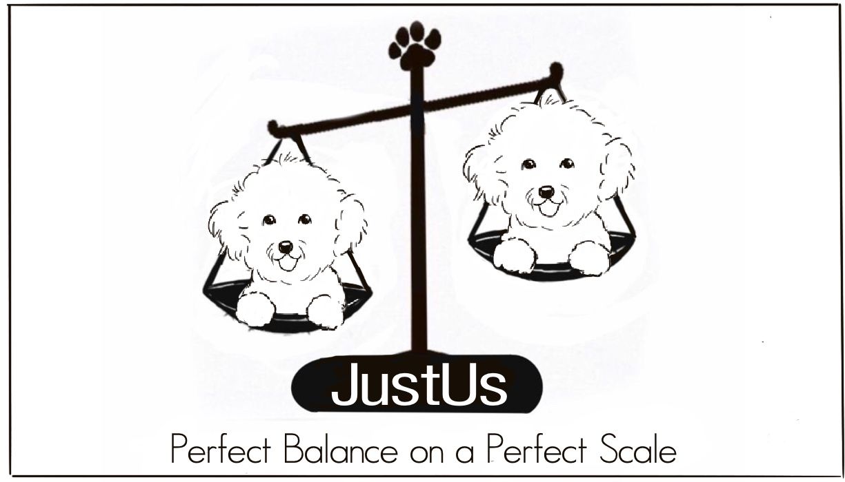
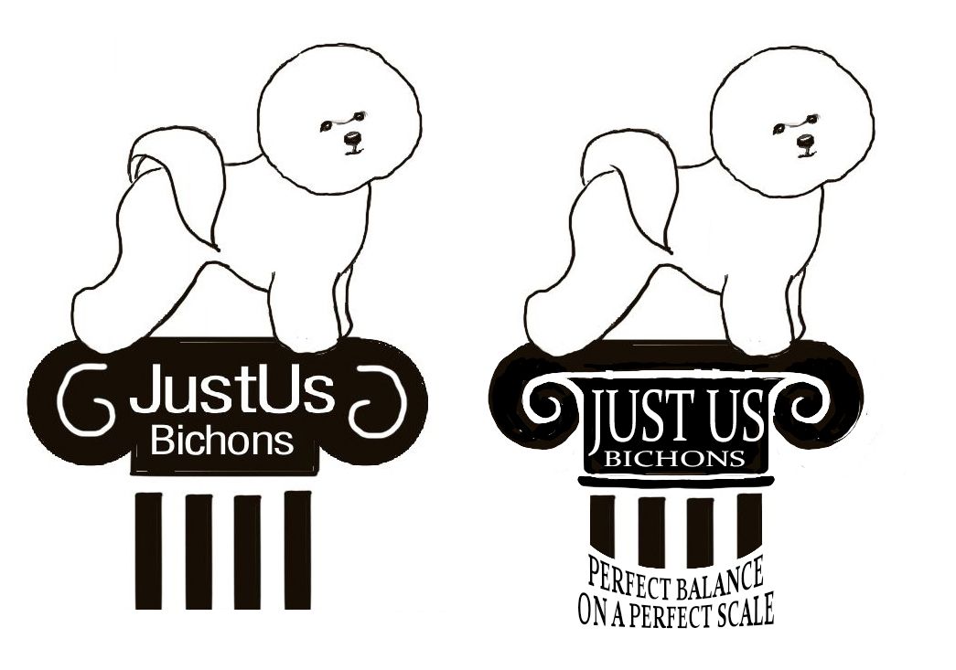
I wasn’t able to think of a way to use the scales in a manner similar to the Rocky Mountain Griffons logo @Erin-Cortese , so I put a standing Bichon on the pillar of justice with & without tag line.
Since an exaggerated head tilt is a thing bichons do when they are communicating, I incorporated that as the contrast between the two bichons on the scale.
Questions:
- Which of these options is feasible to present to the breeder and how many options should generally be offered?
- I really don’t want to research fonts and go through the tedium of figuring out kerning and placement of type on a path until I know the direction she wants to go.
Is it reasonable to expect a person to decide on a concept when type hasn’t been fully fleshed out? (I know—she’s a hobby breeder, not Nike, but I don’t want to be too unprofessional about it)
Thanks again to you all. I am going to LOGOff for the night

-
When doing logo designs, giving many concepts for review is always good, including multiple font styles. Never know what will jump out at them (my font was bad, was just a rough idea to give a concept)
#1 is nice, really looks like a show dog up on the podium like that. Fancy classy dog, classy podium, not so classy fon't, not that script would be good. Maybe play with it. All the black is really heavy. Could try to break it up a bit artistically.
#2 a lot of dead space between the dog and text.
The tail base clashes with the rest of the look of the dog, you also don't really see the base of their tail like that. Could just erase erase a bi o jive it a fuller look.
Played with it to show you what I mean. Just thoughts. It's almost exactly the same height.
All my links: https://APHOTICMOTH.carrd.co/
-
@CLCanadyArts Wow, look at those typos. You get the idea though. I'll proof-read more. Haha.
All my links: https://APHOTICMOTH.carrd.co/
-
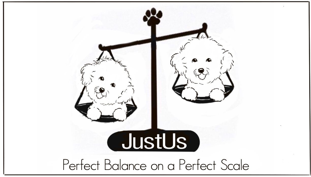
@BichonBistro It looks like your work is coming along nicely! I'm glad the others (@Erin-Cortese and @CLCanadyArts) have weighed in as well. I understand @Erin-Cortese provided the Bichon line drawings traced from your business card - and they are amazing! Would you still be giving the linework a shot on your own as well, to depict the two Bichons on the weighing scale? It would be great to see your personal take on it too, not only in terms of the cute Bichon head tilt, but to see how you would interpret the linework.
Again, it looks like it's progressing well, so good on you.
")
Also, off-topic: your sense of humour comes across in your posts, and it's quite sweet, hahah!
-
This post is deleted! -
@CLCanadyArts yes, I definitely got the idea and love it!